Modern Grotesque Body

Spooky Moon + Olline
Creates crisp high-hierarchy contrast beneath Spooky Moon headlines across menus, websites and labels.
Inspect Olline specimenDisclosure: MakerFileHub may earn a commission from qualifying purchases via paid links on this page. How our links work.
Bulbous seasonal display
Spooky Moon is a bulbous display in white on a purple graveyard scene: heavy letters with rounded shoulders, flared stems and a few small spurs, a tight rhythm and a slight bounce, with a tracked subtitle beneath and a small bat divider between the words.
Paid link
Get this fontProject & layout blueprintsAt-a-glance maker compatibility
Sturdy stroke walls and open counters weed cleanly on adhesive vinyl, HTV apparel film, and cut cardstock.
Visual anatomy & craft review
The words are stacked and the drawing is a seasonal display with flared stems: the strokes swell at the ends, the counters are generous, and the letters carry small spurs that give the face its old-horror-poster flavour without the density of a blackletter. The bounce is mild, so the block reads as a poster title rather than a wobbly novelty, and the generous counters keep the words legible against a busy illustration. The tracked subtitle and the bat divider beneath belong to the sheet rather than to the letterforms. The palette is white on a violet scene with a full moon, and the specimen keeps the type over the darkest part of the sky so the counters stay open.
Seasonal, bulbous, display, bold
Two-font hierarchy recipes
Tested contrast partners — pairing Spooky Moon with grounded secondary typography.
Spooky Moon + Olline
Creates crisp high-hierarchy contrast beneath Spooky Moon headlines across menus, websites and labels.
Inspect Olline specimen
Spooky Moon + Abigail
Adds a warm human signature touch for 1-to-3-word callouts without competing against structured serif capitals.
Inspect Abigail specimenPractical applications
Concrete hierarchy, scale and production guidance tailored to Spooky Moon’s stroke geometry.
A bulbous display reads at poster distance and keeps the horror tone without the legibility problems of a textured gothic face.
Hierarchy & layout recipe
A2 portrait: the event at 120 mm cap height, the details in a 16 mm sans, and a 5 mm rule. Keep 30 mm margins, print white on a dark ground, and keep the type over the quieter part of the illustration.
Pre-production check
Check the poster at five metres, where the flared stems can close the counters; keep them above 6 mm. Confirm the 16 mm details read at three metres and that the rule clears the artwork.
A bold seasonal face sets the theme for a party invitation, and the generous counters keep the greeting readable on a small card.
Hierarchy & layout recipe
A6 card: the greeting at 28 pt, the details in a 9 pt sans, and a small bat. Keep 12 mm margins and print white on a dark card so the counters stay open.
Pre-production check
Check the 28 pt greeting on a home printer, where white ink is not available; print dark on light instead. Confirm the 9 pt details keep a 4.5:1 contrast and that the bat clears the trim.
A seasonal label gives a limited product a shelf presence, and the single-colour version keeps a small run cheap on a dark bottle.
Hierarchy & layout recipe
Print a 70 by 100 mm label: the product at 16 pt, the volume in a 7 pt sans, and a 5 mm rule. Keep 5 mm inside the die and print bone on a dark stock so the type reads on glass.
Pre-production check
Check the 16 pt product on a curved bottle, where the outer letters distort; reduce the width. Confirm the 7 pt volume reads in the chiller and that the rule clears the die.
Technical & licence verification
Confirm included OTF/TTF/WOFF formats, full glyph tables and licence coverage on the live store page before batch production.
Closest visual alternatives
Matched across letterform anatomy, stroke behaviour and craft applications.
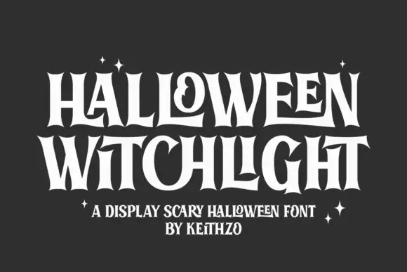
Tall flared Halloween letters with inward curls
Halloween Witchlight shows tall narrow letters with sharply flared ends, where a curled counter and stretched horizontal strokes vary a dense two-line title and the flares open at the feet and crowns of the stems.
Ideas for this font
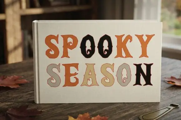
Rustic serif with ghost counters
Spooky Season is a rustic serif shown on a linen book cover: uneven edges, bracketed serifs and counter details drawn as tiny ghost silhouettes, in rust, tan, sage and black, set in two stacked words on a cream ground with autumn leaves on the table around it.
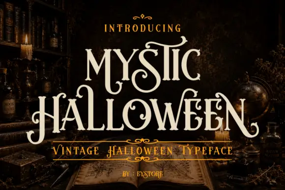
Curled tall mystic display serif
Mystic Halloween is a curled display serif in cream on a dark apothecary shelf: tall condensed capitals with hooked serifs, hairline flourishes in the counters, and a small inline detail on the thick stems.
Ideas for this font
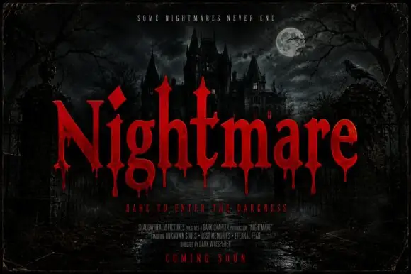
Pointed horror serifs with descending drips
Nightmare Bloodline is a horror display in red on a moonlit castle scene: tall pointed serifs, sharp shoulders and drops of blood falling from the lower terminals of the letters.
Ideas for this font
Same independent foundry
Allow optional Google Analytics to measure visits and catalogue actions. Your search words and notes are not included. Privacy & storage



