High-Contrast Display Serif

Murem + Majestic Letters
Pairs sculptural editorial warmth with Murem's clean modern geometry.
Inspect Majestic Letters specimenDisclosure: MakerFileHub may earn a commission from qualifying purchases via paid links on this page. How our links work.
Ultra-condensed display with cutting angles
Murem is an ultra-condensed display face in red on black: very tall narrow capitals made from straight bars, with angled cuts at the counters and sharp spikes where the strokes meet, filling the whole width of the page.
Paid link
Get this fontProject & layout blueprintsAt-a-glance maker compatibility
Sturdy stroke walls and open counters weed cleanly on adhesive vinyl, HTV apparel film, and cut cardstock.
Visual anatomy & craft review
The word is set as tall as the page allows and the face is built from straight vertical bars: each letter is a set of narrow rectangles joined at right angles, the counters are cut on a diagonal, the R throws a spike instead of a leg, the M is a pair of uprights with a deep V between them, and the E keeps three short arms. There is no curve anywhere and no contrast, so the word reads as a mark cut from tape rather than a letterform, and the extreme condensation is what lets five letters fill a page at that height. The letters are set immediately next to each other so the block has no gaps, and the sample keeps everything else off the page apart from two small studio marks at the foot. The palette is a flat red on black. Murem is a display face for posters, apparel, album artwork and event graphics, and it needs a short word at an enormous size and a dark ground.
Condensed, sharp, loud
Two-font hierarchy recipes
Tested contrast partners — pairing Murem with grounded secondary typography.
Murem + Majestic Letters
Pairs sculptural editorial warmth with Murem's clean modern geometry.
Inspect Majestic Letters specimen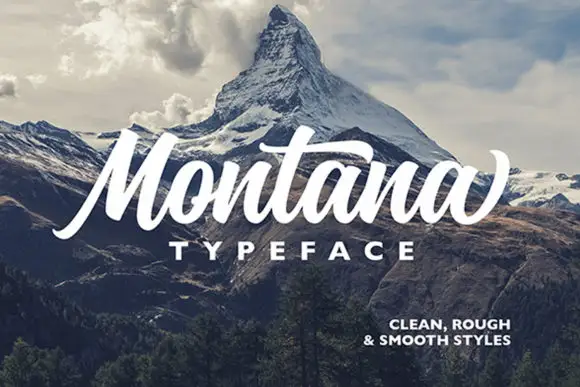
Murem + Montana
Introduces organic movement on pull-quotes, signatures and gift tags.
Inspect Montana specimenPractical applications
Concrete hierarchy, scale and production guidance tailored to Murem’s stroke geometry.
An ultra-condensed face turns a title into a graphic object, and the straight bars stay sharp at sleeve size where a rounded face would soften.
Hierarchy & layout recipe
Print a 300 mm sleeve: set the title at 120 pt on one line, keep 26 mm of clear ground beneath before the artist at 12 pt, and hold 20 mm of margin on all four sides.
Pre-production check
At large sizes the angled cuts must stay clean; proof one sleeve flat and check the spikes before the run.
A condensed block reads at a distance on a dark street, and the red on black pairing is visible where a subtle palette would not be.
Hierarchy & layout recipe
Print a 420 by 594 mm poster: set the title at 200 pt on one line, keep 40 mm of clear ground beneath before the date at 22 pt, and hold 26 mm of margin on all four sides.
Pre-production check
A flat red on black can look brown under street lighting; proof one sheet at night before the print run.
An ultra-condensed face fits a long stage name on a narrow banner, and the heavy bars hold up against a busy crowd background.
Hierarchy & layout recipe
Print a 3000 by 800 mm banner: set the name at 500 pt on one line, keep 90 mm of clear ground beneath before the times at 80 pt, and hold 70 mm of margin on all four sides.
Pre-production check
At banner scale the letter gaps become large; check the spacing on one section at the final size.
Technical & licence verification
Confirm included OTF/TTF/WOFF formats, full glyph tables and licence coverage on the live store page before batch production.
Closest visual alternatives
Matched across letterform anatomy, stroke behaviour and craft applications.
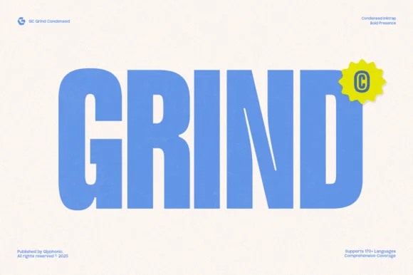
Heavy condensed inktrap display sans
Gc Grind is a bold condensed sans-serif engineered with subtle corner inktraps and flat industrial curves across 170+ languages.
Ideas for this font

Tall architectural condensed poster sans serif
Headline is a crisp, heavy condensed sans serif engineered with flat horizontal terminals, narrow counters, and clean newspaper-poster punch.
Ideas for this font

Ultra-narrow 6:1 skyscraper condensed editorial sans (OTF & TTF)
Homies is an extreme 6:1 ultra-condensed sans serif packing razor-slim, towering vertical bars for high-fashion streetwear & album art (OTF & TTF).
Ideas for this font
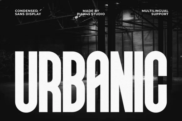
Condensed sans display
Urbanic is a condensed sans display in white on a dark industrial interior: very tall narrow capitals, visually even stroke weight, flat horizontal terminals and tight spacing, so a long word fills the width without a single flourish.
Ideas for this font
Same independent foundry
Allow optional Google Analytics to measure visits and catalogue actions. Your search words and notes are not included. Privacy & storage