Modern Grotesque Body

Munkay + Bielchon
Creates crisp high-hierarchy contrast beneath Munkay headlines across menus, websites and labels.
Inspect Bielchon specimenDisclosure: MakerFileHub may earn a commission from qualifying purchases via paid links on this page. How our links work.
Heavy slab with soft corners
Munkay is a slab serif in orange on a warm grey ground: heavy stems with softly bracketed serifs, a large x-height and a short descender, set as one word with a tracked label above and beneath in the same family.
Paid link
Get this fontProject & layout blueprintsAt-a-glance maker compatibility
Sturdy stroke walls and open counters weed cleanly on adhesive vinyl, HTV apparel film, and cut cardstock.
Visual anatomy & craft review
The word is set once and the drawing is a slab at a heavy weight: the serifs are bracketed rather than square, the stems are thick, and the x-height is large, which makes the face friendly rather than institutional. The single word fills the plate at a size where the bracket on each serif is visible, and the tracked label above and beneath are set in the same family at a fraction of the size, which shows that it can carry a small line. Because the weight is heavy and the serifs are soft, the face works at label size and in signage, and the plate keeps the ground plain so the orange reads as ink. The palette is two tones, and there is nothing else on the page.
Slab, heavy, friendly, modern
Two-font hierarchy recipes
Tested contrast partners — pairing Munkay with grounded secondary typography.
Munkay + Bielchon
Creates crisp high-hierarchy contrast beneath Munkay headlines across menus, websites and labels.
Inspect Bielchon specimen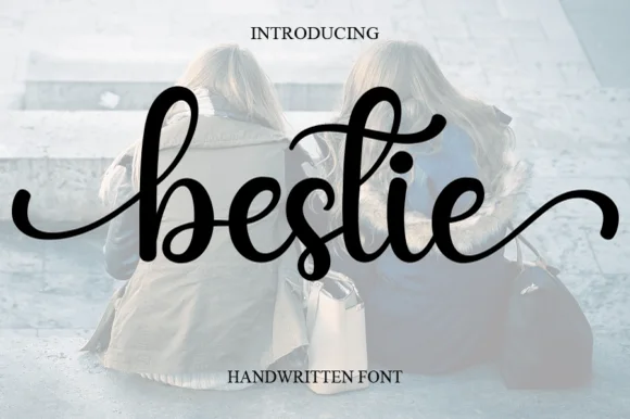
Munkay + Bestie
Adds a warm human signature touch for 1-to-3-word callouts without competing against structured serif capitals.
Inspect Bestie specimenPractical applications
Concrete hierarchy, scale and production guidance tailored to Munkay’s stroke geometry.
A heavy slab reads as a friendly shop name on a pack, and the large x-height keeps it legible at the small size a jar label allows.
Hierarchy & layout recipe
Print a 60 by 80 mm label: the brand at 15 pt, the product in a 7 pt slab, and the weight at 6 pt. Keep 4 mm inside the die and print two colours on a white stock.
Pre-production check
Check the 15 pt brand on a curved jar, where the outer letters distort; reduce the width. Confirm the 6 pt weight reads on the shelf and that the label survives a chilled cabinet.
A friendly slab reads from a corridor distance, and the bracketed serifs photocopy better than a hairline serif on a school copier.
Hierarchy & layout recipe
A4 print: the headline at 44 mm, the times in a 10 mm slab, and the rooms in 9 mm. Keep 20 mm margins and print one colour on white so the notice reads cleanly.
Pre-production check
Check the A4 at two metres, where a heavy slab can look blunt; keep the spacing even. Confirm the 9 mm rooms read at arm's length and that the headline fits the sheet.
A heavy slab gives a cookbook a warm, shopfront feel, and the soft serifs hold at thumbnail size where a sharper face would clot.
Hierarchy & layout recipe
Set the title at 85 mm cap height across 200 mm, the subtitle in a 12 pt slab, and the author at 9 pt. Print two colours on a cream stock and keep the title in the upper half.
Pre-production check
Check the title at thumbnail size, where heavy serifs can merge; open the spacing. Confirm the 9 pt author survives lamination and that the title clears the trim by 12 mm.
Technical & licence verification
Confirm included OTF/TTF/WOFF formats, full glyph tables and licence coverage on the live store page before batch production.
Closest visual alternatives
Matched across letterform anatomy, stroke behaviour and craft applications.

Very heavy rounded sport slab capitals
Chicago Titans pushes slab weight to its limit: thick stems, counters narrowed to slots, wide flat feet and almost no space left between the letters of a word.
Ideas for this font

Broad angular baseball slabs with wedge serifs and a tight fit
Baseball Athlete Jersey is a broad slab capital alphabet with wedge serifs, angular bowls and a tight fit, drawn so a word reads as a sewn athletic letter rather than as a sports headline.
Ideas for this font
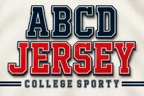
Squared collegiate capitals with an inner border and a shadowed second line
Abcd Jersey is a squared collegiate capital alphabet with an inner border, drawn so a two-line design can carry a light top line and a heavy bottom line in one family.
Ideas for this font
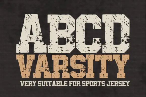
Wide athletic capitals with chamfered bowls and rough chips through the slabs
Abcd Varsity is a wide athletic slab in which the flat ends sit close, the bowls chamfer at the corners and irregular chips eat through the heavy slabs, so a two-word title reads as a weathered collegiate board.
Same independent foundry
Allow optional Google Analytics to measure visits and catalogue actions. Your search words and notes are not included. Privacy & storage