Editorial Serif Anchor

Rowball + The Bilstein Editorial
Anchors Rowball's fluid strokes with crisp Roman proportions on wedding suites, headers and packaging.
Inspect The Bilstein Editorial specimenDisclosure: MakerFileHub may earn a commission from qualifying purchases via paid links on this page. How our links work.
Rounded informal capitals
Rowball is a rounded informal capital hand in brown on cream: fat even strokes, wide open letters with rounded corners, a high x-height and a light bounce that keeps a plain word from looking mechanical.
Paid link
Get this fontProject & layout blueprintsAt-a-glance maker compatibility
Weld or Unite overlapping script joins into one continuous vector path before sending to the blade.
Visual anatomy & craft review
The word is set in capitals inside a taped card, and the face is an informal hand: the R has a small bowl and a short leg, the O and the W are wide, the B closes with two bowls of similar size, the A has a low crossbar and the double L closes with a small tail, while the stroke is even and thick with soft corners and the letters bob a little across the line. The counters are open and the spacing is generous, which is what keeps a fat capital alphabet legible at small sizes on a label or a card. A small line above the card introduces the face, a tracked line below names the style, and torn tape and a pressed butterfly hold the mock-up together. Rowball is a display hand for labels, packaging, cards and signage, and it works best in one or two short words.
A soft capital hand on a taped card
Two-font hierarchy recipes
Tested contrast partners — pairing Rowball with grounded secondary typography.
Rowball + The Bilstein Editorial
Anchors Rowball's fluid strokes with crisp Roman proportions on wedding suites, headers and packaging.
Inspect The Bilstein Editorial specimen
Rowball + Homies
Keeps small-scale dates, URLs, nutrition facts and care instructions crisp and legible below script titles.
Inspect Homies specimenPractical applications
Concrete hierarchy, scale and production guidance tailored to Rowball’s stroke geometry.
A wide rounded capital reads at a glance from a shelf, and the open counters mean a label can be understood by a child still learning letters.
Hierarchy & layout recipe
Print a 90 by 40 mm label: set the word at 20 pt on one line, keep 6 mm of clear ground beneath before the note at 6 pt, and hold 5 mm of margin on all four sides.
Pre-production check
Wide capitals use more width than expected; print one label at the finished size and check the fitting before the set.
A soft capital hand suits a product sold warm, and the thick even stroke survives a rubber stamp on a kraft paper bag without thinning.
Hierarchy & layout recipe
Print a 60 by 45 mm label: set the shop name at 14 pt on one line, keep 5 mm of clear ground beneath before the address at 5.5 pt, and hold 4 mm of margin on all four sides.
Pre-production check
A stamp thickens the stroke and can close the counters; proof one on the real bag and check the O before the order.
A rounded capital reads right across a hall, and the light bounce keeps a plain sign from looking like a printed notice.
Hierarchy & layout recipe
Print a 400 by 250 mm board: set the stall name at 70 pt on two lines, keep 20 mm of clear ground beneath before the prices at 18 pt, and hold 18 mm of border on all four sides.
Pre-production check
A bounce reads as crooked when scaled up; print one at the final size and check the level before the set.
Technical & licence verification
Confirm included OTF/TTF/WOFF formats, full glyph tables and licence coverage on the live store page before batch production.
Closest visual alternatives
Matched across letterform anatomy, stroke behaviour and craft applications.
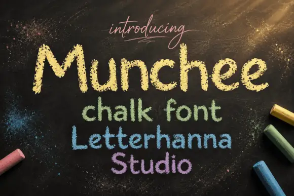
Chalk-textured display
Munchee is a chalk-textured display in cream and pastel on a blackboard: letters drawn with a broken chalky edge, a rounded skeleton with uneven heights, and three further lines in green, blue and purple that show the same face in different chalk colours.
Ideas for this font
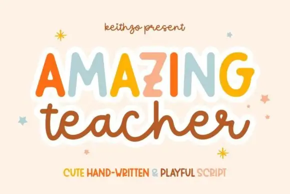
Mixed handwritten display
Amazing Teacher places broad separate capitals in mixed warm colours above a connected lowercase sample in brown, where the top line has blunt rounded ends and the lower t and h rise above the joined rhythm on a cream field with small star marks around the words.
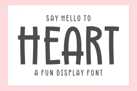
Tall hand-drawn capitals with rough edges and thin raised crossbars
Heart is a tall hand-drawn capital alphabet in which the strokes are narrow and rough-edged, the crossbars sit high and thin, and every letter leans a little, so a word reads as something brushed on a wall.
Ideas for this font
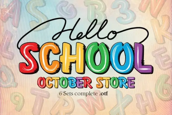
Bright irregular capitals with pale curved highlights and rough dark offsets
Hello School shows chunky irregular capitals in red, orange, yellow, green, blue and violet, where pale curved strokes sit inside the faces, dark rough-edged offsets create a drawn shadow and the large SCHOOL row has tall open counters with uneven widths.
Ideas for this font
Same independent foundry
Allow optional Google Analytics to measure visits and catalogue actions. Your search words and notes are not included. Privacy & storage