Editorial Serif Anchor

Pretty Wedding + The Simple Editorial
Anchors Pretty Wedding's fluid strokes with crisp Roman proportions on wedding suites, headers and packaging.
Inspect The Simple Editorial specimenDisclosure: MakerFileHub may earn a commission from qualifying purchases via paid links on this page. How our links work.
Tall high-contrast wedding script
Pretty Wedding is a tall high-contrast script in black over a pale photograph: narrow bowls, long pointed ascenders and a sweeping exit that runs beneath the second line.
Paid link
Get this fontProject & layout blueprintsAt-a-glance maker compatibility
Weld or Unite overlapping script joins into one continuous vector path before sending to the blade.
Visual anatomy & craft review
Pretty sits above Wedding, and the lettering is a formal script with a strong thick-and-thin: the P opens into a narrow loop, the r and the e are compressed, the t rises into a pointed stem and the W of Wedding throws a wide flourish that returns over the word. The ascenders are tall relative to the bowls, which is what makes the script feel formal rather than casual, and the exit stroke from the final g sweeps out beneath the line and lifts. The ground is a soft photograph of a veil, so the lettering sits over a pale texture rather than a flat colour, and there is no caption at all. The face is a wedding script for invitations, menus and signage: it needs a large size for the contrast to survive, it prints best as one dark ink on a pale ground, and the flourishes require margin on both sides.
A formal script over a veil
Two-font hierarchy recipes
Tested contrast partners — pairing Pretty Wedding with grounded secondary typography.
Pretty Wedding + The Simple Editorial
Anchors Pretty Wedding's fluid strokes with crisp Roman proportions on wedding suites, headers and packaging.
Inspect The Simple Editorial specimen
Pretty Wedding + Miniplate
Keeps small-scale dates, URLs, nutrition facts and care instructions crisp and legible below script titles.
Inspect Miniplate specimenPractical applications
Concrete hierarchy, scale and production guidance tailored to Pretty Wedding’s stroke geometry.
A tall high-contrast script is the conventional language of a formal wedding, and the flourish can be used to tie two lines together.
Hierarchy & layout recipe
Print a 130 by 180 mm invitation: set the names at 30 pt on one row, keep 22 mm of clear ground beneath before the venue at 9 pt, and hold 17 mm of margin so the flourish is not cut.
Pre-production check
Pointed hairlines break on uncoated card; print one invitation on the intended stock and check the t before the suite.
The script fits a tall menu where the heading sits above the courses, and the sweeping exit balances the height of the format.
Hierarchy & layout recipe
Print a 130 by 210 mm menu: set the heading at 26 pt on one row, keep 20 mm of clear ground beneath before the courses at 9 pt, and hold 14 mm of margin on both sides.
Pre-production check
A long exit stroke over a narrow menu can overrun; print one at the finished size and check the ends before the set.
A formal script on a board reads as a welcome rather than a notice, and the contrast holds at a distance where a monoline would go grey.
Hierarchy & layout recipe
Print a 500 by 700 mm board: set the greeting at 120 pt on one row, keep 28 mm of clear ground beneath before the names at 26 pt, and hold 24 mm of border on all sides.
Pre-production check
High-contrast hairlines vanish from a distance; print one board and check it at five metres before the set.
Technical & licence verification
Confirm included OTF/TTF/WOFF formats, full glyph tables and licence coverage on the live store page before batch production.
Closest visual alternatives
Matched across letterform anatomy, stroke behaviour and craft applications.
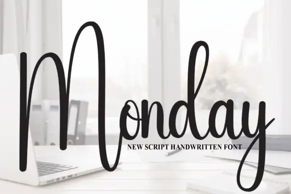
Tall script with an oversized narrow M
Monday is a tall script in black over a photograph of a desk: a very tall narrow capital M drawn as two long strokes with a shallow valley between, a compact connected body and a y whose descender curls below the word.
Ideas for this font
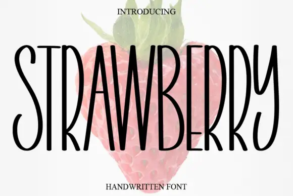
Tall narrow handwritten caps
Strawberry is a tall narrow handwritten face in black over a faded illustration of a strawberry: very condensed capitals with uneven strokes, high ascenders and a light bounce, set as one word with a small serif line above and beneath.
Ideas for this font
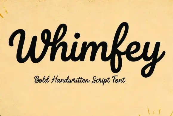
Bold handwritten script
Whimfey is a bold handwritten script in black on aged yellow paper: fat even strokes, a high x-height, short ascenders and a tight rhythm that reads as a confident everyday hand.
Ideas for this font
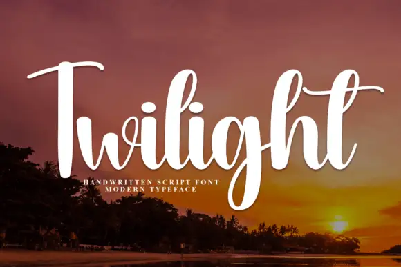
Slanted brush script with fine hairlines
Twilight is a slanted brush script in white over a dusk landscape: tall narrow letters with a soft swell, fine hairline joins, and a capital T whose crossbar runs out into a long thin entry stroke.
Ideas for this font
Same independent foundry
Allow optional Google Analytics to measure visits and catalogue actions. Your search words and notes are not included. Privacy & storage