Neutral Sans Workhorse

Gothica Sanctora + Olline
Lets Gothica Sanctora own the focal silhouette while handling secondary copy, sizing and subheads cleanly.
Inspect Olline specimenDisclosure: MakerFileHub may earn a commission from qualifying purchases via paid links on this page. How our links work.
961-glyph cathedral-filigree & Victorian-scroll blackletter
Gothica Sanctora is an opulent 961-glyph gothic blackletter crowning Victorian-medieval letters with intricate filigree halos and scroll cages.
Paid link
Get this fontProject & layout blueprintsAt-a-glance maker compatibility
Sturdy stroke walls and open counters weed cleanly on adhesive vinyl, HTV apparel film, and cut cardstock.
Visual anatomy & craft review
Gothica Sanctora is an opulent blackletter with 961 glyphs, hollow-inlined capitals, filigree halos and scroll cages that grow from the letters rather than sitting behind them. The lowercase is spiked and tightly knit, the capitals are ornamental set-pieces, and the alternate set lets a designer tune how much cage a word carries. It needs roughly 35 mm for the filigree to read as drawn ornament, and it is a title device: setting a long phrase in it turns the cages into a solid mass. It is at its best in one gold or bone ink on a dark ground.
961-glyphs · Cathedral-filigree · Ultra-ornate
Two-font hierarchy recipes
Tested contrast partners — pairing Gothica Sanctora with grounded secondary typography.
Gothica Sanctora + Olline
Lets Gothica Sanctora own the focal silhouette while handling secondary copy, sizing and subheads cleanly.
Inspect Olline specimen
Gothica Sanctora + Gorga
Grounds bold display lettering with classic typographic authority on posters, badges and apparel.
Inspect Gorga specimenPractical applications
Concrete hierarchy, scale and production guidance tailored to Gothica Sanctora’s stroke geometry.
Filigree halos read as illuminated manuscript work, which is what a gothic or historical edition is selling. Alternates let a designer keep a long title readable while reserving the cages for the initial.
Hierarchy & layout recipe
Jacket 152 x 229 mm, title 54 pt with 12 mm halo allowance, author 16 pt, 18 mm margins. Title page 170 x 240 mm, initial 120 pt, body 11/16 pt. Poster 500 x 700 mm, title 220 mm, imprint 16/22 pt.
Pre-production check
Hollow inline detail under 0.25 mm fills on uncoated text paper and the ornament becomes a grey line. Print on coated stock or reserve the filigree for the initial, and check one 1:1 proof.
Manuscript cages read as an old book rather than a slasher graphic, which suits a cathedral or occult theme. Heavy lowercase holds a name legibly at 25 mm.
Hierarchy & layout recipe
Poster A2, word 280 mm, times 22/28 pt, 30 mm margins. Missal 148 x 210 mm, title 40 mm, rubric 9/13 pt. Label 70 x 50 mm, word 12 mm, 4 mm die margin.
Pre-production check
A 12 mm label cannot hold a cage at all and the ornament turns into a smudge. Keep the filigree above 30 mm and use the plain cut for anything smaller.
Illuminated letterforms give a small label a museum register that a distressed gothic cannot reach. One metallic ink on a dark ground carries the whole ornament.
Hierarchy & layout recipe
Label 80 x 110 mm, name 20 mm, abv 4.5 pt on a 6 mm baseline, 5 mm top arc. Carton 60 x 130 x 30 mm, name 18 mm on the front, 8 mm margins. Chest print 280 x 320 mm, word 200 mm, 40 mm margins.
Pre-production check
Foil on a carton bridges the hollow inline and the filigree becomes a solid plate. Specify a flat die without fine detail, or print in ink and reserve the foil for a rule.
Technical & licence verification
Confirm included OTF/TTF/WOFF formats, full glyph tables and licence coverage on the live store page before batch production.
Closest visual alternatives
Matched across letterform anatomy, stroke behaviour and craft applications.
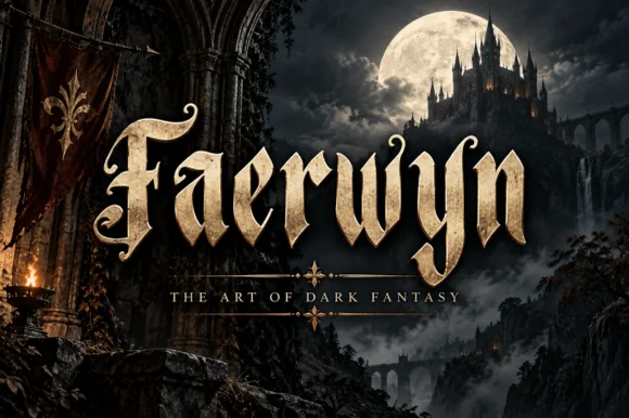
Elven-medieval dark-fantasy calligraphic blackletter
Faerwyn is a mystical dark-fantasy blackletter blending sharp medieval broad-nib calligraphy with sweeping elven ascender curls.
Ideas for this font
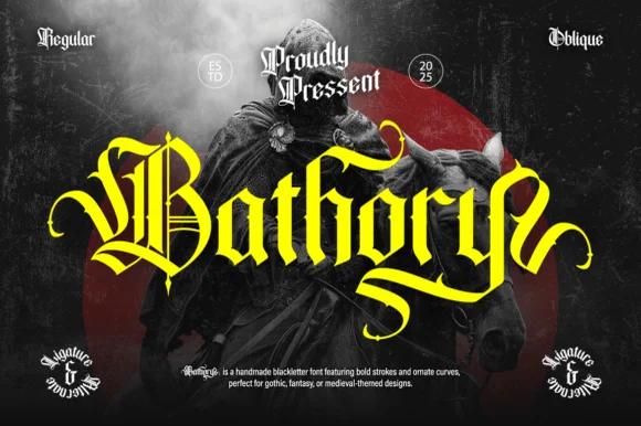
Ornate medieval blackletter family (Regular & Oblique)
Bathory is a lush, handmade medieval blackletter family (Regular & Oblique) featuring double-barred capitals and sweeping flame-curled descenders.
Ideas for this font
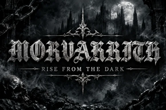
Blackletter with a metal bevel treatment
Morvakrith is a heavy blackletter shown with a metallic bevel: dense vertical strokes, sharp spurs and a narrow lowercase rhythm, rendered in polished silver over a moonlit castle scene with a skull, chains and a motto rule beneath.
Ideas for this font
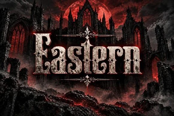
Weathered cathedral Fraktur blackletter display (OTF)
Eastern is a dramatic medieval Fraktur blackletter display font featuring bifurcated crown spurs and classic gothic lowercase (OTF).
Ideas for this font
Same independent foundry
Allow optional Google Analytics to measure visits and catalogue actions. Your search words and notes are not included. Privacy & storage