Neutral Sans Workhorse

Baluthi + Taught
Lets Baluthi own the focal silhouette while handling secondary copy, sizing and subheads cleanly.
Inspect Taught specimenDisclosure: MakerFileHub may earn a commission from qualifying purchases via paid links on this page. How our links work.
Segmented bamboo-like capitals with uneven angles
Baluthi is a decorative capital face in which the strokes divide into segments, small joint bands separate the sections and the angles tilt unevenly, so a word reads as cut bamboo lengths rather than a drawn alphabet.
Paid link
Get this fontProject & layout blueprintsAt-a-glance maker compatibility
Sturdy stroke walls and open counters weed cleanly on adhesive vinyl, HTV apparel film, and cut cardstock.
Visual anatomy & craft review
The stems break into segments with narrow joint bands, the crossbars tilt off the horizontal, dark outlines wrap the strokes and golden shading fills the interior. The segmentation is the character: it makes the letter a constructed object, which is why the sample sets one word on a bright tropical field. Because the joints are narrow, the face wants 30 mm of letter height before the bands stay separate, and vinyl under three quarters of an inch of cap height lets a joint weld shut. The hibiscus, leaves and pineapple are composition references; the segmented capitals are the face.
Segmented · Angular · Outlined
Two-font hierarchy recipes
Tested contrast partners — pairing Baluthi with grounded secondary typography.
Baluthi + Taught
Lets Baluthi own the focal silhouette while handling secondary copy, sizing and subheads cleanly.
Inspect Taught specimen
Baluthi + Stanza
Grounds bold display lettering with classic typographic authority on posters, badges and apparel.
Inspect Stanza specimenPractical applications
Concrete hierarchy, scale and production guidance tailored to Baluthi’s stroke geometry.
The segmented capitals suit a tropical sign, and the outlined strokes hold a one-word name at 70 mm on a painted board. One colour keeps the joint bands from filling on a board.
Hierarchy & layout recipe
Paint a 600 by 250 mm board: set the name at 70 mm, keep every joint band at 4 mm minimum, and keep 25 mm of border so the outlined strokes stay inside the frame. Use a sign-grade enamel on the board.
Pre-production check
A joint band painted under 2 mm closes and the letter becomes a bar; check the mask and keep the bands at 4 mm.
The bamboo segment gives a bottle label detail, and the outlined caps stay readable at 18 pt on a 50 mm panel in two inks. The tilt keeps a small label from reading as a plain outline face.
Hierarchy & layout recipe
Print a 50 by 35 mm label: set the name at 18 pt in capitals, keep the joint bands at 1 mm minimum, and set the flavour in a 6 pt sans beneath with 4 mm of clear ground. Keep the joints on the flat panel.
Pre-production check
Golden shading printed on a matte label turns flat brown; check the proof and keep the shading as a separate ink or drop it.
The segmented letters suit a themed card, and the outlined caps keep a short name clear at 26 pt on an A6 sheet in two inks. Two inks give the outline enough contrast at card size.
Hierarchy & layout recipe
Print an A6 card: set the name at 26 pt, keep 16 mm of clear card around the word for the outline, and set the date at 11 pt in a rounded sans beneath with 10 mm of clear ground.
Pre-production check
Outlined strokes printed over a busy botanical pattern lose their edge; check the card and keep the name on a plain panel.
Technical & licence verification
Confirm included OTF/TTF/WOFF formats, full glyph tables and licence coverage on the live store page before batch production.
Closest visual alternatives
Matched across letterform anatomy, stroke behaviour and craft applications.
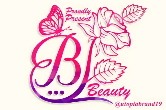
A looping contrast B initial with a large outlined flower, leaves and butterfly
Beauty Flower Monogram is a single ornate script initial with a long descending swash that turns into a line-drawn rose, two leaves and a butterfly, set in a warm pink-to-magenta gradient.
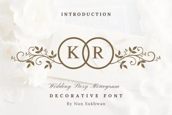
Circle-pair monogram with scrolls
Wedding Story Monogram is a two-initial monogram in bronze on a white still life: two serif capitals set inside two overlapping circles, with mirrored leafy scrolls extending sideways from the rings, staged on an envelope among white roses with a small line above and two lines beneath.
Ideas for this font
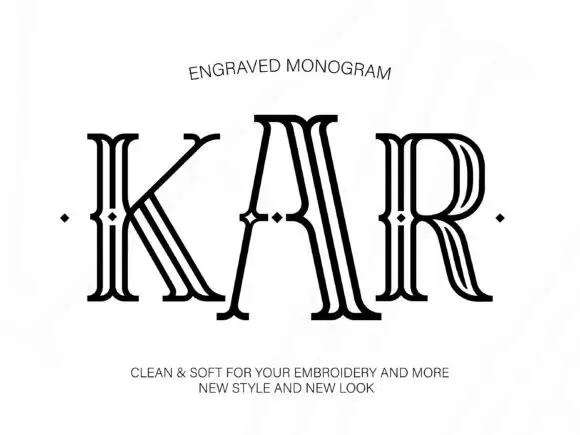
Tall outlined monogram capitals with diamond-shaped interruptions
Engraved shows three capitals drawn as several narrow parallel contours: tall flared serif ends frame open white interiors and small diamond-shaped breaks sit around the midline of each letter.
Ideas for this font
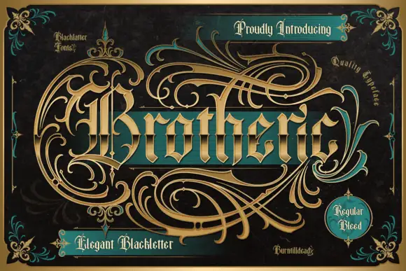
Outlined blackletter with an elaborate sweeping capital B
Brotheric sets a heavy blackletter on a dark panel and lets gold flourishes grow out of the word until they fill the frame, so the lettering reads as one engraved ornament rather than a line of text.
Ideas for this font
Same independent foundry
Allow optional Google Analytics to measure visits and catalogue actions. Your search words and notes are not included. Privacy & storage