Neutral Sans Workhorse

Kelisha Aesthetic + Bargain Condensed
Lets Kelisha Aesthetic own the focal silhouette while handling secondary copy, sizing and subheads cleanly.
Inspect Bargain Condensed specimenDisclosure: MakerFileHub may earn a commission from qualifying purchases via paid links on this page. How our links work.
Heavy contrast mixed case with looped entry strokes and long curling capital legs
Kelisha Aesthetic is a modern luxury sans with high stroke contrast, tall narrow letters and a set of alternates in which an arm or an ascender curls into a loop.
Paid link
Get this fontProject & layout blueprintsAt-a-glance maker compatibility
Sturdy stroke walls and open counters weed cleanly on adhesive vinyl, HTV apparel film, and cut cardstock.
Visual anatomy & craft review
KELISHA over AESTHETIC fills the card in a warm cream over a dark photograph of a hand and a cup, set in a display size where the contrast is obvious: the vertical strokes are heavy, the crossbars and joins are hairline, and several letters carry a curl. The K has an arm that loops back into itself, the first A throws a thin tail into the next letter, and the T in the second row ends in a hook that reaches under the baseline. Small sparkles are drawn in the gaps between words, and a badge at the upper right states the number of alternates and ligatures. The credit line under the words is set in a light serif at a fraction of the size. The face is a fashion and beauty display cut: it fills a card or a bottle label as a single word, and its hairlines make it unsuitable for anything small or absorbent.
Heavy contrast mixed case with looped entry strokes and long curling capital legs
Two-font hierarchy recipes
Tested contrast partners — pairing Kelisha Aesthetic with grounded secondary typography.
Kelisha Aesthetic + Bargain Condensed
Lets Kelisha Aesthetic own the focal silhouette while handling secondary copy, sizing and subheads cleanly.
Inspect Bargain Condensed specimen
Kelisha Aesthetic + Resquel
Grounds bold display lettering with classic typographic authority on posters, badges and apparel.
Inspect Resquel specimenPractical applications
Concrete hierarchy, scale and production guidance tailored to Kelisha Aesthetic’s stroke geometry.
The high contrast reads as premium on a shelf of flat labels, and the looping alternates give a short blend name a detail to recognise at arm's length.
Hierarchy & layout recipe
Print a 65 by 100 mm label: set the blend name at 26 pt on one row, keep 9 mm of clear ground beneath before the weight at 5 pt, and hold 6 mm from the widest curl to the label edge.
Pre-production check
The hairlines close on matte kraft; print one label on the actual stock and check the joins before the roll is ordered.
One word carries the cover, and the curls give a plain photograph a drawn element that a straight sans could not supply at any weight.
Hierarchy & layout recipe
Print a 230 by 300 mm cover: set the feature word at 150 pt across one row, keep 32 mm of clear ground beneath before the standfirst at 11 pt, and hold 18 mm from the last curl to the right trim.
Pre-production check
Hairlines disappear over a bright part of the image; print one cover and check the thin strokes against the lightest area before the run.
The tall contrast suits an evening wedding, and the looping alternates let two names join in a single line without a divider between them.
Hierarchy & layout recipe
Print a 148 by 210 mm invitation: set the names at 30 pt on one row, keep 22 mm of clear ground beneath before the venue at 9 pt, and hold 17 mm of margin from the loops to the card edge.
Pre-production check
Loops can collide when the names are tracked tight; print one invitation with the exact spacing and check the joins before the suite.
Technical & licence verification
Confirm included OTF/TTF/WOFF formats, full glyph tables and licence coverage on the live store page before batch production.
Closest visual alternatives
Matched across letterform anatomy, stroke behaviour and craft applications.
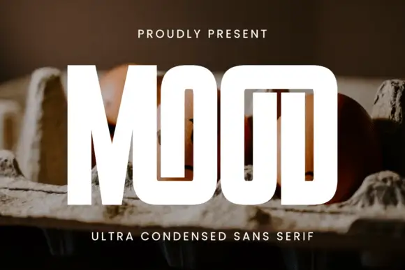
Ultra-tall slot display
Mood is an ultra-tall condensed display in white over a photograph of eggs in a carton: capitals set as narrow vertical slots with a shared top construction across the two O shapes and the D, a small tracked line above and a plain line beneath.
Ideas for this font
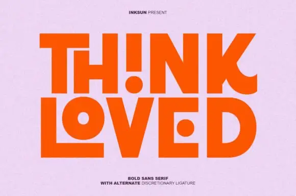
Bold sans with ligature alternates
Think Loved is a bold sans in orange on a pale ground: wide geometric caps with flat terminals, a very high waist and tight spacing, with a ligature that fuses two letters into a single drawn shape, set in two lines with a small tracked note beneath naming the alternate.
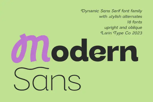
Heavy rounded mixed case paired with a looped M and a fine sweeping S on a second line
Modern Sans is a wide sans family of eighteen fonts, shown with a heavy display cut, a hairline weight and a script alternate that replaces the first letter of a word.
Ideas for this font
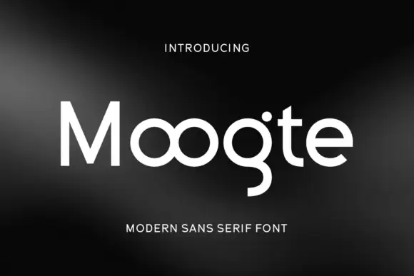
Joined circular display
Moogte is a joined circular display in white on a black ground: mixed case built from near-perfect circles, with the two o bowls fused into a single loop, a curling g descender and a cut on the t, set as one word with a small tracked line above and beneath.
Ideas for this font
Same independent foundry
Allow optional Google Analytics to measure visits and catalogue actions. Your search words and notes are not included. Privacy & storage