Editorial Serif Anchor

Monogram + Brenco
Anchors Monogram's fluid strokes with crisp Roman proportions on wedding suites, headers and packaging.
Inspect Brenco specimenDisclosure: MakerFileHub may earn a commission from qualifying purchases via paid links on this page. How our links work.
Very tall thin capital face
Monogram is a very tall thin capital face in charcoal on off-white: narrow letters with oval bowls, a deep pointed M, fine even strokes and slightly varied heights, set as one word inside a drawn corner frame with a tracked line above and a plain caption beneath.
Paid link
Get this fontProject & layout blueprintsAt-a-glance maker compatibility
Weld or Unite overlapping script joins into one continuous vector path before sending to the blade.
Visual anatomy & craft review
The word spans the plate and the drawing is a thin capital face with tall proportions: the bowls are narrow ovals, the M runs to a deep point, and the strokes are fine and slightly uneven, so the face reads as drawn lettering rather than as a monoline sans. That construction is why it is sold for monograms and nameplates, where a single word is set large and the unevenness becomes character. The corner frame is a drawn ornament supplied with the face, and the tracked lines above and beneath are plain caps. Because the strokes are fine, the face needs a size floor on any material, and the plate is honest about the intended use by showing one word only. It suits an engraving, a sign and a card rather than a sentence.
Handwritten, thin, tall, minimal
Two-font hierarchy recipes
Tested contrast partners — pairing Monogram with grounded secondary typography.
Monogram + Brenco
Anchors Monogram's fluid strokes with crisp Roman proportions on wedding suites, headers and packaging.
Inspect Brenco specimen
Monogram + Mansory
Keeps small-scale dates, URLs, nutrition facts and care instructions crisp and legible below script titles.
Inspect Mansory specimenPractical applications
Concrete hierarchy, scale and production guidance tailored to Monogram’s stroke geometry.
A thin tall capital sets a name cleanly on a plate, and the uneven stroke keeps an engraved sign from looking machined. An engraved name reads as a mark, not a label.
Hierarchy & layout recipe
Engrave a 200 by 80 mm plate: the name at 25 mm cap height, the role in a 7 pt sans, and one colour on brushed metal. Keep 12 mm margins and keep the finest stroke at 1 mm.
Pre-production check
Check the plate at 25 mm, where a fine stroke can disappear in engraving; keep it at 1 mm. Confirm the 7 pt role reads at arm's length and that the name stays centred.
A tall thin capital makes an initials sign that reads as a mark rather than as decoration, and the drawing suits a painted board.
Hierarchy & layout recipe
A3 board: the initials at 120 mm cap height, the date at 18 mm, and one colour on a pale board. Keep 35 mm margins and keep the finest stroke at 4 mm.
Pre-production check
Check the board at six metres, where a fine stroke can vanish; keep it at 4 mm. Confirm the 18 mm date reads at three metres and that the initials clear the border.
A thin capital face gives a milestone card restraint, and the name at a large size carries the design without ornament. The name carries the card alone.
Hierarchy & layout recipe
A6 card: the name at 20 pt, the greeting in a 9.5 pt serif, and the age at 30 pt. Keep 16 mm margins and print one ink on a cream card. Leave 18 mm at the foot for the greeting line.
Pre-production check
Check the 20 pt name on cream card, where a fine stroke can fade; keep the contrast above 4.5:1. Confirm the 9.5 pt greeting reads at arm's length and that the card folds flat.
Technical & licence verification
Confirm included OTF/TTF/WOFF formats, full glyph tables and licence coverage on the live store page before batch production.
Closest visual alternatives
Matched across letterform anatomy, stroke behaviour and craft applications.
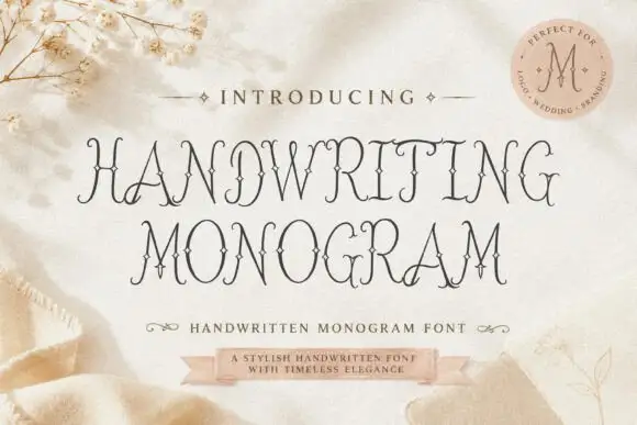
Fine ornamental monogram capitals with hairline flourishes
Handwriting Monogram is a fine ornamental alphabet in capitals only, built from hairline stems and small flourishes, with letters designed to interlock when two or three of them are set together.
Ideas for this font
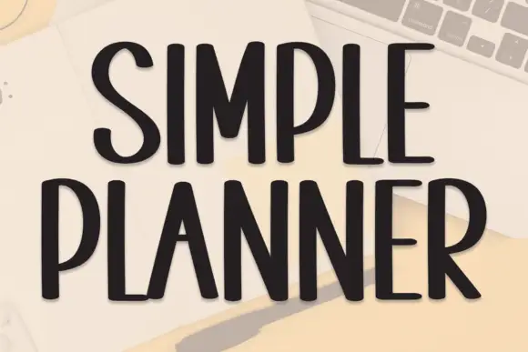
Tall condensed handwriting with light shadow
Simple Planner is a tall condensed hand-drawn display in near-black on a pale desk: narrow letters with blunt ends, a small light shadow and a level rhythm, drawn as two uppercase rows.
Ideas for this font
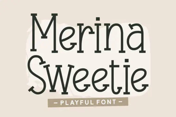
Tall quirky serif-like print
Merina Sweetie is a tall playful hand-lettering with slab-like feet: narrow letters, uneven serifs, a bouncing baseline and a warm olive-brown ink on a cream ground.
Ideas for this font
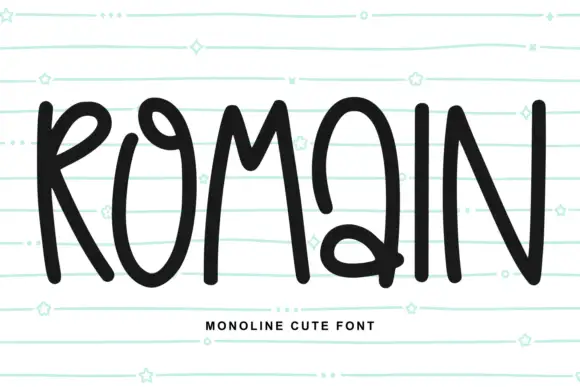
Tall looped monoline capitals
Romain is a tall monoline capital set in black on mint ruled paper: narrow looped letters with a hand-drawn bounce, a capital Q that drops below the baseline and small hearts and stars in the margin.
Ideas for this font
Same independent foundry
Allow optional Google Analytics to measure visits and catalogue actions. Your search words and notes are not included. Privacy & storage