Editorial Serif Anchor

Handwriting Monogram Font + Things
Anchors Handwriting Monogram Font's fluid strokes with crisp Roman proportions on wedding suites, headers and packaging.
Inspect Things specimenDisclosure: MakerFileHub may earn a commission from qualifying purchases via paid links on this page. How our links work.
Fine ornamental monogram capitals with hairline flourishes
Handwriting Monogram is a fine ornamental alphabet in capitals only, built from hairline stems and small flourishes, with letters designed to interlock when two or three of them are set together.
Paid link
Get this fontProject & layout blueprintsAt-a-glance maker compatibility
Set Cricut or Silhouette operation to Pen, Foil Quill, or Laser Score — not Basic Blade Cut.
Visual anatomy & craft review
Each letter is drawn as a delicate skeleton rather than a solid form: the H carries a small curl at the top of each stem, the A closes into a narrow apex with a fine bar, the M repeats that construction twice, and the letters are spaced so that the flourish of one can pass through the counter of the next. Weight is hairline throughout with a slightly heavier point where the pen turns, and the ends of the strokes finish in small hooks rather than tapering flat. Because the face is all capitals and built for pairs, a single letter reads as a mark rather than a word, and three letters read as a monogram rather than text. The soft linen and dried flowers behind, the round badge and the two ribbon lines are presentation; the alphabet is the two words.
Ornamental · Fine · Monogram
Two-font hierarchy recipes
Tested contrast partners — pairing Handwriting Monogram Font with grounded secondary typography.
Handwriting Monogram Font + Things
Anchors Handwriting Monogram Font's fluid strokes with crisp Roman proportions on wedding suites, headers and packaging.
Inspect Things specimen
Handwriting Monogram Font + Base Edge
Keeps small-scale dates, URLs, nutrition facts and care instructions crisp and legible below script titles.
Inspect Base Edge specimenPractical applications
Concrete hierarchy, scale and production guidance tailored to Handwriting Monogram Font’s stroke geometry.
The interlocking capitals let two initials become a single mark that can be repeated on the invitation, the menu and the seal, and the hairline weight stays elegant at small sizes.
Hierarchy & layout recipe
Set the monogram at 18 mm tall on the invitation header, keep it at 10 mm on the menu and the seal, and hold 12 mm of clear space around it so the flourishes are not crowded by text.
Pre-production check
Sealing wax and small stamps close hairlines; test the mark at 10 mm on the actual seal before the whole suite is produced.
A drawn monogram signals a house that marks its own work, and the fine flourish construction reads as a maker's stamp on a label or a lining.
Hierarchy & layout recipe
Set the monogram at 12 mm tall on a 30 by 40 mm woven label, keep the house name in a small caps serif at 6 pt, and leave 5 mm of clearance so the flourishes stay inside the weave.
Pre-production check
A hairline flourish cannot be woven below 0.4 mm; ask the mill for its minimum and simplify the flourish rather than enlarging the mark.
A single interlocked initial pair reads at the size of a wax seal, and the fine construction gives the seal a drawn quality that a heavy monogram would lose in the pressing.
Hierarchy & layout recipe
Set the monogram at 20 mm across the stamp face, leave 4 mm of border so the wax does not flow over the edge, and keep the ribbon colour plain so the mark stays the only ornament.
Pre-production check
Wax swells under pressure and closes a hairline; press one trial seal and simplify the most delicate flourish before casting the stamp.
Technical & licence verification
Confirm included OTF/TTF/WOFF formats, full glyph tables and licence coverage on the live store page before batch production.
Closest visual alternatives
Matched across letterform anatomy, stroke behaviour and craft applications.
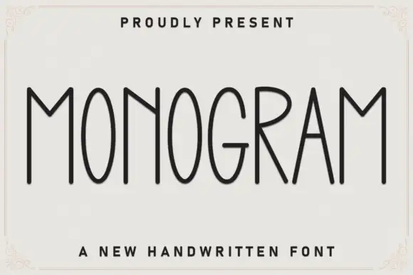
Very tall thin capital face
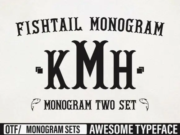
Monogram is a very tall thin capital face in charcoal on off-white: narrow letters with oval bowls, a deep pointed M, fine even strokes and slightly varied heights, set as one word inside a drawn corner frame with a tracked line above and a plain caption beneath.
Ideas for this font
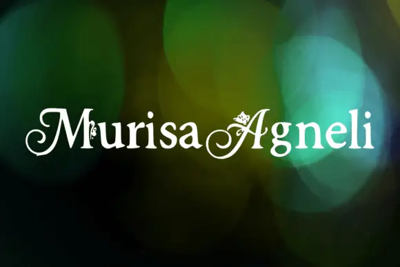
Decorative ornamented capitals
Murisa Agneli is a set of decorative serif capitals in white on a bokeh ground: high-contrast strokes, curled serifs, and small drawn ornaments set inside the counters of several letters.
Ideas for this font
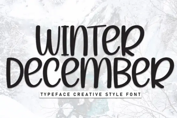
Tall rounded winter lettering
Winter December is a tall rounded hand-lettering in near-black on a pale winter photograph: narrow letters, small counters and a slight warm wobble, with a letter-spaced caption in a boxed strip below.
Ideas for this font

Very slanted calligraphy with broad lower sweeps and fine hairlines
Silken Luxe is a formal calligraphy script with a steep slant, broad lower sweeps and hairlines that thin almost to nothing, drawn so two words build an ornamental diagonal across the plate.
Ideas for this font
Same independent foundry
Allow optional Google Analytics to measure visits and catalogue actions. Your search words and notes are not included. Privacy & storage