Neutral Sans Workhorse

Vintage Monograms J + Montreal
Lets Vintage Monograms J own the focal silhouette while handling secondary copy, sizing and subheads cleanly.
Inspect Montreal specimenDisclosure: MakerFileHub may earn a commission from qualifying purchases via paid links on this page. How our links work.
Interlaced ornamental monogram set
Vintage Monograms J is a sheet of six ornamental monograms in black on white: each a pair of interlaced letters built from curled terminals, hatched shading and sword-like crossbars, arranged in two rows of three above a plain engraved line that names the set.
Paid link
Get this fontProject & layout blueprintsAt-a-glance maker compatibility
Sturdy stroke walls and open counters weed cleanly on adhesive vinyl, HTV apparel film, and cut cardstock.
Visual anatomy & craft review
The plate is a catalogue page rather than a specimen, and that is right for a monogram set, because the value is in the variety: six designs, each interlacing two letters through a central spine, with hatching that suggests an engraving. The drawing relies on a fine hatch and fine curls, so the size floor is high and the reproduction method matters, and the plate sets each mark large enough that the hatch reads as tone rather than as noise. The white ground is neutral. The engraved line at the foot is product copy naming the set. It suits a wedding crest, a bookplate and a stationer's mark, and a buyer should check the smallest intended size, since the hatch is the first thing to fill in.
Decorative, monogram, ornamental, engraved
Two-font hierarchy recipes
Tested contrast partners — pairing Vintage Monograms J with grounded secondary typography.
Vintage Monograms J + Montreal
Lets Vintage Monograms J own the focal silhouette while handling secondary copy, sizing and subheads cleanly.
Inspect Montreal specimen
Vintage Monograms J + Lumera Editorial
Grounds bold display lettering with classic typographic authority on posters, badges and apparel.
Inspect Lumera Editorial specimenPractical applications
Concrete hierarchy, scale and production guidance tailored to Vintage Monograms J’s stroke geometry.
A set of engraved monograms gives a couple a choice of crest, and the hatching reproduces in foil or letterpress where a flat mark would look plain.
Hierarchy & layout recipe
Set the chosen mark at 45 mm on the invitation, 26 mm on the menu and 18 mm on a favour tag, in one ink. Keep the finest hatch above 0.3 mm and hold 6 mm clear space around the mark.
Pre-production check
Check the 18 mm tag, where the hatch can fill into a grey block; simplify at that size. Confirm the 45 mm invitation holds in letterpress and that the interlace stays tight.
An engraved monogram gives a stationer a mark with authority, and the interlaced construction reads on a box lid. It reads as engraved stock.
Hierarchy & layout recipe
Set the mark at 22 pt on a card, 80 mm on a window and 15 pt on a box, keeping the hatch only above 26 pt. Keep one colour and reserve clear space equal to half the mark height.
Pre-production check
Check the 15 pt box mark, where the hatch closes into a tone; use the plain variant at that size. Confirm the window mark reads at six metres and that the interlace survives a vinyl cut.
An engraved monogram makes a bookplate look printed a century ago, and the interlace gives two initials one shape. It reads as an old plate.
Hierarchy & layout recipe
Print a 90 by 60 mm plate: the mark at 32 mm, the name in a 9 pt serif, and one ink on a cream stock. Keep 8 mm margins and keep the hatch above 0.3 mm.
Pre-production check
Check the 32 mm mark on a small plate, where the hatch can fill; keep it above 0.3 mm. Confirm the 9 pt name reads at arm's length and that the plate pastes flat without bubbles.
Technical & licence verification
Confirm included OTF/TTF/WOFF formats, full glyph tables and licence coverage on the live store page before batch production.
Closest visual alternatives
Matched across letterform anatomy, stroke behaviour and craft applications.
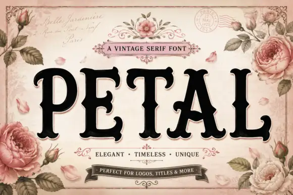
Vintage serif with rose ornament
Petal is a vintage serif in black on a pale rose ground: very heavy caps with bracketed serifs and a high waist, set on one line inside an ornamental frame with painted roses, ribbons, a postmark and a script line above and beneath naming the category and its uses.
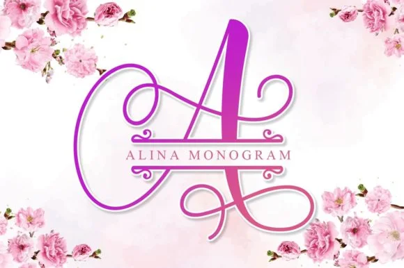
Calligraphic split-bar monogram
Alina Monogram builds ornate calligraphic capitals with an integrated centre split bar, where sweeping ribbon loops wrap each uppercase initial while a clean horizontal band runs through the middle to hold family names or a wedding date.
Ideas for this font

A looping contrast B initial with a large outlined flower, leaves and butterfly
Beauty Flower Monogram is a single ornate script initial with a long descending swash that turns into a line-drawn rose, two leaves and a butterfly, set in a warm pink-to-magenta gradient.
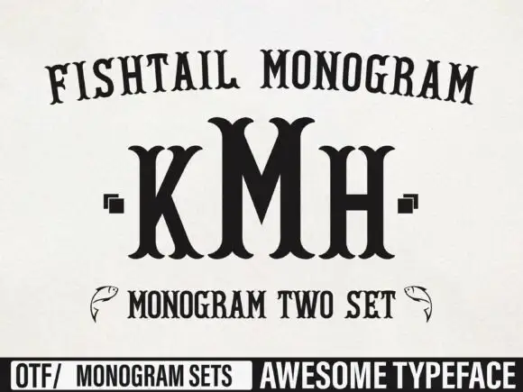
Tall monogram capitals with split fishtail ends
Fishtail Monogram shows a tall central M standing between narrower K and H, where split curved terminals flare at both ends of every upright, small square marks sit beside the outer letters and a fish outline appears at each side of a lower line.
Ideas for this font
Same independent foundry
Allow optional Google Analytics to measure visits and catalogue actions. Your search words and notes are not included. Privacy & storage