Neutral Sans Workhorse

Ebony + Modern Limited
Lets Ebony own the focal silhouette while handling secondary copy, sizing and subheads cleanly.
Inspect Modern Limited specimenDisclosure: MakerFileHub may earn a commission from qualifying purchases via paid links on this page. How our links work.
Contrast capitals with curled terminals, fine interior tendrils and small star-like marks
Ebony is an ornate Victorian display face in which every stroke carries a spiral, a dot or a small curl, so a word looks engraved and then hand-decorated on top.
Paid link
Get this fontProject & layout blueprintsAt-a-glance maker compatibility
Sturdy stroke walls and open counters weed cleanly on adhesive vinyl, HTV apparel film, and cut cardstock.
Visual anatomy & craft review
EBONY over FONT fills the card in solid black on a violet cosmic ground of nebulae and filigree corners, and the letters are covered in ornament: the counters of the E and the B hold spirals, the stems of the N and the Y sprout curls, and small dots sit in the gaps. The forms are wide and symmetric, with a circular O and a Y whose arms end in scrolls, and the whole word is drawn at a size where the ornament reads as ornament rather than as texture. Small rules with ornamental centres divide the two rows, and the two lines of information below are set in a plainer face so the eye has somewhere to rest. The face is a title cut for certificates, vintage packaging, fair posters and book plates, and it needs size: at 20 pt the spirals close up and the word becomes a dark bar with dots in it.
Contrast capitals with curled terminals, fine interior tendrils and small star-like marks
Two-font hierarchy recipes
Tested contrast partners — pairing Ebony with grounded secondary typography.
Ebony + Modern Limited
Lets Ebony own the focal silhouette while handling secondary copy, sizing and subheads cleanly.
Inspect Modern Limited specimen
Ebony + Vanielst Elegant Serif Display Stylistic
Grounds bold display lettering with classic typographic authority on posters, badges and apparel.
Inspect Vanielst Elegant Serif Display Stylistic specimenPractical applications
Concrete hierarchy, scale and production guidance tailored to Ebony’s stroke geometry.
The ornament sets the period on a title page with no illustration, and the wide letters carry a long title in one strong block at the top of the page.
Hierarchy & layout recipe
Print a 135 by 216 mm title page: set the title at 44 pt across two rows, keep 32 mm of clear ground beneath before the imprint at 9 pt, and hold 20 mm of margin left and right of the widest curl.
Pre-production check
The dotted interiors fill in on uncoated book paper; print one page on the intended stock and inspect the counters first.
The ornament gives a formal invitation its decoration in the lettering itself, which leaves the rest of the card plain and readable.
Hierarchy & layout recipe
Print a 148 by 210 mm invitation: set the names at 30 pt across one row, keep 24 mm of clear ground beneath before the venue at 9 pt, and hold 18 mm of margin from the outer curls to the card edge.
Pre-production check
Curled terminals crowd the line below when the names are long; print one invitation and check the gap before the suite is approved.
The lettering suggests a shop that has been trading for a century, and the ornament fills a small label that has no room for a picture.
Hierarchy & layout recipe
Print a 60 by 85 mm label: set the brand name at 20 pt on one row, keep 7 mm of clear ground beneath before the weight at 5 pt, and hold 5 mm from the curls to the die line.
Pre-production check
Small labels lose the spirals; print one label at the finished size and check the ornament before the roll is ordered.
Technical & licence verification
Confirm included OTF/TTF/WOFF formats, full glyph tables and licence coverage on the live store page before batch production.
Closest visual alternatives
Matched across letterform anatomy, stroke behaviour and craft applications.
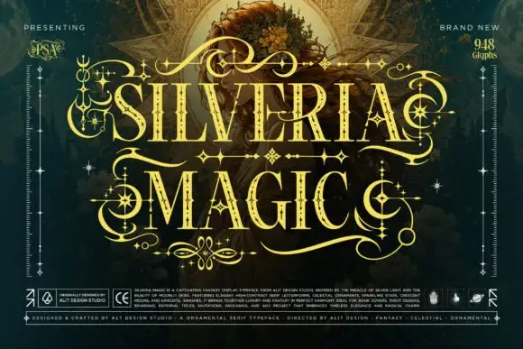
Ornate high-contrast capitals with celestial embellishments
Silveria Magic shows narrow serif capitals in pale gold with fine internal details and sharp contrasting strokes, where long sweeping extensions, crescent curls and star-shaped ornaments frame two rows over a detailed teal fantasy scene and a corner note advertises a glyph count.
Ideas for this font
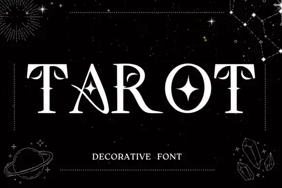
Celestial decorative serif
Tarot is a decorative serif in white on black: contrasted caps with pointed mid-stem accents, a star set inside the O, a drawn crescent inside the A, and sharp serifs, set as one word between dotted rules with constellation lines, crystals and a ringed planet drawn around the plate.
Ideas for this font
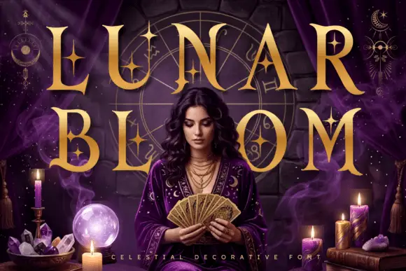
Celestial star-accented display
Lunar Bloom is a decorative display in gold over a purple scene with a figure holding a fan: tall contrast capitals with four-point star accents set inside the strokes and beside them, with crescents and star charts floating in the corners and a tracked line along the foot.
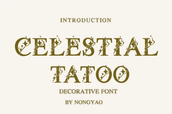
Star-inlaid celestial serif capitals
Celestial Tattoo adorns classic roman capitals with four-point star sparkles and crescent curls, built for tarot decks, astrology brands and apothecary labels, where each uppercase character carries tiny celestial cutouts and curled finials while the underlying letter stays a clean roman capital.
Ideas for this font
Same independent foundry
Allow optional Google Analytics to measure visits and catalogue actions. Your search words and notes are not included. Privacy & storage