Neutral Sans Workhorse

Cambridge + Borsen
Lets Cambridge own the focal silhouette while handling secondary copy, sizing and subheads cleanly.
Inspect Borsen specimenDisclosure: MakerFileHub may earn a commission from qualifying purchases via paid links on this page. How our links work.
Dense blackletter with split C and long hairline swashes
Cambridge shows a black gothic word beneath an inverted skyline, where the C carries a thin parallel inner stroke and a wide upper arc, the heavy lowercase bodies meet in sharp diamond joins, fine curves extend above the middle and beneath the final g, and the i dot is a tilted diamond.
Paid link
Get this fontProject & layout blueprintsAt-a-glance maker compatibility
Set Cricut or Silhouette operation to Pen, Foil Quill, or Laser Score — not Basic Blade Cut.
Visual anatomy & craft review
The strokes stay heavy and angular, the joins sharpen into diamonds, the fine hairlines cut across the broad strokes and the final letter falls into a long ornamental tail. That diamond structure is the character: the word reads as an etched gothic rather than a book blackletter, which is why the cover keeps a plain white field. The skyline and the rule ornaments are separate art. Keep 44 pt so the thin inner strokes stay visible, reserve 20 mm beneath for the tail and do not set a long phrase.
Dense blackletter with split C and long hairline swashes
Two-font hierarchy recipes
Tested contrast partners — pairing Cambridge with grounded secondary typography.
Cambridge + Borsen
Lets Cambridge own the focal silhouette while handling secondary copy, sizing and subheads cleanly.
Inspect Borsen specimen
Cambridge + The Simple Editorial
Grounds bold display lettering with classic typographic authority on posters, badges and apparel.
Inspect The Simple Editorial specimenPractical applications
Concrete hierarchy, scale and production guidance tailored to Cambridge’s stroke geometry.
The etched gothic sets a jacket title with weight, and the fine inner strokes give the cover detail without an illustration.
Hierarchy & layout recipe
Print a 129 by 198 mm paperback jacket: set the title at 52 pt on one row, keep 22 mm of clear ground beneath for the tail, and keep 18 mm of margin at each side.
Pre-production check
The inner hairlines break on uncoated stock; check the proof and choose a coated jacket stock.
The gothic weight gives a bottle heritage, and the diamond joins keep a short distillery name crisp at small label size.
Hierarchy & layout recipe
Print a 55 by 85 mm label: set the brand name at 22 pt on one row, keep 10 mm of clear ground beneath before the age at 7 pt, and keep 6 mm to the die edge.
Pre-production check
The thin inner stroke fills under 18 pt; check the plate proof and hold the name at 20 pt.
The dark ornamental weight suits a themed period evening, and the long tail gives a board a flourish without added graphics.
Hierarchy & layout recipe
Print a 500 by 300 mm board: set the title at 56 mm on one row, keep 30 mm of clear ground beneath for the tail, and keep 28 mm of border so the ornament stays inside.
Pre-production check
The skyline is cover art, not part of the type; check the artwork files before planning scenery.
Technical & licence verification
Confirm included OTF/TTF/WOFF formats, full glyph tables and licence coverage on the live store page before batch production.
Closest visual alternatives
Matched across letterform anatomy, stroke behaviour and craft applications.
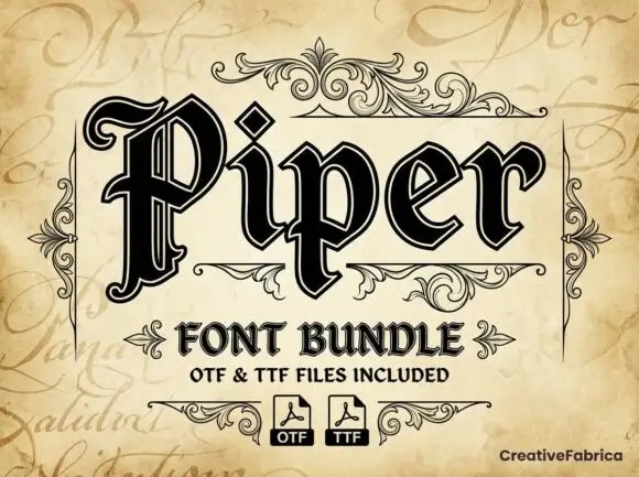
Outlined blackletter with doubled edges
Piper is an outlined blackletter in black on aged cream: a large curled P with doubled edges, narrow bodies, a diamond counter and fine inner lines, set as one large word above a scroll-flanked line that names the bundle and two format marks.
Ideas for this font
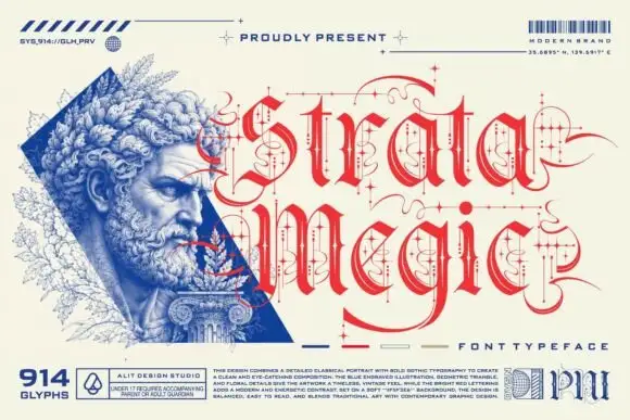
Fine calligraphic blackletter with looping line-and-dot ornaments
Strata Megic is a classical display serif with high contrast, sharp serifs and ornamental flourishes, shown in a technical drawing layout with glyph counts and swatch keys.
Ideas for this font
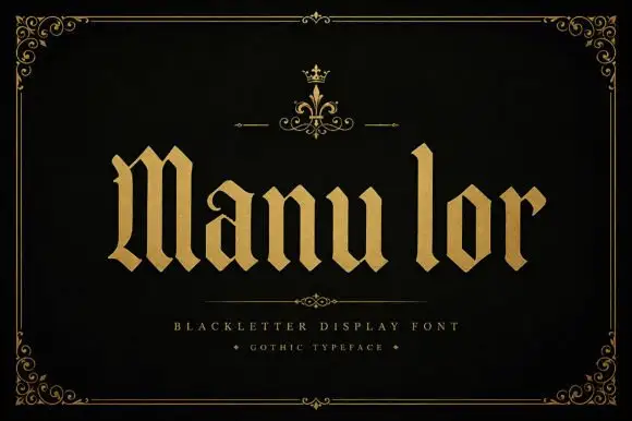
Broad blackletter with diamond shoulders
Manulor is a broad blackletter in gold on a black ground: diamond-shaped shoulders, a tall narrow l, even stroke widths and heavy bowls, set as one word between a small crown ornament above and two tracked credit lines beneath, all inside a fine ornamental frame.
Ideas for this font
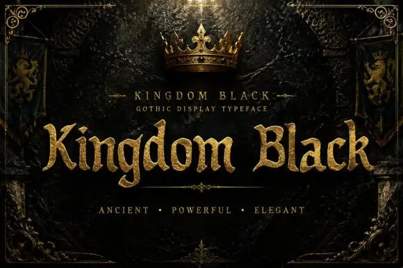
Weighty serif-like Gothic with rounded bowls and tapered sharp tips
Kingdom Black is a gothic display face filled with a textured gold, presented as a royal title plate with a crown above, lion banners at the sides and an ornamental frame.
Ideas for this font
Same independent foundry
Allow optional Google Analytics to measure visits and catalogue actions. Your search words and notes are not included. Privacy & storage