Editorial Serif Anchor

Lettifa Cute + Kernova
Anchors Lettifa Cute's fluid strokes with crisp Roman proportions on wedding suites, headers and packaging.
Inspect Kernova specimenDisclosure: MakerFileHub may earn a commission from qualifying purchases via paid links on this page. How our links work.
Bold upright looping script
Lettifa Cute is a bold upright script in black on white: fat even strokes, tall loops on the ascenders, a nearly vertical axis and a small circular badge noting the style.
Paid link
Get this fontProject & layout blueprintsAt-a-glance maker compatibility
Weld or Unite overlapping script joins into one continuous vector path before sending to the blade.
Visual anatomy & craft review
Lettifa is written on the upper line and Cute beneath it, and the lettering is a bold upright script with almost no slant: the L opens with a tall loop that rises well above the other letters, the e and the t are compact, the i is dotted and the f and the a are broad loops, and the whole pair reads as a confident hand rather than a calligraphic one. The stroke is an even monoline with rounded terminals, and the joins are tight enough to hold the words as single shapes. The ground is white with a soft shadow falling across the page, and a small round badge at the right names the file type, with a serif caption beneath. The face is a bold script for labels, packaging and cards: the heavy even weight survives small sizes and cutting, and the tall L gives a name a strong first letter.
A bold upright script with a tall looped L
Two-font hierarchy recipes
Tested contrast partners — pairing Lettifa Cute with grounded secondary typography.
Lettifa Cute + Kernova
Anchors Lettifa Cute's fluid strokes with crisp Roman proportions on wedding suites, headers and packaging.
Inspect Kernova specimen
Lettifa Cute + Homies
Keeps small-scale dates, URLs, nutrition facts and care instructions crisp and legible below script titles.
Inspect Homies specimenPractical applications
Concrete hierarchy, scale and production guidance tailored to Lettifa Cute’s stroke geometry.
A bold upright script reads at a counter from arm's length, and the even weight holds on a small label where a calligraphy would not.
Hierarchy & layout recipe
Print a 55 by 45 mm label: set the bakery at 14 pt on one row, keep 5 mm of clear ground beneath before the product at 5 pt, and hold 4 mm from the loop of the L to the die line.
Pre-production check
The tall L needs margin on a small die; print one at the real size and check the first letter before the order.
A bold script on a small tag reads in low light and holds a full name at twelve points, which most fine scripts cannot do.
Hierarchy & layout recipe
Print a 45 by 80 mm tag: set the greeting at 13 pt on one row, keep 5 mm of clear ground beneath before the name at 6.5 pt, and hold 4 mm from the lowest loop to the punch hole.
Pre-production check
Fat loops can close on a small tag; print one at the real size, punch it and check the letters before the order.
A bold script on a board reads across a market aisle, and a single ink keeps the sign cheap for a stall that trades for a day.
Hierarchy & layout recipe
Print a 500 by 300 mm board: set the stall name at 90 pt on one row, keep 22 mm of clear ground beneath before the prices at 16 pt, and hold 20 mm of border on all sides.
Pre-production check
A bold even script can look like a logo at ninety points; print one board at the final size and check it reads as lettering before the set.
Technical & licence verification
Confirm included OTF/TTF/WOFF formats, full glyph tables and licence coverage on the live store page before batch production.
Closest visual alternatives
Matched across letterform anatomy, stroke behaviour and craft applications.
Heavy decorative script with curled entries
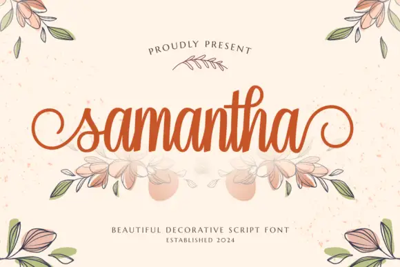
Samantha is a heavy decorative script in warm orange on speckled cream: thick even strokes, a tall loop on the h, curled entry and exit strokes on the s and the a, and an illustrated bouquet of leaves and flowers drawn beneath the word.
Ideas for this font
Rounded script with curled capitals
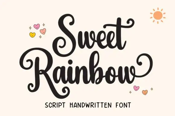
Sweet Rainbow is a rounded script in black on cream: curled capitals that spiral inward, fat even strokes and lollipop terminals, with drawn hearts and a small sun around the words.
Ideas for this font
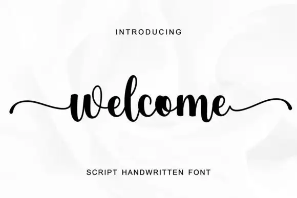
Compact script with long side tails
Welcome is a compact script in black on a white rose photograph: tight round letters, a high x-height, and two long horizontal tails, one entering from the left and one leaving to the right.
Ideas for this font
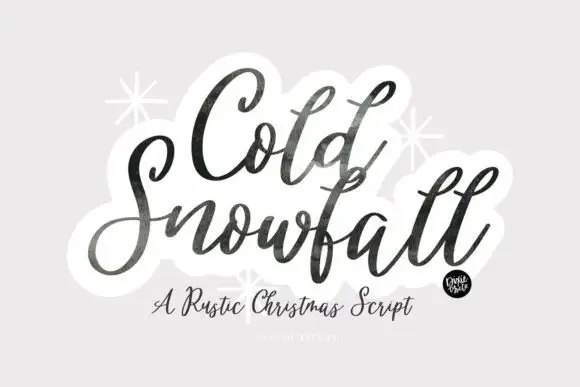
Textured slanted seasonal brush script
Cold Snowfall is a slanted thick-thin seasonal script whose dark strokes look worn at the edges, whose tittles are drawn as snowflakes and whose tall f and l loops crowd the centre line.
Ideas for this font
Same independent foundry
Allow optional Google Analytics to measure visits and catalogue actions. Your search words and notes are not included. Privacy & storage