Neutral Sans Workhorse

Rustic + Kohilo
Lets Rustic own the focal silhouette while handling secondary copy, sizing and subheads cleanly.
Inspect Kohilo specimenDisclosure: MakerFileHub may earn a commission from qualifying purchases via paid links on this page. How our links work.
Brutal death-metal splatter display
Rustic is a brutal death-metal display in white on a red skull: letters built from thin spiky strokes that branch and fork, plus a splatter texture that throws flecks around every terminal, so the word reads as a logo burned onto a surface.
Paid link
Get this fontProject & layout blueprintsAt-a-glance maker compatibility
Fine grain and micro-texture excel in 300 DPI print, sublimation, and screen print rather than small vinyl weeding.
Visual anatomy & craft review
The word is set as a symmetrical mass rather than as a line: each letter is drawn from thin strokes with long horizontal barbs, the strokes fork at the ends, and the splatter rises above and below the letters, which blurs the top and bottom edges into points. Because the strokes are thin, the white reads as a scratch against the red ground, and the letters resolve only when the eye follows the tallest branches, which is exactly the convention of the genre. Symmetry holds the mass together, and the specimen adds nothing else: a single tracked introduction above and a caption below, both in a plain sans, so the logo is the only complex form. The ground is a red skull with ram horns, which is the setting the face is designed for.
Metal, brutal, splattered, aggressive
Two-font hierarchy recipes
Tested contrast partners — pairing Rustic with grounded secondary typography.
Rustic + Kohilo
Lets Rustic own the focal silhouette while handling secondary copy, sizing and subheads cleanly.
Inspect Kohilo specimen
Rustic + Rosemode
Grounds bold display lettering with classic typographic authority on posters, badges and apparel.
Inspect Rosemode specimenPractical applications
Concrete hierarchy, scale and production guidance tailored to Rustic’s stroke geometry.
A brutal logo sets the genre instantly, and the splatter construction reads as a scene flyer rather than as a decorated gothic, which is what the audience expects.
Hierarchy & layout recipe
A2 portrait: the logo at 200 mm wide, the line-up in a 12 mm sans, and the date at 30 mm. Keep the logo on flat black with 40 mm of clear space beneath so the splatter does not touch the type below.
Pre-production check
Check the splatter at full size, where flecks under 0.5 mm vanish; thicken the outer branches. Confirm the 12 mm line-up reads at two metres and that the logo's lowest points clear the date by 20 mm.
A logo-grade face gives a music book an authentic cover, and using it once at full width keeps the reference clear instead of decorative.
Hierarchy & layout recipe
Set the title at 180 mm wide on a 240 mm cover, the subtitle in a 9 pt sans, and the editor credit in 7 pt caps. Print white on a dark matte stock so the thin strokes read as scratches rather than as texture.
Pre-production check
Check the title at thumbnail size, where the mass becomes a white smear; add a legible subtitle so the book is identifiable in a listing. Confirm the 7 pt credit survives the lamination and that the title clears the trim.
A brutal mark is what band merchandise needs, and the single-colour construction keeps a screen print affordable for a small run.
Hierarchy & layout recipe
Print a 300 mm chest graphic: the logo at 240 mm wide in one ink on a dark shirt, the tour line in a 6 mm sans beneath, and a 2 mm border. Keep the thinnest branches at least 1.2 mm so the screen holds them.
Pre-production check
Check the screen at actual mesh, where branches under 1 mm break; thicken them for the print. Wash-test one shirt and confirm the 6 mm tour line stays legible after the first wash.
Technical & licence verification
Confirm included OTF/TTF/WOFF formats, full glyph tables and licence coverage on the live store page before batch production.
Closest visual alternatives
Matched across letterform anatomy, stroke behaviour and craft applications.
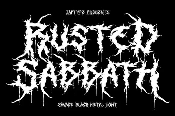
Savage black metal capitals built from spiked, dripping strokes
Rusted Sabbath is a black metal display alphabet in which the stems split into spikes, the counters disappear and the tops of the letters run into flame-like hooks, so a band name reads as a sigil before it reads as words.
Ideas for this font
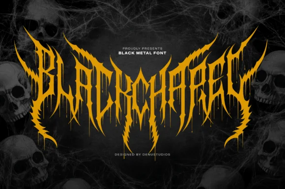
Spiked black-metal sigil lettering with ragged edges and dripping points
Blackchapel is an extreme-metal sigil face in which the letters merge into a spiked mass, the stems split into thorns and the bottoms run into drips, so a word reads as a band logo rather than as readable type.
Ideas for this font
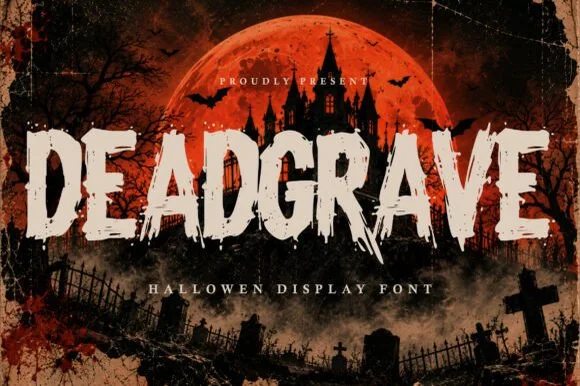
Splintered zombie-claw & graveyard slasher horror display
Deadgrave is a menacing, splintered horror display typeface ripping jagged claw gashes along the bottom edges of heavy graveyard capitals!
Ideas for this font
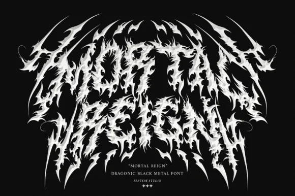
Dragonic thorny black-metal display with flame-like spikes and a winged arch
Mortal Reign is a black-metal display face in which the letters are built from flame-like spikes, the word arches upward at both ends and the thorns interlock between letters, so the mark reads as a winged sigil.
Ideas for this font
Same independent foundry
Allow optional Google Analytics to measure visits and catalogue actions. Your search words and notes are not included. Privacy & storage