Neutral Sans Workhorse

Magic Mama + Base Edge
Lets Magic Mama own the focal silhouette while handling secondary copy, sizing and subheads cleanly.
Inspect Base Edge specimenDisclosure: MakerFileHub may earn a commission from qualifying purchases via paid links on this page. How our links work.
Vintage groovy display with offset shadow
Magic Mama is a vintage groovy display in pale green with a heavy brown offset: fat rounded letters that lean and bulge, a solid step of depth to the lower left, and a scatter of four-point sparkles around two concentric circles.
Paid link
Get this fontProject & layout blueprintsAt-a-glance maker compatibility
Weld or Unite overlapping script joins into one continuous vector path before sending to the blade.
Visual anatomy & craft review
Both words are set at large size and the drawing is a 1970s soft display: the letters are fat and rounded, the M carries a curved entry, the a and the g are single-storey with large bowls, and the whole word leans back to the left, which is what gives it the period feel. The depth is a single hard offset in a darker tone rather than a gradient, so the letterforms read as paper cut-outs lifted off the page, and the offset is consistent across every letter. Spacing is tight, so the shapes overlap visually and the word reads as a block with a rhythm, and the counters stay wide enough to keep it legible at poster size. The ground is a pale green field with two big circles, sparkles and a tracked caption, which reproduces the graphic language of the era without adding a photograph.
Groovy, retro, rounded, dimensional
Two-font hierarchy recipes
Tested contrast partners — pairing Magic Mama with grounded secondary typography.
Magic Mama + Base Edge
Lets Magic Mama own the focal silhouette while handling secondary copy, sizing and subheads cleanly.
Inspect Base Edge specimen
Magic Mama + Amor Hadena
Grounds bold display lettering with classic typographic authority on posters, badges and apparel.
Inspect Amor Hadena specimenPractical applications
Concrete hierarchy, scale and production guidance tailored to Magic Mama’s stroke geometry.
A groovy display sets a decade in one word, and the hard offset gives a home-printed card the depth of a designed piece without a photograph.
Hierarchy & layout recipe
A6 card: the word at 34 pt with a 1.5 mm offset, the details in a 9 pt grotesque, and two sparkles at the corners. Keep the palette to two tones plus the offset and leave 12 mm margins so the offset never reaches the trim.
Pre-production check
Check the offset at 34 pt, where a 1 mm step can look like a misregistration; keep it at 1.5 mm and consistent on every letter. Confirm the 9 pt details keep a 4.5:1 contrast and that the leaning letters do not crowd the card's edge.
A groovy face with a hard shadow reads as a period poster, and the rounded shapes stay legible at a distance where a busy illustration would not.
Hierarchy & layout recipe
A2 portrait: the two words at 130 mm cap height, the date in a 16 mm grotesque, and concentric circles behind at 40 percent tint. Keep the offset at 5 mm for the large size and leave the lower third for the practical details.
Pre-production check
Check the offset at 5 mm on the printed poster, where it must stay even around the round bowls; inspect the curves of the o and the a. Confirm the 16 mm date reads at four metres and that the tinted circles do not reduce the contrast of the type.
A groovy face gives a small drinks brand a nostalgic identity that stands out on a shelf of minimal labels, and the two-tone construction prints cheaply.
Hierarchy & layout recipe
Print a 70 by 100 mm label: the brand at 20 pt with a 1 mm offset, the flavour in a 7 pt grotesque, and the volume in 6.5 pt. Keep the palette to two inks plus the offset tone and leave 5 mm clear inside the die.
Pre-production check
Check the 20 pt brand on the label's coated stock, where the offset tone must not merge with the fill; separate the tones by at least 30 percent. Confirm the 6.5 pt volume reads on the curve and that the leaning letters stay inside the die line.
Technical & licence verification
Confirm included OTF/TTF/WOFF formats, full glyph tables and licence coverage on the live store page before batch production.
Closest visual alternatives
Matched across letterform anatomy, stroke behaviour and craft applications.
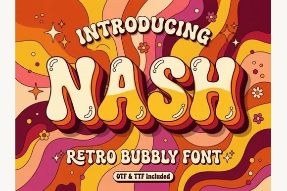
Groovy 1970s psychedelic lava-lamp bubble display (OTF & TTF)
Nash is a cheerful 1970s psychedelic bubble display font swelling bottom-heavy groovy curves for retro shirts, posters, and mugs (OTF & TTF).
Ideas for this font
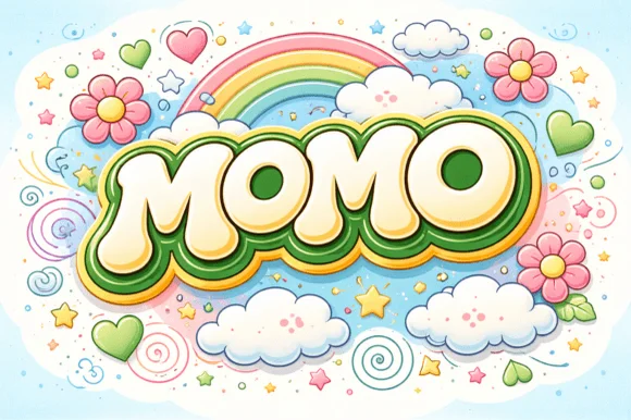
Groovy 60s/70s rainbow-flower-power plump bubble font
Momo is a plush, groovy retro bubble display font built for multi-ringed 1970s rainbow outlines, daisy illustrations, and puff-print apparel.
Ideas for this font
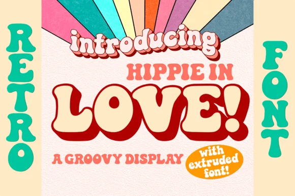
1970s groovy bell-bottom display with matched Extruded font
Hippie in Love is a chunky 1970s retro display family bundled with a dedicated Extruded shadow font for instant 3D poster lettering.
Ideas for this font
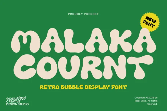
Ultra-heavy groovy pillow-bubble retro display
Malaka Cournt is an ultra-bold retro bubble display font sculpting wide, squishy 1970s letterforms with compressed teardrop counters.
Ideas for this font
Same independent foundry
Allow optional Google Analytics to measure visits and catalogue actions. Your search words and notes are not included. Privacy & storage