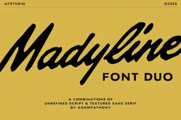
Editorial Serif Anchor

Vanilla Daisy + Brenco
Anchors Vanilla Daisy's fluid strokes with crisp Roman proportions on wedding suites, headers and packaging.
Inspect Brenco specimenDisclosure: MakerFileHub may earn a commission from qualifying purchases via paid links on this page. How our links work.
Heavy looping script with deep return
Vanilla Daisy is a heavy looping script in black with a large alphabet: fat even strokes, tall loops, and a swash from the final letter that returns beneath the whole word before lifting.
Paid link
Get this fontProject & layout blueprintsAt-a-glance maker compatibility
Weld or Unite overlapping script joins into one continuous vector path before sending to the blade.
Visual anatomy & craft review
Vanilla sits above Daisy, and both words are drawn in a heavy monoline script whose bowls are broad and whose ascenders form full loops: the V opens with a wide arm, the i and the l rise into narrow loops and the y drops into a long tail. The design idea sits at the end: the exit stroke from the last letter of the second word sweeps out and returns beneath both lines before lifting away, so the two words are underlined by one continuous flourish. The ground is white with a styled flat-lay of flowers, a coffee and small objects, and a circular badge beside the words states the glyph count, with a plain sans caption at the right. The face is a decorative script for packaging and cards: the returning swash needs a wide measure and clear space below the last line.
A heavy script with a deep returning swash
Two-font hierarchy recipes
Tested contrast partners — pairing Vanilla Daisy with grounded secondary typography.
Vanilla Daisy + Brenco
Anchors Vanilla Daisy's fluid strokes with crisp Roman proportions on wedding suites, headers and packaging.
Inspect Brenco specimen
Vanilla Daisy + Mansory
Keeps small-scale dates, URLs, nutrition facts and care instructions crisp and legible below script titles.
Inspect Mansory specimenPractical applications
Concrete hierarchy, scale and production guidance tailored to Vanilla Daisy’s stroke geometry.
A heavy script with a returning swash gives a small baker a mark that looks drawn for the shop, and the large alphabet covers scent and size lines as well as the name.
Hierarchy & layout recipe
Print a 60 by 90 mm label: set the brand at 18 pt on one row, keep 8 mm of clear ground beneath so the swash is not crowded by the weight line, and hold 4 mm of margin on all sides.
Pre-production check
The returning swash runs long and can cross the die on a narrow label; print one at the real size and check both ends before the order.
The swash turns a two-word greeting into a single drawn gesture, and the heavy stroke reads clearly on a card at a modest size.
Hierarchy & layout recipe
Print a 120 by 120 mm square card: set the greeting at 32 pt across two rows, keep 16 mm of clear ground beneath before the message, and hold 14 mm of margin so the swash stays inside.
Pre-production check
A returning swash can close the space under the second line; print one card at the finished size and check the clearance before the batch.
A heavy script on a window reads from the pavement, and the swash gives the fascia a bottom edge without a painted rule.
Hierarchy & layout recipe
Print a 700 by 400 mm window graphic: set the name at 110 pt across two rows, keep 26 mm of clear ground beneath the swash before the street at 16 pt, and hold 24 mm of border.
Pre-production check
Thin swash ends drop out of cut vinyl; print one at the final size and check the tail before the order.
Technical & licence verification
Confirm included OTF/TTF/WOFF formats, full glyph tables and licence coverage on the live store page before batch production.
Closest visual alternatives
Matched across letterform anatomy, stroke behaviour and craft applications.
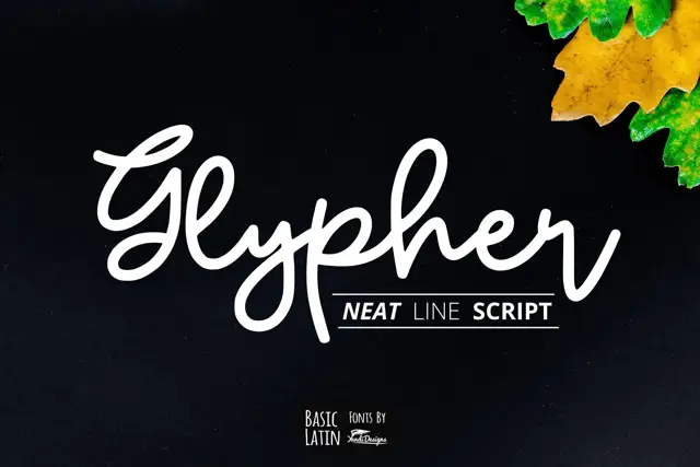
Rounded line-like joined script
Glypher is a rounded monoline joined script with a looping G, tall l and h ascenders that nearly double the x-height, and a high dot over the i.
Ideas for this font
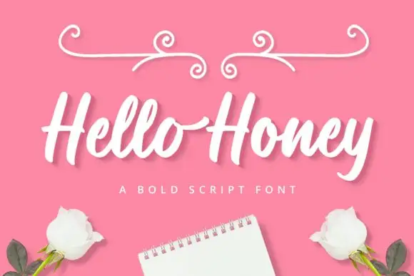
Broad slanted connected script with thick even strokes and open loops
Hello Honey is a broad slanted script in which the strokes stay thick through every join, the loops stay open and the letters lean together, so a phrase reads as one confident pen line.
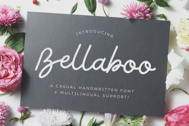
Broad casual looped handwriting
Bellaboo is a broad casual script with wide rounded bowls, tall parallel l stems and a relaxed baseline that keeps the word feeling written rather than drawn.
Ideas for this font
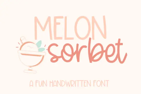
Narrow capitals above a rounded casual script
Melon Sorbet is a pair of voices on a warm cream page: tall narrow light capitals for the first word and a rounded casual script in coral for the second, with a small drawn sorbet cup and two leaves beside them.
Same independent foundry
Allow optional Google Analytics to measure visits and catalogue actions. Your search words and notes are not included. Privacy & storage