Neutral Sans Workhorse

Lunar Mystique + Sailors
Lets Lunar Mystique own the focal silhouette while handling secondary copy, sizing and subheads cleanly.
Inspect Sailors specimenDisclosure: MakerFileHub may earn a commission from qualifying purchases via paid links on this page. How our links work.
Enchanted curled script
Lunar Mystique is an enchanted script in black on a gilded celestial ground: a moderate-contrast connected script with curled entry and exit strokes, a tall looping L and a heavy swell on the downstrokes, with small witch characters at the corners and a caption beneath in the same construction.
Paid link
Get this fontProject & layout blueprintsAt-a-glance maker compatibility
Sturdy stroke walls and open counters weed cleanly on adhesive vinyl, HTV apparel film, and cut cardstock.
Visual anatomy & craft review
The two words are stacked and the drawing is a decorative script: the downstrokes swell, the upstrokes thin, and every terminal curls into a spiral, which gives the lettering its storybook quality. The loops on the ascenders are wide and open, so the word stays readable despite the ornament, and the spacing lets the tails interlock between the two lines. Because the script is decorative, it is set large and used once, and the specimen keeps the supporting caption in a light version of the same hand rather than introducing a second face. The ground is a gilded illustration with swirls and a moon, and the small characters at the corners plus the badge at the top right belong to the product, not the typeface.
Script, enchanted, curled, elegant
Two-font hierarchy recipes
Tested contrast partners — pairing Lunar Mystique with grounded secondary typography.
Lunar Mystique + Sailors
Lets Lunar Mystique own the focal silhouette while handling secondary copy, sizing and subheads cleanly.
Inspect Sailors specimen
Lunar Mystique + Glofi
Grounds bold display lettering with classic typographic authority on posters, badges and apparel.
Inspect Glofi specimenPractical applications
Concrete hierarchy, scale and production guidance tailored to Lunar Mystique’s stroke geometry.
A curled script gives a Halloween invitation the storybook tone that a drippy display cannot, and the open loops keep the words readable at card size.
Hierarchy & layout recipe
A6 card: the greeting at 28 pt, the details in a 9 pt serif, and a small moon. Keep 12 mm margins, leave 8 mm around the spirals, and print gold on a dark card.
Pre-production check
Check the 28 pt greeting on a dark card, where a thin upstroke can disappear; keep the contrast high. Confirm the 9 pt details read at arm's length and that the spirals clear the trim.
A decorative script reads as a hand-painted sign at a distance, and the heavy downstrokes hold in paint where a monoline would look thin.
Hierarchy & layout recipe
A1 board: the greeting at 80 mm x-height, the names in a 36 mm serif, and the date at 22 mm. Keep 40 mm margins so the spirals are never cut, and paint two colours on a dark board.
Pre-production check
Check the board at four metres, where the curls can merge into a texture; keep the spacing open. Confirm the 22 mm date reads from the door and that the spirals stay inside the frame.
A curled script reads as a period label, and the swollen downstrokes print on a small sticker where a fine script would fill with fibre.
Hierarchy & layout recipe
Print a 60 by 80 mm label: the product at 14 pt, the weight in a 6 pt sans, and a small moon. Keep 5 mm inside the die and print two colours on a kraft stock so the spirals read as drawn.
Pre-production check
Check the 14 pt product on kraft, where a spiral can close; keep the size above 12 pt. Confirm the 6 pt weight reads on the shelf and that the label survives a damp wipe.
Technical & licence verification
Confirm included OTF/TTF/WOFF formats, full glyph tables and licence coverage on the live store page before batch production.
Closest visual alternatives
Matched across letterform anatomy, stroke behaviour and craft applications.
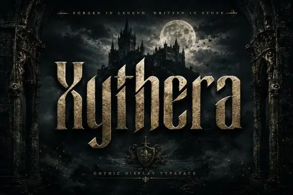
Textured gothic display
Xythera is a textured gothic display in gold on a dark scene: tall capitals with sharp spurs, a carved surface, and a stone-like speckle inside the strokes, framed by an arched stone border with a moonlit castle behind, so the plate reads as a fantasy title rather than a blackletter.
Ideas for this font

Sharp angular blackletter with fractured serifs and kept lowercase counters
Blade Gothic is a blackletter display in which the strokes break into sharp angles, the serifs fracture and the vertical rhythm stays clean, so a title reads as medieval lettering that still resolves at headline scale.
Ideas for this font
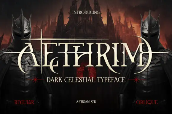
Fantasy capitals with needle-like extensions
Aethrim has high-contrast upright capitals with fine pointed cross-strokes and sweeping crescent-like curves, and long horizontal extensions cut across the title near cap height while armoured figures and a dark castle frame the word.
Ideas for this font
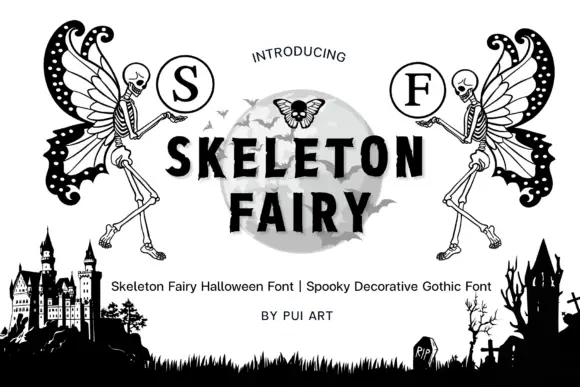
Skeleton-fairy monogram display
Skeleton Fairy is a display set on a white ground: two winged skeleton figures in black line, each raising a circled serif initial, framing a central word in heavy sans over a pale moon, with a graveyard silhouette along the foot and a plain credit line beneath.
Same independent foundry
Allow optional Google Analytics to measure visits and catalogue actions. Your search words and notes are not included. Privacy & storage