Modern Grotesque Body

Game Day + Homies
Creates crisp high-hierarchy contrast beneath Game Day headlines across menus, websites and labels.
Inspect Homies specimenDisclosure: MakerFileHub may earn a commission from qualifying purchases via paid links on this page. How our links work.
Solid varsity blocks with clipped corners and a dashed cut line around each letter
Game Day is a solid varsity block alphabet in which every letter has clipped corners and a fine dashed line running just inside its edge, so the word reads as a cut-out athletic patch.
Paid link
Get this fontProject & layout blueprintsAt-a-glance maker compatibility
Sturdy stroke walls and open counters weed cleanly on adhesive vinyl, HTV apparel film, and cut cardstock.
Visual anatomy & craft review
The G closes with a straight bar, the M splays from a narrow vertex, the A carries a low crossbar and the D keeps a square bowl, all at a heavy even weight with flat slabs and corners cut at a consistent angle. The dashed line inside the contour is the production detail: it marks where a vinyl cutter or a die would follow, which is why the face suits garment and sticker work. Because the letters are solid and equally weighted, they stack into two lines with minimal leading and stay readable from a distance on a court or a hall wall. Counters survive at 40 mm and close below 14 pt. The blurred gym photograph, the black fill, the white dashes, the balls and the small badge are presentation; the typeface is the three words.
Varsity · Clipped · Solid
Two-font hierarchy recipes
Tested contrast partners — pairing Game Day with grounded secondary typography.
Game Day + Homies
Creates crisp high-hierarchy contrast beneath Game Day headlines across menus, websites and labels.
Inspect Homies specimen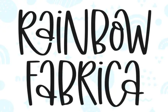
Game Day + Rainbow Fabrica
Adds a warm human signature touch for 1-to-3-word callouts without competing against structured serif capitals.
Inspect Rainbow Fabrica specimenPractical applications
Concrete hierarchy, scale and production guidance tailored to Game Day’s stroke geometry.
The clipped corners and the dashed cut line map directly onto a vinyl plot, and the solid blocks read across a hall at 30 cm.
Hierarchy & layout recipe
Cut a 2.4 m wall graphic: set each word at 30 cm and stack with 10 cm between lines, keep the vinyl's minimum stroke at the plotter's limit, and leave 25 cm of wall clear below the lowest line so the lettering sits above head height.
Pre-production check
Wall vinyl shrinks slightly when applied to a textured surface; check one installed word before cutting the rest and keep the dashed line off the letter edge.
The block construction embroiders cleanly at 60 mm, and the clipped corners reduce the stitch count where a rounded face would pull.
Hierarchy & layout recipe
Embroider a 90 mm patch: set the team name at 60 mm across the centre, keep the border in a 3 mm stain stitch at the edge, and stay 8 mm inside the patch edge so the clipped corners are not caught by the merrow.
Pre-production check
A merrow border pulls the outer letters inward; check a stitch-out and reduce the team name by one size if the corners distort.
The solid blocks hold at 12 pt on a small sticker while the dashed line keeps the cut-out character, which is what a club shop sells.
Hierarchy & layout recipe
Print a 60 mm round sticker: set the club name at 12 pt across the centre, set the founding year in a 5 pt slab beneath, and keep 6 mm inside the die so the clipped corners are not clipped twice by the cut.
Pre-production check
A dashed line under 0.2 mm vanishes on a matte laminate; check the finished sticker and remove the dashes below 14 pt rather than lightening them.
Technical & licence verification
Confirm included OTF/TTF/WOFF formats, full glyph tables and licence coverage on the live store page before batch production.
Closest visual alternatives
Matched across letterform anatomy, stroke behaviour and craft applications.
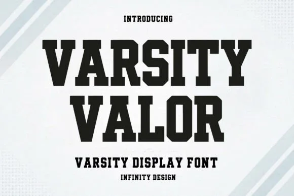
Solid varsity slab with flat serifs
Varsity Valor is a varsity display face in solid black on a pale ground: heavy capitals with thick flat serifs, flat apexes and a tight fit, with a small hatched pattern behind the words and tracked capital lines above and below.
Ideas for this font
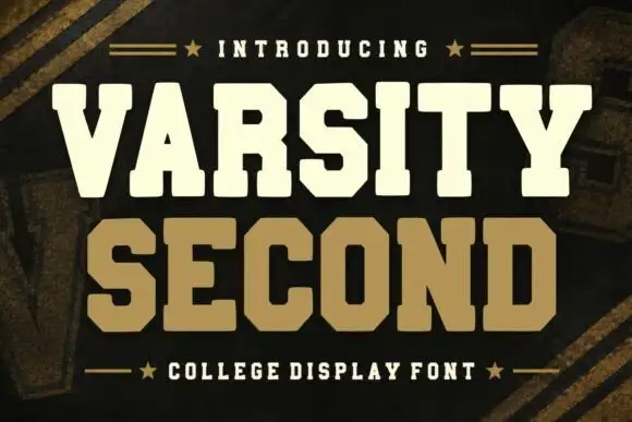
Collegiate block slab display
Varsity Second is a collegiate block in cream and tan on a dark ground: heavy slab capitals with rectangular serifs, wide stems, a flat-topped A and a squared O, stacked with a star rule above and a caption rule below.
Ideas for this font

Clean condensed collegiate slab with heavy slabs and tight fit
Apex Varsity is a clean condensed collegiate slab in which the letters run narrow and tall, the slabs are square and heavy and the fit stays tight, so a long team name holds a single line at a modest size.
Ideas for this font
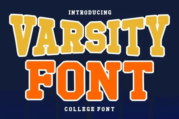
Layered college slab with arched line
Varsity Font is a layered college slab in gold and orange on navy: wide square serifs, flat-topped caps, a heavy white outline on both lines and a slight arch across the top, so the pair reads as an embroidered team patch rather than a plain headline.
Ideas for this font
Same independent foundry
Allow optional Google Analytics to measure visits and catalogue actions. Your search words and notes are not included. Privacy & storage