Neutral Sans Workhorse

Lemota + Headline
Lets Lemota own the focal silhouette while handling secondary copy, sizing and subheads cleanly.
Inspect Headline specimenDisclosure: MakerFileHub may earn a commission from qualifying purchases via paid links on this page. How our links work.
Chunky display sans with cut details
Lemota is a chunky display in yellow on royal blue: near-solid caps and lower case, counters reduced to small slits and circles, a slot cut into the e, and a flat-topped a, all set with tight tracking so the word reads as a slab of colour.
Paid link
Get this fontProject & layout blueprintsAt-a-glance maker compatibility
Sturdy stroke walls and open counters weed cleanly on adhesive vinyl, HTV apparel film, and cut cardstock.
Visual anatomy & craft review
Both the capital and the lower-case line are set in the same weight, and the drawing is a heavy sans rather than a slab: there are no serifs, the terminals are cut horizontally, and the counters of the o and the e are small holes inside a large mass of ink. The e carries a horizontal slot instead of a crossbar, the a has a flat top, and the m and the t keep square shoulders, so the face reads as a designed display rather than a heavy text sans. Tracking is tight enough that the letters almost touch, which is what turns the word into a shape, and the pale blue ground gives the yellow a strong contrast without any extra element. A small starburst badge, a caption line and two corner labels complete the page, all set in the same chunky face at a smaller size.
Chunky, heavy, bold, graphic
Two-font hierarchy recipes
Tested contrast partners — pairing Lemota with grounded secondary typography.
Lemota + Headline
Lets Lemota own the focal silhouette while handling secondary copy, sizing and subheads cleanly.
Inspect Headline specimen
Lemota + Askinо
Grounds bold display lettering with classic typographic authority on posters, badges and apparel.
Inspect Askinо specimenPractical applications
Concrete hierarchy, scale and production guidance tailored to Lemota’s stroke geometry.
A chunky display with cut details reads as a designed product rather than a generic soda, and the mass of the letterforms holds on a can where thin type would disappear.
Hierarchy & layout recipe
Print a 330 ml can wrap: the name at 26 pt across the front, the flavour in 9 pt, and the volume in 7 pt. Keep the name 10 mm clear of the can's side seam and print in two flat colours so the slit counters stay sharp.
Pre-production check
Check the slit counters at 26 pt on the curved can, where they can close as the artwork wraps; open them slightly for the wrap file. Confirm the 7 pt volume stays legible on the metal and that the yellow holds a 4.5:1 contrast on the blue.
A heavy display gives a design annual a cover that behaves like a poster, and the cut details keep a solid word from reading as an undifferentiated block.
Hierarchy & layout recipe
Set the title at 160 pt across 210 mm, tracking at minus 20 units, in one colour on a flat ground, with the year in 12 pt at the foot. Keep the title 20 mm from the trim and set the subtitle in the same face at 16 pt so the page stays in one voice.
Pre-production check
Check the title at 160 pt, where the tight tracking can fuse the L into the E; add 15 units of tracking for the cover version. Confirm the 12 pt year stays legible at thumbnail size and that the counters remain open after the screen.
A chunky face reads from a distance and gives a festival poster a graphic identity that can be repeated across signage without needing illustrations.
Hierarchy & layout recipe
Print an A1 poster: the name at 200 mm cap height in two lines, the line-up in a 14 mm sans, and the date at 40 mm. Keep the display on the top half with 30 mm margins and repeat the same lockup at A3 for the programme covers.
Pre-production check
Check the poster at five metres, where the slit counters can close visually; widen the e slot for the large-format version. Confirm the 14 mm line-up reads at two metres and that the A3 reduction keeps the same optical weight.
Technical & licence verification
Confirm included OTF/TTF/WOFF formats, full glyph tables and licence coverage on the live store page before batch production.
Closest visual alternatives
Matched across letterform anatomy, stroke behaviour and craft applications.
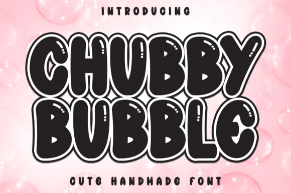
Sticker-outlined marshmallow bubble display with shine slits
Chubby Bubble is a fat, rounded handmade bubble display font wrapped in a parallel outline ring and accented with interior shine marks.
Ideas for this font
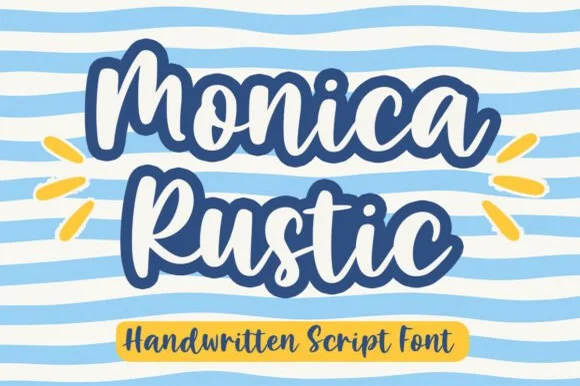
Bold handwritten script with a heavy outline
Monica Rustic is a handwritten script in navy and white on pale blue: fat connected letters with an inline and a heavy dark outline, a bouncy baseline and wide loops, set as two stacked words with a tracked caption in a yellow pill.
Ideas for this font
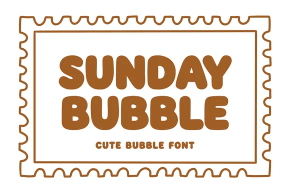
Warm chubby zero-counter-clutter retro bubble sans
Sunday Bubble is a warm, ultra-plump rounded bubble display font with soft cozy strokes and super-fast Cricut weeding.
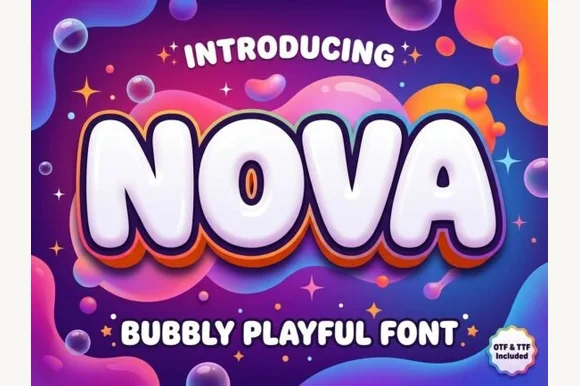
Inflated bubbly display with layered depth
Nova is an inflated display in glossy white on a psychedelic gradient: rounded, blown-up letters with a thick outline and two offset layers behind them in orange and violet, so the word looks like a balloon sign lit from above.
Ideas for this font
Same independent foundry
Allow optional Google Analytics to measure visits and catalogue actions. Your search words and notes are not included. Privacy & storage