High-Contrast Display Serif

Senior + Askinо
Pairs sculptural editorial warmth with Senior's clean modern geometry.
Inspect Askinо specimenDisclosure: MakerFileHub may earn a commission from qualifying purchases via paid links on this page. How our links work.
Fat rounded sans with tight spacing
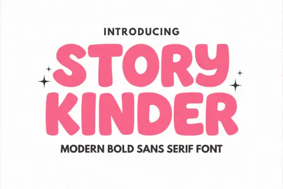
Senior is a fat rounded sans in tight black caps on an off-white ground: nearly uniform stroke weight, closed counters, letterspacing pulled in until the forms almost touch, and a grainy fill that reads as a printed rubber stamp.
Paid link
Get this fontProject & layout blueprintsAt-a-glance maker compatibility
Sturdy stroke walls and open counters weed cleanly on adhesive vinyl, HTV apparel film, and cut cardstock.
Visual anatomy & craft review
The word occupies most of the page and the design is deliberately blunt: the strokes are thick in every direction, the corners are rounded rather than squared, and the counters of the e, the o and the r are small holes inside a mass of black, which is what makes the face work as a graphic rather than a reading face. Letterspacing is negative enough that the S leans into the E and the O nearly touches the R, and the only air in the word comes from the counter shapes. The fill carries a fine stipple, so at large sizes the letters read as ink on paper rather than as vector shapes, and the two surrounding lines are set in the same family at a much smaller size with wide tracking, which shows the face has a companion weight. The page is otherwise empty, so the specimen is doing the job a mockup would normally do: proving the letterforms hold at hero scale.
Fat, rounded, graphic, modern
Two-font hierarchy recipes
Tested contrast partners — pairing Senior with grounded secondary typography.
Senior + Askinо
Pairs sculptural editorial warmth with Senior's clean modern geometry.
Inspect Askinо specimen
Senior + Autography
Introduces organic movement on pull-quotes, signatures and gift tags.
Inspect Autography specimenPractical applications
Concrete hierarchy, scale and production guidance tailored to Senior’s stroke geometry.
A fat rounded sans with negative tracking gives a clothing mark the blunt confidence of a printed stamp, and the closed counters keep it recognisable at badge size.
Hierarchy & layout recipe
Set the word at 46 pt with tracking at minus 30 units, then build a secondary lockup for small use by opening the tracking to zero so the counters stay readable at 16 px. Keep the mark one colour and always on a light ground.
Pre-production check
Check the small lockup at 16 px, where the e and the r counters will close first; if they do, switch to the wider cut rather than scaling. Confirm the negative tracking does not fuse the S into the E on a laser print at 46 pt.
A heavy rounded sans announces an event in one word and stays legible at banner scale, where thin or high-contrast faces lose their detail against the sky.
Hierarchy & layout recipe
Print 1,000 by 500 mm: the word at 260 mm cap height centred, the date in the same family at 40 mm below, and the venue at 25 mm. Keep 50 mm of clear vinyl around the word so the eyelets never crowd the counters.
Pre-production check
Check the counters at 25 percent on screen before printing, since a fat face can close up in a low-resolution proof. Confirm the eyelets sit 60 mm clear of the type and that the 25 mm venue line reads from four metres.
A blunt fat sans gives a section opener the weight of a poster while leaving the rest of the spread free for photography, which is how fashion pages are usually built.
Hierarchy & layout recipe
Set the word at 200 pt bleeding off the left edge by 12 mm, the section number in the same family at 24 pt in the upper right, and the standfirst in a 10 pt serif in a 55 mm column at the foot. Keep the page otherwise empty.
Pre-production check
Check the bleed at trim: the S must lose no more than 8 mm or the word stops reading as a word. Confirm the counter of the e survives the screen at 200 pt and that the standfirst is not orphaned below the fold.
Technical & licence verification
Confirm included OTF/TTF/WOFF formats, full glyph tables and licence coverage on the live store page before batch production.
Closest visual alternatives
Matched across letterform anatomy, stroke behaviour and craft applications.
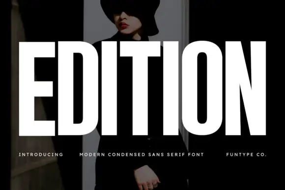
Very heavy condensed capitals with squared stems and narrow oval counters
Edition shows white capital lettering spanning most of a dark portrait cover: thick vertical strokes and broad flat arms build a rectangular title, the O keeps rounded outer sides around a small vertically elongated counter and the I stands as a plain bar.
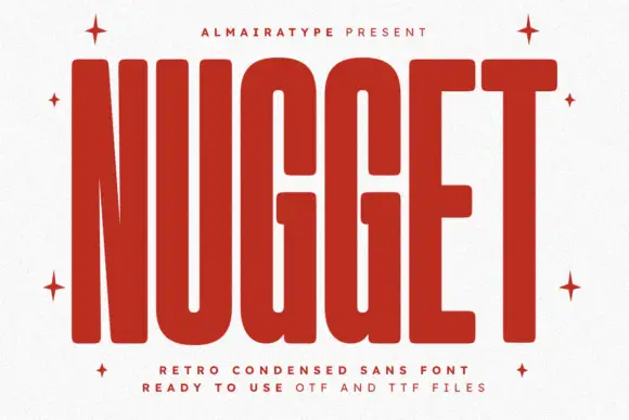
Very tall heavy capitals with rounded corners and narrow internal channels
Nugget shows red capitals filling most of a white cover, where thick near-even strokes leave thin vertical openings in the U and G, the N draws a sharply narrowing diagonal and every outer corner softens.
Ideas for this font
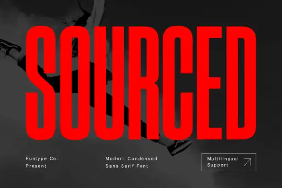
Very condensed heavy capitals with narrow rounded rectangular counters
Sourced shows vivid red capitals across a dark monochrome photograph, where tall heavy uprights and flat-ended arms leave thin rounded rectangular counters inside the O and D, the R carries a straight angled leg and the C opens only a small gap on its right side.
Ideas for this font
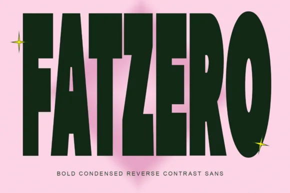
Bold condensed reverse-contrast sans with heavy bars and thin counters
Fatzero is a bold condensed reverse-contrast sans in which the horizontals run thick, the verticals thin and the counters close to slots, so a single word reads as a fashion poster rather than as a headline.
Ideas for this font
Same independent foundry
Allow optional Google Analytics to measure visits and catalogue actions. Your search words and notes are not included. Privacy & storage