Neutral Sans Workhorse

Mood + Homies
Lets Mood own the focal silhouette while handling secondary copy, sizing and subheads cleanly.
Inspect Homies specimenDisclosure: MakerFileHub may earn a commission from qualifying purchases via paid links on this page. How our links work.
Ultra-tall slot display
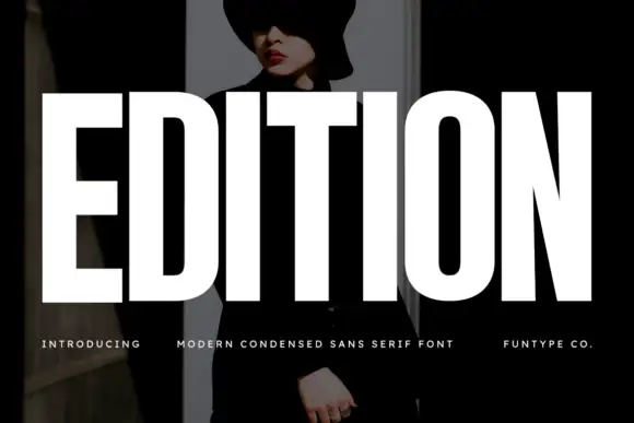
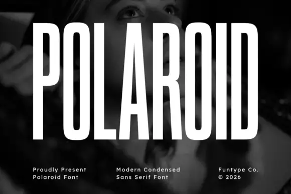
Mood is an ultra-tall condensed display in white over a photograph of eggs in a carton: capitals set as narrow vertical slots with a shared top construction across the two O shapes and the D, a small tracked line above and a plain line beneath.
Paid link
Get this fontProject & layout blueprintsAt-a-glance maker compatibility
Sturdy stroke walls and open counters weed cleanly on adhesive vinyl, HTV apparel film, and cut cardstock.
Visual anatomy & craft review
The word fills the frame top to bottom and the drawing is an extremely condensed display: the counters are narrow slots, the stems are shared where letters meet, and the D and the two Os read as a single repeated construction, which is the detail that makes the block memorable rather than merely narrow. That construction sets both a size floor and a strong context, because the slots close below a certain size and the word depends on height. The photograph behind it is staging, and the placement shows that the white holds over a mid-tone image with detail. The tracked line above and the plain line beneath are product copy. Because the letters are this narrow, the face fills a vertical poster or a narrow cover and reads at distance on a sign.
Display, ultra-condensed, tall, modern
Two-font hierarchy recipes
Tested contrast partners — pairing Mood with grounded secondary typography.
Mood + Homies
Lets Mood own the focal silhouette while handling secondary copy, sizing and subheads cleanly.
Inspect Homies specimen
Mood + The Bilstein Editorial
Grounds bold display lettering with classic typographic authority on posters, badges and apparel.
Inspect The Bilstein Editorial specimenPractical applications
Concrete hierarchy, scale and production guidance tailored to Mood’s stroke geometry.
An ultra-tall display fills a narrow cover, and the shared slot construction gives a short word a graphic identity at newsstand size.
Hierarchy & layout recipe
Set the title at 160 mm cap height across 120 mm, the photographer in a 10 pt sans, and the imprint at 8 pt. Print one ink on a coated stock and keep 20 mm margins at the head.
Pre-production check
Check the title at 160 mm, where a slot can fill; keep the slits above 0.3 mm. Confirm the 8 pt imprint survives lamination and that the title clears the trim by 20 mm.
An ultra-condensed face turns a short night name into a vertical wall, which is what a street poster needs to stop a passer-by.
Hierarchy & layout recipe
A1 poster: the night at 280 mm cap height, the date in a 24 mm sans, and the venue at 12 mm. Keep 30 mm margins and print two colours on a dark stock with the type reversed out.
Pre-production check
Check the A1 at five metres, where a slot can close; keep it above 3 mm. Confirm the 12 mm venue reads at two metres and that the date clears the block on both sides.
A narrow display gives a short name a vertical blade, which suits a narrow frontage where a wide logo cannot fit. Height is the whole idea.
Hierarchy & layout recipe
Fabricate a 300 by 900 mm blade: the name at 240 mm cap height, the floor in a 16 mm sans, and a 3 mm return. Keep 20 mm margins and specify a matte powder coat rather than gloss.
Pre-production check
Check the blade at 240 mm, where a slot can vanish in metal; open it. Confirm the 16 mm floor reads at two metres and that the blade clears the pavement line by 300 mm.
Technical & licence verification
Confirm included OTF/TTF/WOFF formats, full glyph tables and licence coverage on the live store page before batch production.
Closest visual alternatives
Matched across letterform anatomy, stroke behaviour and craft applications.
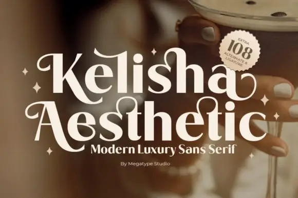
Heavy contrast mixed case with looped entry strokes and long curling capital legs
Kelisha Aesthetic is a modern luxury sans with high stroke contrast, tall narrow letters and a set of alternates in which an arm or an ascender curls into a loop.
Ideas for this font
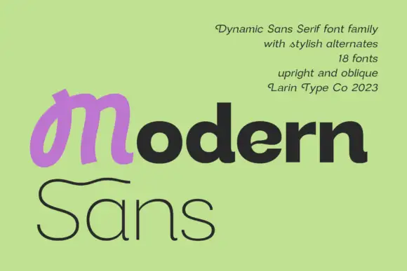
Heavy rounded mixed case paired with a looped M and a fine sweeping S on a second line
Modern Sans is a wide sans family of eighteen fonts, shown with a heavy display cut, a hairline weight and a script alternate that replaces the first letter of a word.
Ideas for this font
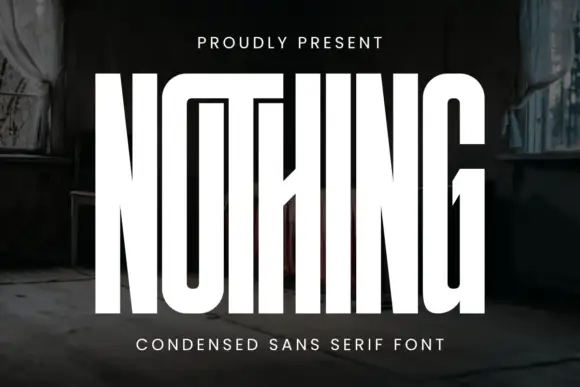
Very tall condensed display
Nothing is an extremely tall condensed display in white on a dark, peeling interior: narrow capitals whose tops join a shared bar, with a central diagonal joint across the middle of the word, flat terminals and hairline counters, and tracked caps above and beneath that name the style.
Ideas for this font
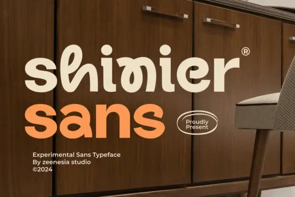
Experimental looped display
Shinier is an experimental display in cream and orange on a walnut cabinet: rounded mixed case in which tall loops are threaded through the letters, an interlocked final n and r, and a registered mark at the shoulder, with a plain sans caption at the foot.
Ideas for this font
Same independent foundry
Allow optional Google Analytics to measure visits and catalogue actions. Your search words and notes are not included. Privacy & storage