Editorial Serif Anchor

Junella + Aureline
Anchors Junella's fluid strokes with crisp Roman proportions on wedding suites, headers and packaging.
Inspect Aureline specimenDisclosure: MakerFileHub may earn a commission from qualifying purchases via paid links on this page. How our links work.
Narrow casual rounded lettering with tall ascenders and a tight rhythm
Junella is narrow casual handwriting in rounded lettering, with tall ascenders, tight spacing and a level baseline, so a single word reads as a tall friendly column rather than a written line.
Paid link
Get this fontProject & layout blueprintsAt-a-glance maker compatibility
Weld or Unite overlapping script joins into one continuous vector path before sending to the blade.
Visual anatomy & craft review
Nothing connects. Each letter is drawn as a rounded monoline with a soft terminal: the capital J drops a long curved descender that hooks left, the u and the n keep narrow bowls, the e closes almost to the eye, the double l rises into two tall plain stems and the final a closes with a short tail. The letters are packed tightly, which is what makes the word look tall and narrow even though each shape is round, and the ascenders run well above the x-height so the silhouette is a rectangle rather than a band. Weight is uniform and medium, ends are rounded, and the baseline never drifts. The cream ground, the abstract shapes around the word and the small badges below are presentation; the lettering is the word.
Narrow · Casual · Rounded
Two-font hierarchy recipes
Tested contrast partners — pairing Junella with grounded secondary typography.
Junella + Aureline
Anchors Junella's fluid strokes with crisp Roman proportions on wedding suites, headers and packaging.
Inspect Aureline specimen
Junella + Borsen
Keeps small-scale dates, URLs, nutrition facts and care instructions crisp and legible below script titles.
Inspect Borsen specimenPractical applications
Concrete hierarchy, scale and production guidance tailored to Junella’s stroke geometry.
Narrow rounded lettering fits a shop sign or a stamp, and because nothing connects the word stays legible at the small size of a printed sticker.
Hierarchy & layout recipe
Set the shop name at 18 pt on a 50 mm round sticker, keep the category line in a 6 pt sans, and leave 5 mm inside the die so the tall ascenders do not follow the cut.
Pre-production check
A round die cuts through ascenders; check the artwork against the die and lower the baseline if a stem crosses the cut line.
The narrow tall shapes give a feature heading a friendly voice without the weight of a display face, and the tight spacing lets a long title fit one measure.
Hierarchy & layout recipe
Set the heading at 34 pt on the opening page, keep the body in a 10 pt serif with 14 pt leading, and hold 14 mm between the heading and the first paragraph so the tall ascenders have air.
Pre-production check
Tight spacing on a heading can make the word read as one shape; check the printed proof and open the tracking slightly rather than reducing the size.
Rounded separate letters are easy to read at a glance, and the narrow shapes fit a long class name on a small label without shrinking the type.
Hierarchy & layout recipe
Set the class name at 16 pt on a 60 by 25 mm label, keep the term at 7 pt directly beneath it, and leave 4 mm of margin all round so the tall l does not touch the border.
Pre-production check
Labels on plastic folders lift at the corners; print a sheet, apply one to a real folder and confirm the ascenders survive the edge trim.
Technical & licence verification
Confirm included OTF/TTF/WOFF formats, full glyph tables and licence coverage on the live store page before batch production.
Closest visual alternatives
Matched across letterform anatomy, stroke behaviour and craft applications.
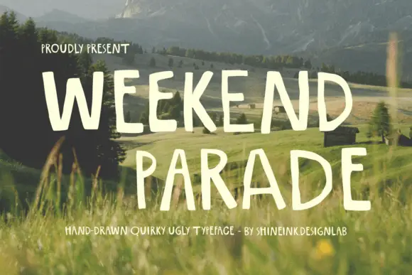
Narrow hand-drawn upright capitals
Weekend Parade is a set of tall narrow hand-drawn capitals with uneven stems, open counters and a baseline that drifts across the length of the line.
Ideas for this font
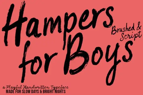
Loose brushed handwriting with slanted bodies and dry swept ends
Hampers for Boys is loose brushed handwriting in which the letters lean forward, the strokes sweep through each letter and the ends lift dry off the page.
Ideas for this font
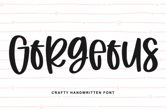
Heavy narrow handwriting with tight counters
Gorgeous is a heavy narrow handwriting that keeps a tall x-height and nearly closed counters, so a single word reads as a dense band with a lively, uneven baseline running under it.
Ideas for this font
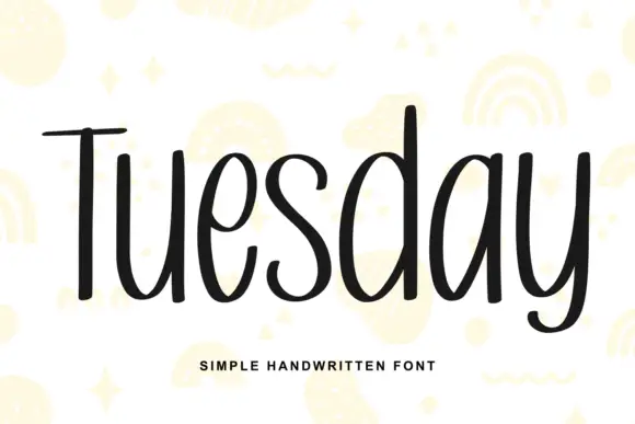
Simple unjoined handwriting with a light bounce
Tuesday is a simple handwritten face in black on white: a monoline, unjoined hand with tall ascenders, circular bowls and a slight bounce along the line, shown over pale yellow doodles of rainbows, stars and squiggles.
Ideas for this font
Same independent foundry
Allow optional Google Analytics to measure visits and catalogue actions. Your search words and notes are not included. Privacy & storage