Neutral Sans Workhorse

Ruvena + Bareum
Lets Ruvena own the focal silhouette while handling secondary copy, sizing and subheads cleanly.
Inspect Bareum specimenDisclosure: MakerFileHub may earn a commission from qualifying purchases via paid links on this page. How our links work.
Angular geometric display
Ruvena is an angular capital display in cream on a dusk-lit interior: wide capitals with a diamond-like A opening, sharply directed middle arms and a squared rhythm, set as one large word with a rule beneath and a full character listing in three blocks at the lower left.
Paid link
Get this fontProject & layout blueprintsAt-a-glance maker compatibility
Sturdy stroke walls and open counters weed cleanly on adhesive vinyl, HTV apparel film, and cut cardstock.
Visual anatomy & craft review
The plate is unusually practical: a large wordmark at the top and then a plain listing of uppercase, lowercase, numerals and punctuation in three blocks, which answers the first question a buyer asks about case coverage. The drawing is an angular capital with a diamond opening in the A, so the face reads as a modern geometric display, and the squared rhythm makes it stack well in two lines. That construction sets a moderate size floor, because the diamond opening closes first. The listed character set is genuine product information rather than decoration, and the rule beside the title names the style. It suits a mark, a poster and a screen at display sizes.
Display, angular, geometric, modern
Two-font hierarchy recipes
Tested contrast partners — pairing Ruvena with grounded secondary typography.
Ruvena + Bareum
Lets Ruvena own the focal silhouette while handling secondary copy, sizing and subheads cleanly.
Inspect Bareum specimen
Ruvena + Wolles Elegant Modern Serif
Grounds bold display lettering with classic typographic authority on posters, badges and apparel.
Inspect Wolles Elegant Modern Serif specimenPractical applications
Concrete hierarchy, scale and production guidance tailored to Ruvena’s stroke geometry.
An angular mark reads as technical rather than decorative, and the diamond A gives a short name a precise silhouette. The diamond gives the mark.
Hierarchy & layout recipe
Set the mark at 20 pt on a card, 100 mm on a wall and 14 pt on a drawing sheet, keeping the diamond opening uncut. Keep one colour and clear space equal to half the mark height.
Pre-production check
Check the 14 pt sheet mark, where the diamond can close; keep the size above 16 pt. Confirm the wall mark reads at eight metres and that the opening cuts cleanly in vinyl.
An angular display fills a cover with one word, and the squared rhythm holds at thumbnail size. The rhythm fills the cover.
Hierarchy & layout recipe
Set the title at 100 mm cap height across 200 mm, the subtitle in an 8.5 pt sans, and the issue at 7 pt. Print one ink on a matte stock and keep 22 mm margins at the head.
Pre-production check
Check the title at 100 mm, where an opening can look like a gap; keep it deliberate. Confirm the 7 pt issue survives lamination and that the title clears the trim.
An angular face signals a technical course, and the heavy strokes read on a corridor board seen at an angle. It reads as a course poster.
Hierarchy & layout recipe
A3 poster: the course at 70 mm cap height, the times in a 20 mm sans, and the room at 12 mm. Keep 25 mm margins and print two colours on a light stock.
Pre-production check
Check the A3 at three metres, where a diamond can close; keep it above 4 mm. Confirm the 12 mm room reads at two metres and that the poster sits at eye height.
Technical & licence verification
Confirm included OTF/TTF/WOFF formats, full glyph tables and licence coverage on the live store page before batch production.
Closest visual alternatives
Matched across letterform anatomy, stroke behaviour and craft applications.
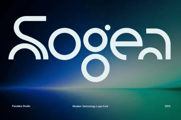
Elegant serif with ink traps
Sogea is an elegant serif in cream on a warm brown field: high contrast, fine hairlines, sharp serifs and small ink traps at the junctions, a tall waist and a wide x-height, set in two lines with a tracked caption beneath and a small ornament above.
Ideas for this font
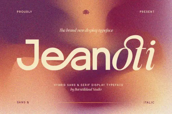
Broad plain mixed case shifting into a fine looped slanted ending
Jeanoti shows pale lettering over a warm blurred portrait, where the opening word uses broad near-even sans strokes with a squared J top and a wide e, before the ending rises into a large upper loop and closes with a detached oval dot and a curved foot.
Ideas for this font
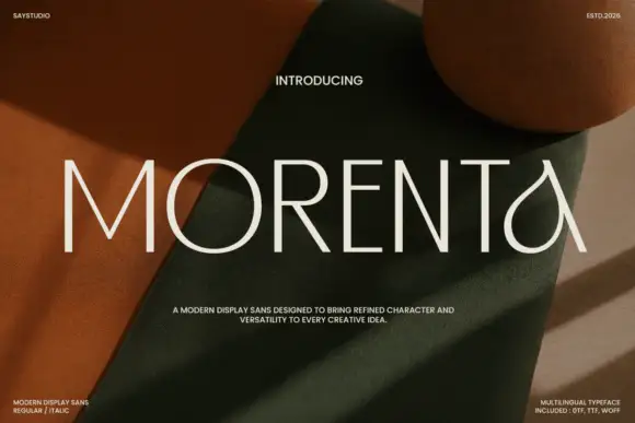
Thin straight display with teardrop forms
Morenta is a thin display in off-white over a rust and olive fabric still life: straight capitals with hairline-thin strokes, a teardrop-shaped A and a curved tail on the final letter, high contrast between the geometric stems and the curved finish, set as one large word with small tracked notes in each corner.
Ideas for this font
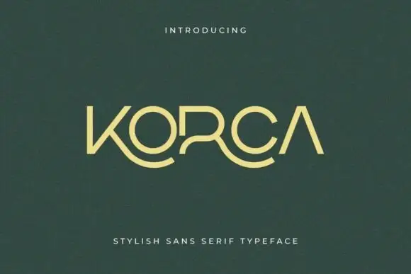
Light geometric capitals with sweeping lower K and R extensions
Korca shows a yellow-green capital name on dark green, where the O and C close as broad round forms, the A carries no crossbar and the K and R extend into long curved lower strokes that sweep beneath the neighbouring letters.
Same independent foundry
Allow optional Google Analytics to measure visits and catalogue actions. Your search words and notes are not included. Privacy & storage