Editorial Serif Anchor

Joyful Caroling + Augler
Anchors Joyful Caroling's fluid strokes with crisp Roman proportions on wedding suites, headers and packaging.
Inspect Augler specimenDisclosure: MakerFileHub may earn a commission from qualifying purchases via paid links on this page. How our links work.
Fine rounded festive handwriting with open counters and a light even stroke
Joyful Caroling is fine rounded handwriting in which the letters stand separately, the counters stay wide open and the stroke holds one light weight across the phrase.
Paid link
Get this fontProject & layout blueprintsAt-a-glance maker compatibility
Weld or Unite overlapping script joins into one continuous vector path before sending to the blade.
Visual anatomy & craft review
The capital J is drawn as a plain hook with no flourish, and the letters after it keep that simplicity: the o and the y close round bowls, the f rises and falls in one smooth stroke, the u holds two even arches, the l is a plain stem and the C of the second word opens wide. Nothing connects, nothing slants and nothing tapers, which is what makes the pair of words read as a clean handwritten label rather than a script. Because the counters are generous, the face stays legible at 16 pt on a tag and at 90 mm on a banner without changing character. The green ground, the white ink, the trees, the elves and the small musical notes are presentation; the lettering is the two words.
Rounded · Fine · Festive
Two-font hierarchy recipes
Tested contrast partners — pairing Joyful Caroling with grounded secondary typography.
Joyful Caroling + Augler
Anchors Joyful Caroling's fluid strokes with crisp Roman proportions on wedding suites, headers and packaging.
Inspect Augler specimen
Joyful Caroling + Inkora
Keeps small-scale dates, URLs, nutrition facts and care instructions crisp and legible below script titles.
Inspect Inkora specimenPractical applications
Concrete hierarchy, scale and production guidance tailored to Joyful Caroling’s stroke geometry.
The open counters read across a hall and the light even stroke keeps a long seasonal word legible at 80 mm on a fabric banner.
Hierarchy & layout recipe
Set the greeting at 80 mm on a 1.2 m fabric banner, set the stall name at 40 mm beneath it, and leave 30 mm at each end so the rounded ends stay inside the hem.
Pre-production check
Fabric printing closes open counters slightly; check a proof at final size and confirm the o and e are still round before the run.
The simple rounded hand suits a kraft tag and stays readable at 15 pt where a heavier festive script would clot against the paper texture.
Hierarchy & layout recipe
Set the greeting at 15 pt on a 50 by 90 mm kraft tag, keep the recipient's name in a 7 pt sans beneath, and leave a clear 12 mm band at the top for the punched hole.
Pre-production check
Kraft absorbs ink and softens rounded ends; print one tag on the actual stock and open the tightest counters if they begin to fill.
The light rounded letters give a family card a warm, unpretentious tone, and the open counters keep a two-word greeting clear at 30 pt.
Hierarchy & layout recipe
Set the greeting at 30 pt on a 148 by 105 mm card, set the sender line in a 7 pt sans at the foot, and leave 16 mm of margin so the strokes stay inside the trim.
Pre-production check
A light stroke printed on textured card can break at the curves; print one card on the actual stock and check the joins of the f and y.
Technical & licence verification
Confirm included OTF/TTF/WOFF formats, full glyph tables and licence coverage on the live store page before batch production.
Closest visual alternatives
Matched across letterform anatomy, stroke behaviour and craft applications.
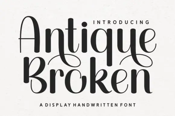
Handwritten display with high contrast and broken strokes
Antique Broken is a handwritten display alphabet in which the strokes swell to heavy dark shapes and then break into thin lines, so a word reads as drawn with a broad nib that lifted between strokes.
Ideas for this font
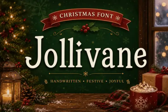
Soft narrow serif display with diamond tittles
Jollivane is a narrow serif display with soft, slightly bowed strokes, diamond tittles and a gentle bounce on the baseline, so a word reads as a hand-lettered sign rather than as a text serif.
Ideas for this font
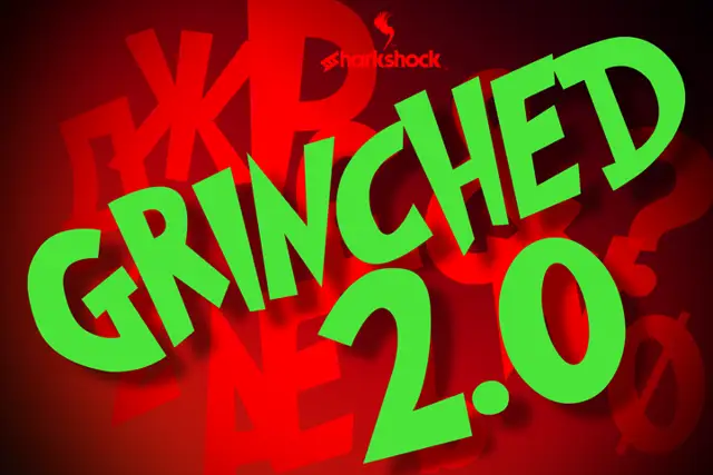
Bold chunky caps with flat tops and slightly wonky weight
Grinched 2.0 is a bold capital alphabet in which the strokes stay thick and the shapes sit slightly off true, so a short word reads as a hand-cut sign rather than as a clean grotesque.
Ideas for this font
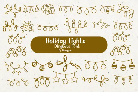
Loose line-art dingbats of hanging lights, baubles and tangled strings
Holiday Lights is a dingbat font that draws Christmas light garlands in one even line: bulb strings, loops of wire, rows of candles, hanging stars and sprigs of pine, all ready to be dropped between two pieces of type.
Ideas for this font
Same independent foundry
Allow optional Google Analytics to measure visits and catalogue actions. Your search words and notes are not included. Privacy & storage