Editorial Serif Anchor

Human Error + Evoire
Anchors Human Error's fluid strokes with crisp Roman proportions on wedding suites, headers and packaging.
Inspect Evoire specimenDisclosure: MakerFileHub may earn a commission from qualifying purchases via paid links on this page. How our links work.
Thick irregular ballpoint capitals with a mixed-case lowercase
Human Error draws its capitals with a thick ballpoint, letting the stroke swell and thin at random and setting the two-line title on a hand-drawn baseline that tilts and settles instead of ruling flat.
Paid link
Get this fontProject & layout blueprintsAt-a-glance maker compatibility
Weld or Unite overlapping script joins into one continuous vector path before sending to the blade.
Visual anatomy & craft review
Set in two lines on torn sketch paper, the H is the tallest thing on the card: a straight left stem, a short arm and a crossbar set low, while the lowercase u, m and a behind it keep a large x-height and blunt, slightly angular shoulders. The r in the second line peaks where a printed r would flatten, and both lines drift down to the right before the last letter pulls them back, so the lockup looks written rather than placed. Strokes thin where the pen lifts and thicken at every turn, which is the ballpoint evidence the presentation leans on. The pencil hatching in the corner, the torn deckle of the paper and the small script line at the bottom belong to the cover, and the tracked label above the title is a different face entirely.
Candid · Uneven · Ballpoint
Two-font hierarchy recipes
Tested contrast partners — pairing Human Error with grounded secondary typography.
Human Error + Evoire
Anchors Human Error's fluid strokes with crisp Roman proportions on wedding suites, headers and packaging.
Inspect Evoire specimen
Human Error + Modern Heritage
Keeps small-scale dates, URLs, nutrition facts and care instructions crisp and legible below script titles.
Inspect Modern Heritage specimenPractical applications
Concrete hierarchy, scale and production guidance tailored to Human Error’s stroke geometry.
A heavy ballpoint header survives photocopying and a grey office printer far better than a light script, and the uneven baseline reads as a tutor's own hand rather than as a downloaded template.
Hierarchy & layout recipe
Set the workshop title at 22 pt across the top third of an A4 sheet, keep the subtitle in a plain text face at 9 pt with 6 mm of air beneath it, and leave the lower half for the exercise grid so the heading never competes with the space people write in.
Pre-production check
Print one page on the office copier and look at the e and a counters: the even thick stroke closes them first once the reproduction drops to 300 dpi.
The pen-like strokes make a quote read as a written note from the printer, which suits a small studio that wants its paperwork to feel handled by a person rather than generated by a system.
Hierarchy & layout recipe
Run the studio name at 18 pt at the top of a 105 mm slip, keep quantities and prices in a tabular sans at 8 pt underneath, and stop the header short of the right edge so the final r keeps its overshoot inside the trim.
Pre-production check
At 18 pt on thermal paper the irregular edges fuzz into the white; proof a single slip on the actual stock before ordering a pad of five hundred.
A ballpoint capital set large carries the informality the article is about, and the mixed-case word keeps the headline from looking like a logo stamped on the page.
Hierarchy & layout recipe
Set the two-line opener at 54 pt and 40 pt on the first spread, run the standfirst at 10 pt with 4 mm of clearance under the lowest letter, and align the body column to the second line rather than to the first.
Pre-production check
The alternates exist so repeated letters differ; check the two o's and r's in your own headline before it goes to press, or the duplicates read as a mistake.
Technical & licence verification
Confirm included OTF/TTF/WOFF formats, full glyph tables and licence coverage on the live store page before batch production.
Closest visual alternatives
Matched across letterform anatomy, stroke behaviour and craft applications.
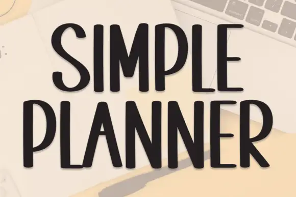
Tall condensed handwriting with light shadow
Simple Planner is a tall condensed hand-drawn display in near-black on a pale desk: narrow letters with blunt ends, a small light shadow and a level rhythm, drawn as two uppercase rows.
Ideas for this font
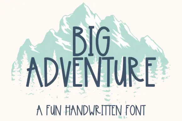
Tall handwritten capitals
Big Adventure shows tall separate capitals with narrow bowls and an angular A, where the G, T and R stand above an uneven baseline and a mountain illustration sits behind the lettering.
Ideas for this font
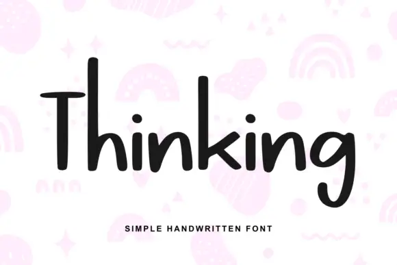
Heavy irregular mixed-case print
Thinking is a heavy hand-drawn print in near-black on pale pink: tall narrow letters, a very tall T with a wide arm, and a light irregular rhythm, over a scatter of drawn pastel doodles.
Ideas for this font
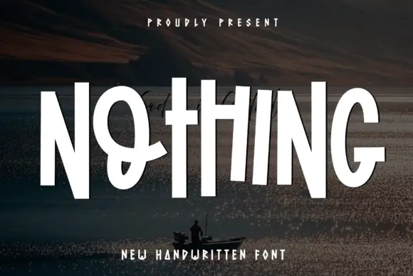
Tall compact display capitals
Nothing is a set of tall condensed hand-drawn capitals, set in white over a dark landscape: narrow stems, short crossbars and a few letters that step out of the line.
Ideas for this font
Same independent foundry
Allow optional Google Analytics to measure visits and catalogue actions. Your search words and notes are not included. Privacy & storage