Neutral Sans Workhorse

Horse + Helina
Lets Horse own the focal silhouette while handling secondary copy, sizing and subheads cleanly.
Inspect Helina specimenDisclosure: MakerFileHub may earn a commission from qualifying purchases via paid links on this page. How our links work.
Heavy plain capitals opened by large running and rearing horse silhouettes
Horse sets dark block capitals across an orange desert landscape, where large pale horse silhouettes cross the broad strokes with flowing manes and raised forelegs breaking into the letter interiors, the H and O holding especially large figures and the E carrying a smaller one near its upper half.
Paid link
Get this fontProject & layout blueprintsAt-a-glance maker compatibility
Sturdy stroke walls and open counters weed cleanly on adhesive vinyl, HTV apparel film, and cut cardstock.
Visual anatomy & craft review
The blocks stay heavy and square, the counters stay open enough to hold a figure and the silhouettes cut cleanly through the fill rather than sitting behind it. That figure-in-letter build is the character: the word reads as a carved brand rather than a decorated face, which is why the dunes stay outside the type. Each horse maps to a specific letter, so check the actual glyphs before writing a new word. Keep 48 pt so the legs and manes stay separate.
Heavy plain capitals opened by large running and rearing horse silhouettes
Two-font hierarchy recipes
Tested contrast partners — pairing Horse with grounded secondary typography.
Horse + Helina
Lets Horse own the focal silhouette while handling secondary copy, sizing and subheads cleanly.
Inspect Helina specimen
Horse + Vanielst Elegant Serif Display Stylistic
Grounds bold display lettering with classic typographic authority on posters, badges and apparel.
Inspect Vanielst Elegant Serif Display Stylistic specimenPractical applications
Concrete hierarchy, scale and production guidance tailored to Horse’s stroke geometry.
The silhouette letters give a ranch brand a carved mark, and the open counters keep a short name legible on a feed sack at 70 mm.
Hierarchy & layout recipe
Print a 70 by 100 mm sack label: set the brand at 26 pt on one row, keep 12 mm of clear ground beneath before the weight at 8 pt, and keep 8 mm to the die edge so the legs stay whole.
Pre-production check
Mane gaps close under 24 pt; check the plate proof and hold the brand at 26 pt or above on the sack.
The horse silhouettes name the business without an extra illustration, and the heavy blocks read at the end of a gravel drive.
Hierarchy & layout recipe
Print a 700 by 400 mm board: set the school name at 60 mm on one row, keep 26 mm of clear ground beneath before the hours at 15 pt, and keep 30 mm of border all round.
Pre-production check
The dunes are cover imagery; check the artwork files before planning any landscape with the type.
The figure letters suit a club poster, where children read the animals before the words and the heavy blocks hold across a hall.
Hierarchy & layout recipe
Print an A3 poster: set the club name at 70 pt across two rows, keep 22 mm of clear ground beneath before the date at 15 pt, and keep 24 mm of border.
Pre-production check
Only a few letters carry a horse; check your own wording at final size before promising the effect.
Technical & licence verification
Confirm included OTF/TTF/WOFF formats, full glyph tables and licence coverage on the live store page before batch production.
Closest visual alternatives
Matched across letterform anatomy, stroke behaviour and craft applications.
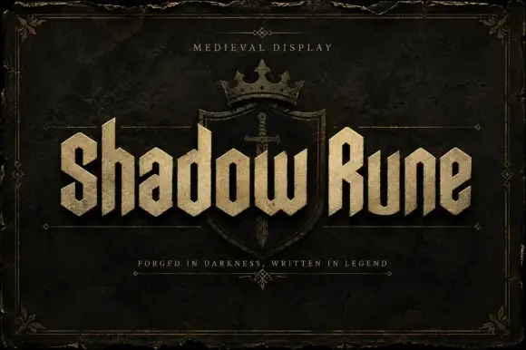
Squared narrow blackletter
Shadow Rune is a squared narrow blackletter in bone on a dark stone ground: capitals with diagonal shoulders, a clipped S, blunt stems and a small scale texture, set as two words across a shield device with a small tracked line above and a plain line beneath.
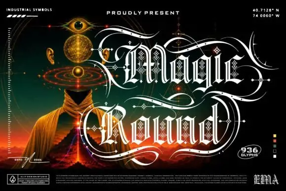
Outlined ornamental blackletter
Magic Round is an outlined ornamental blackletter in white on a dark illustrated scene: letters traced with a double line and filled with a diamond lattice, with huge swashes that sweep beneath and between the words, set in two lines above a landscape of a hooded figure, an eye and a volcano, with small technical marks at the corners.
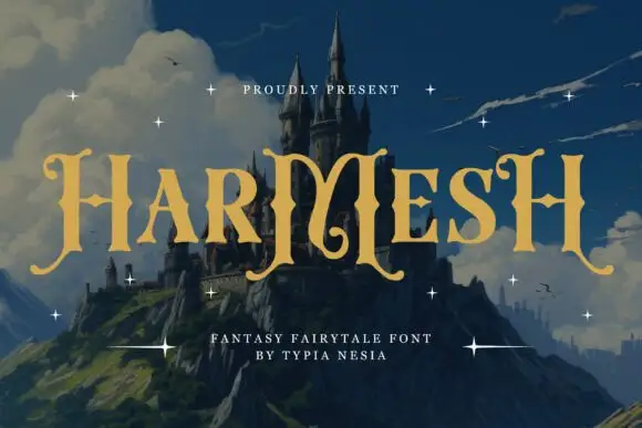
Angular fantasy capitals with hooked tops and curling feet
Harmesh shows gold-coloured capitals over a castle landscape, where tall stems end in pointed hooks and large curling feet, and the heavy H and M shapes use angular inner joins with broad triangular endings while small stars sit around the title.
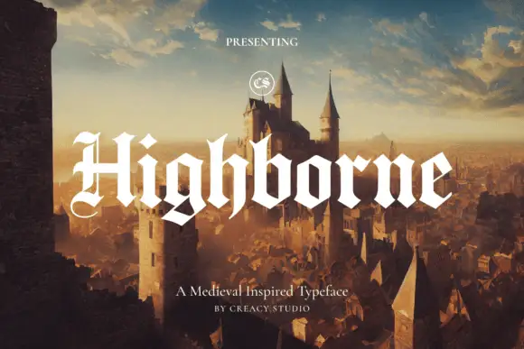
Solid blackletter with divided H and pointed angular shoulders
Highborne sets a solid blackletter across a painted castle town, its strokes rising into sharp peaks, the shoulders angled into points and the first capital divided down the middle.
Same independent foundry
Allow optional Google Analytics to measure visits and catalogue actions. Your search words and notes are not included. Privacy & storage