Modern Grotesque Body

Distressed Varsity + Noar
Creates crisp high-hierarchy contrast beneath Distressed Varsity headlines across menus, websites and labels.
Inspect Noar specimenDisclosure: MakerFileHub may earn a commission from qualifying purchases via paid links on this page. How our links work.
Inset-bordered varsity capitals with light wear and angular cuts
Distressed Varsity is a bordered varsity alphabet: heavy capitals with an inner keyline that follows the contour, slightly worn edges and angular cuts at the corners, set only in uppercase.
Paid link
Get this fontProject & layout blueprintsAt-a-glance maker compatibility
Fine grain and micro-texture excel in 300 DPI print, sublimation, and screen print rather than small vinyl weeding.
Visual anatomy & craft review
Each letter is a heavy block with a thin inner line running inside its edge at a constant distance, so the face reads as two nested outlines rather than a solid form. The D closes into a rectangular bowl, the I is a plain heavy stem with two slabs, the S keeps its curves but cuts its terminals at an angle, and the E, R and T repeat the same slab treatment. The wear is light and even: small chips appear on the edges, more on the diagonals than on the verticals, so the texture reads as age rather than damage. Counters are tight rectangles and there is no lowercase. The green ink on white paper and the small caption underneath are presentation; the typeface is the two words and the third line.
Bordered · Varsity · Worn
Two-font hierarchy recipes
Tested contrast partners — pairing Distressed Varsity with grounded secondary typography.
Distressed Varsity + Noar
Creates crisp high-hierarchy contrast beneath Distressed Varsity headlines across menus, websites and labels.
Inspect Noar specimen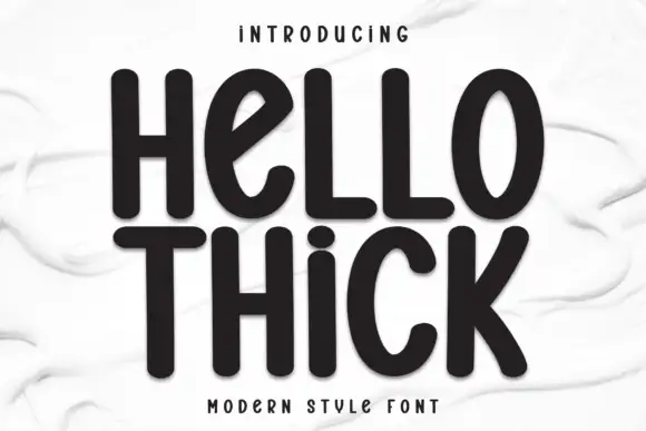
Distressed Varsity + Hello Thick
Adds a warm human signature touch for 1-to-3-word callouts without competing against structured serif capitals.
Inspect Hello Thick specimenPractical applications
Concrete hierarchy, scale and production guidance tailored to Distressed Varsity’s stroke geometry.
The bordered capitals read at distance and the inner keyline gives the face weight without making the letters heavy, which keeps a long school name legible on a narrow sign.
Hierarchy & layout recipe
Set the department name at 25 cm on a 2 m sign, keep the room numbers in a clean sans at 6 cm, and leave 15 cm of margin so the worn edges read against a plain panel.
Pre-production check
Cut metal signage of a bordered face needs a bridge in the keyline; check the vector at full size and thicken the inner line if it falls below 4 mm.
The worn bordered caps give a decade-specific voice, and the flat construction lets a long headline sit on one line without the bounce of a display script.
Hierarchy & layout recipe
Set the header at 48 pt on the opening spread, set the team lists in a clean condensed at 9 pt, and keep 16 mm between the header and the copy so the keyline reads clearly.
Pre-production check
A thin keyline on uncoated stock can break at 48 pt; print the spread on the actual paper and open the line slightly before the run.
Bordered varsity caps name the theme immediately, and the worn edges keep a printed banner from looking like a modern corporate template.
Hierarchy & layout recipe
Set the greeting at 80 mm tall across a 1.2 m printed banner, keep the name at 50 mm beneath it, and leave 35 mm at each end so the outermost keyline stays clear of the sewn hem.
Pre-production check
Fabric printing closes a thin inner line at large sizes; check the proof at final scale and thicken the keyline before the banner is sewn.
Technical & licence verification
Confirm included OTF/TTF/WOFF formats, full glyph tables and licence coverage on the live store page before batch production.
Closest visual alternatives
Matched across letterform anatomy, stroke behaviour and craft applications.
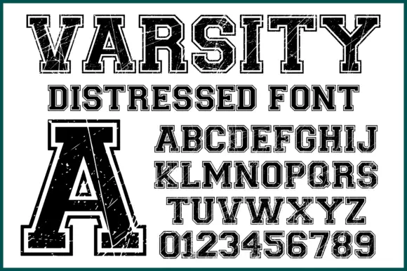
Varsity slab with double outline and wear
Varsity Distressed is a varsity slab in black on white: heavy capitals with flat serifs, a double outline that follows the silhouette, and a worn texture across the fill, shown with a full alphabet and a digit set.
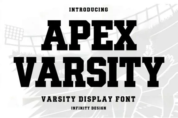
Clean condensed collegiate slab with heavy slabs and tight fit
Apex Varsity is a clean condensed collegiate slab in which the letters run narrow and tall, the slabs are square and heavy and the fit stays tight, so a long team name holds a single line at a modest size.
Ideas for this font
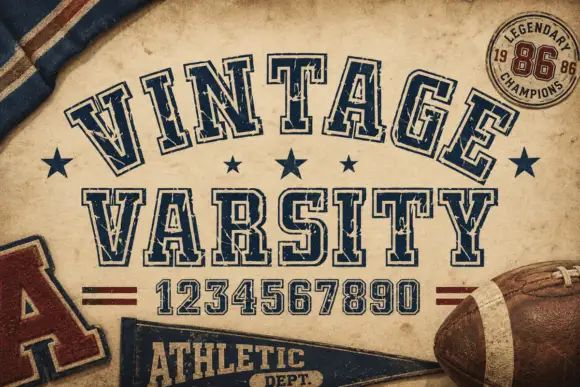
Weathered outlined college capitals
Vintage Varsity is a weathered collegiate display in navy outline on aged tan paper: arched capitals, double-line letterforms and a printed wear that leaves speckles across the strokes.
Ideas for this font
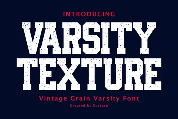
Display
Varsity Texture is a collegiate block face: heavy slab-serifed capitals with a flat top and foot, tight spacing and a grain texture that leaves the letters looking stamped on fabric.
Ideas for this font
Same independent foundry
Allow optional Google Analytics to measure visits and catalogue actions. Your search words and notes are not included. Privacy & storage