Neutral Sans Workhorse

Highborne + Inkora
Lets Highborne own the focal silhouette while handling secondary copy, sizing and subheads cleanly.
Inspect Inkora specimenDisclosure: MakerFileHub may earn a commission from qualifying purchases via paid links on this page. How our links work.
Solid blackletter with divided H and pointed angular shoulders
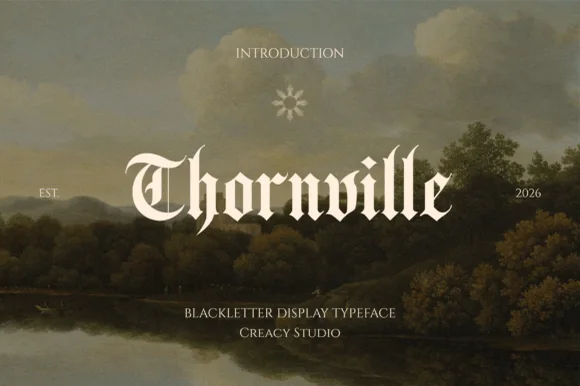
Highborne sets a solid blackletter across a painted castle town, its strokes rising into sharp peaks, the shoulders angled into points and the first capital divided down the middle.
Paid link
Get this fontProject & layout blueprintsAt-a-glance maker compatibility
Sturdy stroke walls and open counters weed cleanly on adhesive vinyl, HTV apparel film, and cut cardstock.
Visual anatomy & craft review
Highborne runs as one line of mixed case in cream against a golden dusk, the H carrying a vertical split through its stem and a long entry stroke sweeping under it, while the lowercase letters keep compact bowls and diamond-shaped tops. It is a textura build without much of the usual flourish: heavy vertical stems, thin angled joins and hard square feet, so the word reads as carved rather than written. The cover adds small caps above and a studio credit below, plus a circular monogram. Because the counters are narrow and the peaks are fine, the face needs size and a clean ground, and the sample is generous with both.
Solid blackletter with divided H and pointed angular shoulders
Two-font hierarchy recipes
Tested contrast partners — pairing Highborne with grounded secondary typography.
Highborne + Inkora
Lets Highborne own the focal silhouette while handling secondary copy, sizing and subheads cleanly.
Inspect Inkora specimen
Highborne + Svara
Grounds bold display lettering with classic typographic authority on posters, badges and apparel.
Inspect Svara specimenPractical applications
Concrete hierarchy, scale and production guidance tailored to Highborne’s stroke geometry.
The solid blackletter carries a medieval subject without costume props, and the mixed case keeps a long title from turning into a dense block.
Hierarchy & layout recipe
Print a 152 by 229 mm page: set the title at 44 pt across two lines, keep 16 mm of clear ground beneath before the author line at 10 pt, and keep 18 mm of margin from the text block.
Pre-production check
Narrow counters fill in at small sizes; check the proof on the chosen paper before the run.
The carved letterforms suit a long-table dinner in the dark months, and the cream on dark ground reads warmly on a folded card.
Hierarchy & layout recipe
Print a 105 by 148 mm card: set the greeting at 36 pt on one row, keep 14 mm of clear ground beneath before the time at 10 pt, and keep 12 mm of margin so the pointed shoulders stay clear of the trim.
Pre-production check
The split H is a single glyph; check your own word in the file before designing around that letter.
The gothic weight sits naturally with Halloween without turning into horror, and the heavy stems hold up on a sign seen from a distance.
Hierarchy & layout recipe
Print a 600 by 400 mm board: set the fair name at 64 mm on one row, keep 26 mm of clear ground beneath before the hours at 16 pt, and keep 28 mm of border all round.
Pre-production check
Fine joins can close on a cheap board print; check a proof at final board size before ordering.
Technical & licence verification
Confirm included OTF/TTF/WOFF formats, full glyph tables and licence coverage on the live store page before batch production.
Closest visual alternatives
Matched across letterform anatomy, stroke behaviour and craft applications.
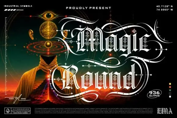
Outlined ornamental blackletter
Magic Round is an outlined ornamental blackletter in white on a dark illustrated scene: letters traced with a double line and filled with a diamond lattice, with huge swashes that sweep beneath and between the words, set in two lines above a landscape of a hooded figure, an eye and a volcano, with small technical marks at the corners.
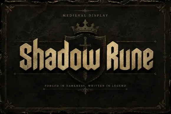
Squared narrow blackletter
Shadow Rune is a squared narrow blackletter in bone on a dark stone ground: capitals with diagonal shoulders, a clipped S, blunt stems and a small scale texture, set as two words across a shield device with a small tracked line above and a plain line beneath.
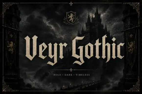
Angular blackletter with paired tips
Veyr Gothic is an angular blackletter in bone on a dark castle scene: capitals with paired V tips, low curled tails, sharp joins and a heavy even stroke, set in two words across the middle of the frame with a small line above and a tracked line beneath a divider.
Ideas for this font
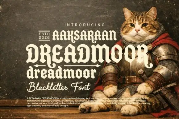
Soft heavy blackletter with curled capitals and uneven rounded bowls
Dreadmoor is a bold medieval display face with rounded blackletter bones, a small set of capitals that behave like initials, and a heavy base line under the word that reads as a shelf.
Ideas for this font
Same independent foundry
Allow optional Google Analytics to measure visits and catalogue actions. Your search words and notes are not included. Privacy & storage