Editorial Serif Anchor

Busted + Marquis - Elegant Modern Serif
Anchors Busted's fluid strokes with crisp Roman proportions on wedding suites, headers and packaging.
Inspect Marquis - Elegant Modern Serif specimenDisclosure: MakerFileHub may earn a commission from qualifying purchases via paid links on this page. How our links work.
Upright monoline script with tall narrow capitals and long entry stroke
Busted is an upright monoline script in which the capital rises far above the x-height and enters from a long straight lead, while the lowercase stays narrow and evenly spaced on a level baseline.
Paid link
Get this fontProject & layout blueprintsAt-a-glance maker compatibility
Weld or Unite overlapping script joins into one continuous vector path before sending to the blade.
Visual anatomy & craft review
The capital B is drawn as a tall narrow stem with two shallow lobes and a lead-in stroke that comes up from below the baseline at a steep angle, which gives the word a lifted start. The lowercase letters keep that narrowness: the u, s, t, e and d all sit within a tight band, their bowls shallow, and the joins pass at a consistent height rather than sagging. Weight is a single even line from start to finish, with no swelling at the turns, and the ascender on the d is the only element that breaks the band. The final d exits in a short straight stroke that rises slightly, so the word finishes higher than it began. Ends stop blunt with a small round cap. The pale ground, the multicoloured letters and the tracked label are presentation; the script is the word.
Upright · Monoline · Tall
Two-font hierarchy recipes
Tested contrast partners — pairing Busted with grounded secondary typography.
Busted + Marquis - Elegant Modern Serif
Anchors Busted's fluid strokes with crisp Roman proportions on wedding suites, headers and packaging.
Inspect Marquis - Elegant Modern Serif specimen
Busted + Olline
Keeps small-scale dates, URLs, nutrition facts and care instructions crisp and legible below script titles.
Inspect Olline specimenPractical applications
Concrete hierarchy, scale and production guidance tailored to Busted’s stroke geometry.
The tall narrow capital and the even monoline hold up when the mark is embossed on a bag or printed at 10 pt on a label, and the upright stance reads as confident rather than decorative.
Hierarchy & layout recipe
Set the roastery name at 16 pt on a 90 by 140 mm bag, keep the roast and origin in a narrow caps at 6 pt, and leave 8 mm above the capital so the long lead-in is not crowded.
Pre-production check
Foil stamping a monoline under 0.3 mm breaks up; ask for the minimum stroke the die can hold and increase the mark rather than the stroke.
An upright monoline byline sits quietly beside a serif column, and the tall capital gives the name presence without the flourish that would compete with the headline.
Hierarchy & layout recipe
Set the byline at 13 pt under the headline, keep the role in a 7 pt caps sans, and hold 6 mm above the body so the lead-in stroke is not confused with a paragraph indent.
Pre-production check
At 13 pt the long lead-in can look like a printing artefact; check the page proof and shorten the lead if it reads as noise.
The upright narrow lettering fits a long surname on a small place card, and the even weight keeps names readable across a table under low light.
Hierarchy & layout recipe
Set the name at 15 pt on a 90 by 45 mm card, keep the table number in a 6 pt caps serif, and leave 6 mm at the left so the lead-in stroke has space to rise from the edge.
Pre-production check
A place card tilted in a holder foreshortens the tall capital; check one card in an actual holder before the whole set is printed.
Technical & licence verification
Confirm included OTF/TTF/WOFF formats, full glyph tables and licence coverage on the live store page before batch production.
Closest visual alternatives
Matched across letterform anatomy, stroke behaviour and craft applications.

Light lowercase script with long outer tails and a low even stroke
Abigail is a light lowercase-only script in which the word sits low on the line and both ends run out as long flat tails, so a name reads as a single signed line rather than as a set of letters.
Ideas for this font
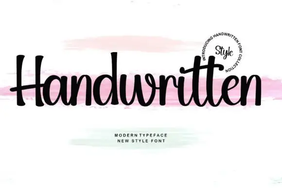
Upright compact script with flared terminals and closed tight fit
Handwritten is a compact upright script in which the letters stay close together, the strokes run heavy and even, and the terminals flare slightly where the pen lifts.
Ideas for this font
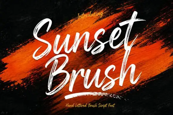
Rough brush script with a dry edge
Sunset Brush is a rough brush script in white over an orange paint smear: heavy strokes with dry, split ends, tall narrow loops and a forward slant that keeps a twelve-letter phrase moving.
Ideas for this font
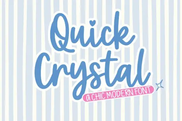
Rounded bold script with a keyline
Quick Crystal is a rounded bold script in blue with a white keyline on a pale striped ground: fat even strokes, a capital Q with a curled tail, and a final l that lifts into a short exit as the word ends.
Same independent foundry
Allow optional Google Analytics to measure visits and catalogue actions. Your search words and notes are not included. Privacy & storage