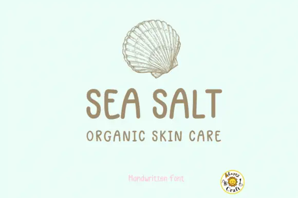
Editorial Serif Anchor

Greek Yoghurt + Alerigue
Anchors Greek Yoghurt's fluid strokes with crisp Roman proportions on wedding suites, headers and packaging.
Inspect Alerigue specimenDisclosure: MakerFileHub may earn a commission from qualifying purchases via paid links on this page. How our links work.
Rounded upright informal letters with open bowls and a level baseline
Greek Yoghurt is rounded upright handwriting in which the letters stand separately, the bowls stay open and the baseline holds level, so a phrase reads as a note written quickly with a marker.
Paid link
Get this fontProject & layout blueprintsAt-a-glance maker compatibility
Weld or Unite overlapping script joins into one continuous vector path before sending to the blade.
Visual anatomy & craft review
The capital G is drawn as a wide crescent with a flat bar, and the letters after it keep an easy roundness: the r holds a short arm, the e loops back through its bowl, the k splays from a single stem, the y drops a straight tail and the o and the g close loose counters. Nothing connects and nothing slants, the weight is a consistent medium with fully rounded ends, and the letter heights vary by a stroke or two so the line keeps a hand-made rhythm rather than a ruled one. Because the counters stay open, the face copies cleanly at 11 pt and holds up on a worksheet or a label. The striped ground, the sticky note, the strawberry and the two caption blocks are presentation; the lettering is the words.
Rounded · Informal · Upright
Two-font hierarchy recipes
Tested contrast partners — pairing Greek Yoghurt with grounded secondary typography.
Greek Yoghurt + Alerigue
Anchors Greek Yoghurt's fluid strokes with crisp Roman proportions on wedding suites, headers and packaging.
Inspect Alerigue specimen
Greek Yoghurt + Hermano
Keeps small-scale dates, URLs, nutrition facts and care instructions crisp and legible below script titles.
Inspect Hermano specimenPractical applications
Concrete hierarchy, scale and production guidance tailored to Greek Yoghurt’s stroke geometry.
The informal round hand gives a worksheet a human tone without losing legibility, and the open counters survive photocopying at A4 where a tighter face would plug.
Hierarchy & layout recipe
Set the header at 24 pt at the head of an A4 sheet, keep the instructions in a 12 pt sans at 16 pt leading, and hold 10 mm between the header and the first task line.
Pre-production check
Photocopiers close the small counters of a round face; check a copy at full size and open the a and e if the ink begins to bridge them.
The everyday hand reads as a note from the maker and stays legible at 12 pt on a small pot label, which is where most dairy packaging lives.
Hierarchy & layout recipe
Set the product name at 12 pt on a 60 mm round pot label, keep the weight and date in a 6 pt sans, and leave 5 mm of margin so the rounded ends are not clipped.
Pre-production check
Chilled pots sweat and the label lifts; check one applied label after a day in the fridge and move the type away from the lid rim.
The plain rounded hand thanks a customer without flourish, and the even weight keeps a short message readable on a card that is only glanced at.
Hierarchy & layout recipe
Set the message at 16 pt on a 90 by 55 mm card, keep the order number in a 6 pt sans at the foot, and leave 8 mm at the base so the descenders clear the edge.
Pre-production check
Cards in a parcel rub against the contents; print on a heavier stock and check that the rounded ends do not scuff in transit.
Technical & licence verification
Confirm included OTF/TTF/WOFF formats, full glyph tables and licence coverage on the live store page before batch production.
Closest visual alternatives
Matched across letterform anatomy, stroke behaviour and craft applications.
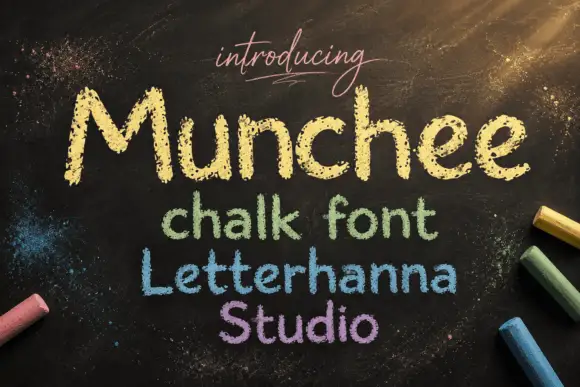
Chalk-textured display
Munchee is a chalk-textured display in cream and pastel on a blackboard: letters drawn with a broken chalky edge, a rounded skeleton with uneven heights, and three further lines in green, blue and purple that show the same face in different chalk colours.
Ideas for this font
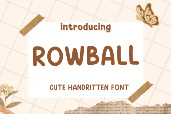
Rounded informal capitals
Rowball is a rounded informal capital hand in brown on cream: fat even strokes, wide open letters with rounded corners, a high x-height and a light bounce that keeps a plain word from looking mechanical.
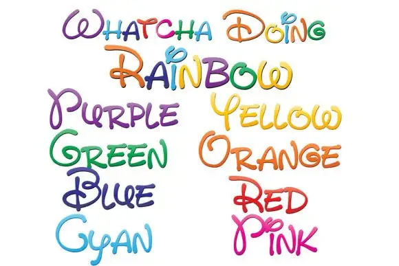
Loose rounded handwriting with loops and shaded rainbow colours
Whatcha Doing is a playful curled script in which each letter carries a decorative loop or tail, and the sample sets the set's name plus a colour word in each of eight colour variants.
Ideas for this font
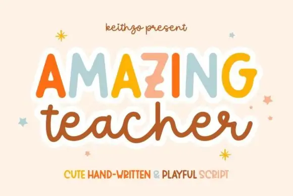
Mixed handwritten display
Amazing Teacher places broad separate capitals in mixed warm colours above a connected lowercase sample in brown, where the top line has blunt rounded ends and the lower t and h rise above the joined rhythm on a cream field with small star marks around the words.
Same independent foundry
Allow optional Google Analytics to measure visits and catalogue actions. Your search words and notes are not included. Privacy & storage