High-Contrast Display Serif

Good Vibes Only Duo + Bulgary
Pairs sculptural editorial warmth with Good Vibes Only Duo's clean modern geometry.
Inspect Bulgary specimenDisclosure: MakerFileHub may earn a commission from qualifying purchases via paid links on this page. How our links work.
Groovy duo pairing blobby fat capitals with a wide monoline script
Good Vibes Only is a two-cut family in which fat blobby capitals stack in two lines and a wide monoline script is written across them, so a short phrase reads as a poster from a record shop window.
Paid link
Get this fontProject & layout blueprintsAt-a-glance maker compatibility
Weld or Unite overlapping script joins into one continuous vector path before sending to the blade.
Visual anatomy & craft review
The G curls a thick spur, the o stays a fat oval, the d closes a wide bowl, the v splays two fat arms and the b holds a heavy stem, all at a groovy weight with soft, uneven contours; the script cut writes a light connected line with a long entry swash. The overlap is the character: the script runs across the middle of the stacked caps, which is how the sample uses the two cuts as one image rather than as two typefaces. The caps need 30 pt and the script 18 pt, and the script must stay a light colour over a mid-tone to survive. The pale ground, the white dots and the caption below are presentation; the two overlapping words are the family.
Groovy · Blobby · Duo
Two-font hierarchy recipes
Tested contrast partners — pairing Good Vibes Only Duo with grounded secondary typography.
Good Vibes Only Duo + Bulgary
Pairs sculptural editorial warmth with Good Vibes Only Duo's clean modern geometry.
Inspect Bulgary specimen
Good Vibes Only Duo + Simple Alphabet
Introduces organic movement on pull-quotes, signatures and gift tags.
Inspect Simple Alphabet specimenPractical applications
Concrete hierarchy, scale and production guidance tailored to Good Vibes Only Duo’s stroke geometry.
The overlapping cuts give a small poster a period look without illustration, and the script stays legible over the fat caps at 60 pt and 26 pt.
Hierarchy & layout recipe
Print an A3 poster: set the caps at 60 pt on two stacked lines, set the script at 26 pt across the join in a contrasting colour, and keep 25 mm of border so the swash is not cut by the trim.
Pre-production check
A script laid over a cap join can lose its thin joins; check the proof and pick a script colour with at least four steps of contrast against the cap colour.
The groovy shapes read through glass, and the wide script gives the shop a slogan line at 40 mm without a second design.
Hierarchy & layout recipe
Print a 300 by 120 mm sticker: set the caps at 45 mm, set the slogan at 18 pt in the script across them, and keep 10 mm of clear vinyl around the word so it peels cleanly.
Pre-production check
Vinyl thinner than 10 mm at the edge tears on a window; check the sticker and add a backing shape rather than cutting the letters free.
The fat caps read in direct sunlight and the monoline script gives the kiosk menu board a hand-written specials line at 90 mm and 30 pt.
Hierarchy & layout recipe
Print a 700 by 400 mm board: set the two cap words at 90 mm, set the two specials at 30 pt in the script beneath, and print both in flat inks with no gradient so the shapes stay crisp.
Pre-production check
A gradient on a fat blob letter looks like a bad print at distance; check the board and keep both inks flat.
Technical & licence verification
Confirm included OTF/TTF/WOFF formats, full glyph tables and licence coverage on the live store page before batch production.
Closest visual alternatives
Matched across letterform anatomy, stroke behaviour and craft applications.
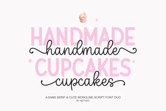
Bold sans serif paired with a monoline script with curled outer tails
Handmade Cupcakes pairs a bold sans serif in capitals with a light monoline script whose tails curl at both ends, so a label can carry a firm product word and a soft handwritten line.
Ideas for this font
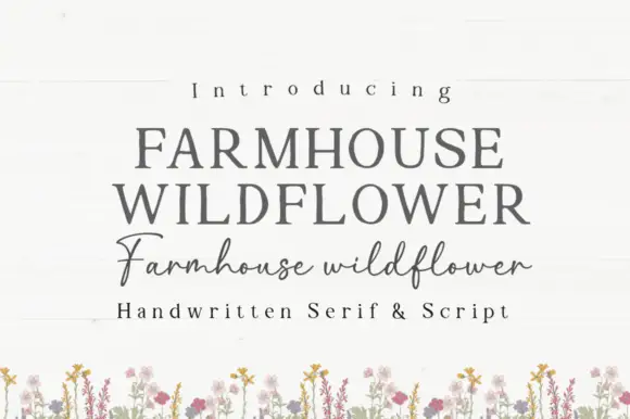
Soft upright serif caps with uneven edges paired with a loose connected script
Farmhouse Wildflower is a two-cut pair in which soft upright serif capitals carry slightly uneven edges and a lighter connected script runs low rounded joins with long strokes leaving the first and last letters.
Ideas for this font
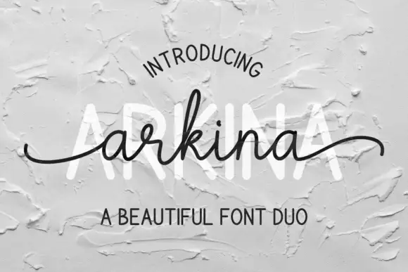
Tall sans capitals with a low looping script duo
Arkina Duo layers a very low looping connected script over tall narrow capitals that read as engraved lettering pressed into plaster, with entry strokes starting well left of the first letter.
Ideas for this font
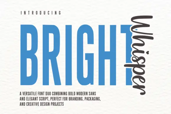
Very tall condensed bold sans paired with a loose script set vertically
Bright Whisper Duo pairs an extremely tall condensed sans in heavy weight with a loose upright script, and the sample sets the script sideways against the sans so the two voices sit at right angles.
Ideas for this font
Same independent foundry
Allow optional Google Analytics to measure visits and catalogue actions. Your search words and notes are not included. Privacy & storage