Modern Grotesque Body

Gomiro + Taught
Creates crisp high-hierarchy contrast beneath Gomiro headlines across menus, websites and labels.
Inspect Taught specimenDisclosure: MakerFileHub may earn a commission from qualifying purchases via paid links on this page. How our links work.
Sculptural interlocking swash-ligature uppercase luxury serif
Gomiro is a glamorous uppercase luxury serif sweeping dramatic ribbon ligatures through 'G-O' and 'R-O' letter pairs!
Paid link
Get this fontProject & layout blueprintsAt-a-glance maker compatibility
Crisp hairline serifs shine on stationery, foil stamping, and packaging; add slight offset for small decals.
Visual anatomy & craft review
Gomiro is an uppercase luxury serif whose ribbon ligatures sweep through the G-O and R-O pairs, so a word reads as a serpentine monogram rather than a normal wordmark. The ribbons are structural: the letters must touch, which fixes the tracking, and the thin joins need size and a smooth stock to survive. It needs roughly 32 mm for the ribbons to read, and it is best in champagne or bronze on a dark ground, or a fine foil on matte board.
Couture-ligature · Sweeping-GO-RO · Gold-editorial
Two-font hierarchy recipes
Tested contrast partners — pairing Gomiro with grounded secondary typography.
Gomiro + Taught
Creates crisp high-hierarchy contrast beneath Gomiro headlines across menus, websites and labels.
Inspect Taught specimen
Gomiro + Coastal Honey
Adds a warm human signature touch for 1-to-3-word callouts without competing against structured serif capitals.
Inspect Coastal Honey specimenPractical applications
Concrete hierarchy, scale and production guidance tailored to Gomiro’s stroke geometry.
Ribbon ligatures read as an engraved monogram, which is what a small fragrance or jewellery house puts on a carton. The joined letters behave as one plate at 20 pt, and the hairlines print crisply on coated board.
Hierarchy & layout recipe
Carton 55 x 140 x 30 mm, name 20 pt, weight 5.5 pt, 8 mm margins. Label 40 x 70 mm, name 12 pt, 4 mm top arc. Card 85 x 55 mm, name 10 pt, role 5.5 pt.
Pre-production check
A hot foil on a 0.25 mm ribbon join breaks and the monogram arrives in pieces. Keep joins at 0.5 mm for foil, and pull one foil proof before the label run.
Ribbon-tied capitals read as an engraved couple monogram, which is what a formal wedding suite wants. The joined letters make a short surname one mark at 28 pt, and the fine joins foil on matte card.
Hierarchy & layout recipe
Invitation 130 x 180 mm, names 28 pt, details 9/13 pt, 15 mm margins and 10 mm trim. Menu 120 x 210 mm, header 16 pt, dishes 9/13 pt. Name card 90 x 50 mm, name 9 pt.
Pre-production check
A 9 pt name card closes the ribbon join into a solid dot and the monogram becomes a blob. Keep the monogram at 14 pt or above, and check one printed card before the suite.
Serpentine serif ligatures read as a couture masthead, which is what a luxury title prints on a cover. The joined capitals fill the trim at 96 pt, and the ribbon gives the title its identity without an illustration.
Hierarchy & layout recipe
Cover 210 x 297 mm, title 96 pt, cover lines 10/14 pt, 18 mm margins. Opener 420 x 297 mm, headline 110 mm, body 9/13 pt. Insert 148 x 210 mm, word 40 pt, 15 mm margins.
Pre-production check
A web-offset run drops a 0.09 mm ribbon join and the monogram breaks open on the cover. Confirm coated stock and a 0.12 mm floor, and check one printed signature before the full run.
Technical & licence verification
Confirm included OTF/TTF/WOFF formats, full glyph tables and licence coverage on the live store page before batch production.
Closest visual alternatives
Matched across letterform anatomy, stroke behaviour and craft applications.

Romantic spiral-swashed high-fashion editorial serif
Amor Hadena is a dramatic swash-serif weaving lyrical spiral curls and towering looped ascenders across high-contrast Roman letters!
Ideas for this font
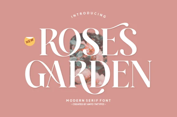
Romantic high-contrast floral-editorial swash serif
Roses Garden is a refined modern editorial serif crowned with graceful overhead S-swashes, looped ligatures, and multilingual support.
Ideas for this font

Crisp contemporary editorial serif duo (Regular + Italic, OTF/TTF/WOFF)
Svara is a sharp modern editorial serif family pairing an upright Regular with a lively true Italic across OTF, TTF & WOFF formats!
Ideas for this font

Bold transitional display serif with overhead canopy swash
Vanielst is a substantial, medium-high-contrast display serif highlighted by graceful overhead swash loops and crisp bracketed feet.
Ideas for this font
Same independent foundry
Allow optional Google Analytics to measure visits and catalogue actions. Your search words and notes are not included. Privacy & storage