High-Contrast Display Serif

Agern + Wolles Elegant Modern Serif
Pairs sculptural editorial warmth with Agern's clean modern geometry.
Inspect Wolles Elegant Modern Serif specimenDisclosure: MakerFileHub may earn a commission from qualifying purchases via paid links on this page. How our links work.
Angular geometric capitals with open joins and a curved G
Agern is a wide geometric logo sans in caps, with squared bowls, joins cut at an angle and a very open skeleton, drawn to hold a short brand name at large sizes.
Paid link
Get this fontProject & layout blueprintsAt-a-glance maker compatibility
Sturdy stroke walls and open counters weed cleanly on adhesive vinyl, HTV apparel film, and cut cardstock.
Visual anatomy & craft review
AGERN spans the lower half of the card in white on a near-black ground, and the letters are built from straight segments: the A has a flattened apex, the G is a square with a bar that stops short, the E is three equal bars, the R has a straight leg and the N is drawn with a diagonal that meets the stem at a hard angle. The spacing is wide and even, so the word reads as a mark rather than a word, and the counters are open rectangles. Three small credits run along the top in a light grotesque, and a round badge at the upper right marks the release. The face is a logotype cut first and a heading face second: it needs a short word and a wide measure, and at small sizes the cut joins close up and the geometry flattens into a plain wide sans.
Angular geometric capitals with open joins and a curved G
Two-font hierarchy recipes
Tested contrast partners — pairing Agern with grounded secondary typography.
Agern + Wolles Elegant Modern Serif
Pairs sculptural editorial warmth with Agern's clean modern geometry.
Inspect Wolles Elegant Modern Serif specimen
Agern + Rebel Marks
Introduces organic movement on pull-quotes, signatures and gift tags.
Inspect Rebel Marks specimenPractical applications
Concrete hierarchy, scale and production guidance tailored to Agern’s stroke geometry.
The cut joins give a four-letter name a distinctive mark without a drawn symbol, and the wide skeleton fills a business card end at any size.
Hierarchy & layout recipe
Print an 85 by 55 mm card: set the wordmark at 14 pt in caps, keep 6 mm of clear ground beneath before the contact block at 6 pt, and hold 5 mm from the widest letter to the card edge.
Pre-production check
The angled joins fill in at small reproductions; print one card at the final size and check the A and the N before the order.
The squared geometry echoes a plan drawing straight off the sheet, and one wide word fills a cover that carries no photograph anywhere on it at all.
Hierarchy & layout recipe
Print a 230 by 300 mm cover: set the cover word at 130 pt across one row, keep 32 mm of clear ground beneath before the volume line at 11 pt, and hold 22 mm from the last letter to the right trim.
Pre-production check
Wide letter spacing shows every ink variance; print one cover and check the stems for banding before the run.
The technical geometry suits a workshop, and the open counters stay readable on a door plate that is seen at a steep angle.
Hierarchy & layout recipe
Print a 240 by 90 mm plate: set the room name at 24 pt in caps, keep 8 mm of clear ground beneath before the number at 12 pt, and hold 7 mm of margin at each end of the plate.
Pre-production check
Engraved plates thin the cut joins; cut one sample and check the angles before the full set.
Technical & licence verification
Confirm included OTF/TTF/WOFF formats, full glyph tables and licence coverage on the live store page before batch production.
Closest visual alternatives
Matched across letterform anatomy, stroke behaviour and craft applications.

Bold modern geometric sans
Olline is a bold geometric sans in red on black: circular counters, a heavy even stroke, a lowercase with a straight-sided o and a dot that floats away from the i, presented at extreme size with small tracked captions in the corners, so the plate reads as a contemporary identity study.
Ideas for this font

Modern geometric grotesque caps
Limited Coffee is a modern geometric grotesque in black on cream: wide round capitals, a circular O and C, a low crossbar on the A, flat terminals and even spacing, so the pair reads as a contemporary retail sign rather than a period revival.
Ideas for this font
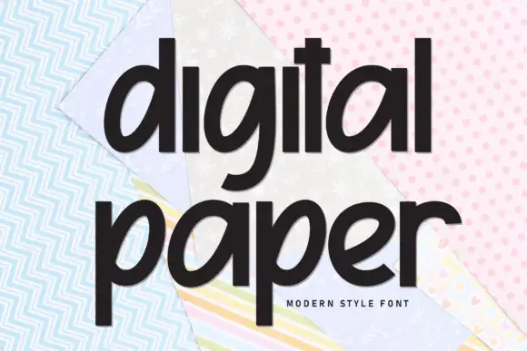
Dense lowercase with slanted bowls, upright ascenders and deep descenders
Digital Paper sets a heavy condensed sans in lowercase on a collage of pastel paper, the letters tall and close together so the two words read as one dark block against the pattern.
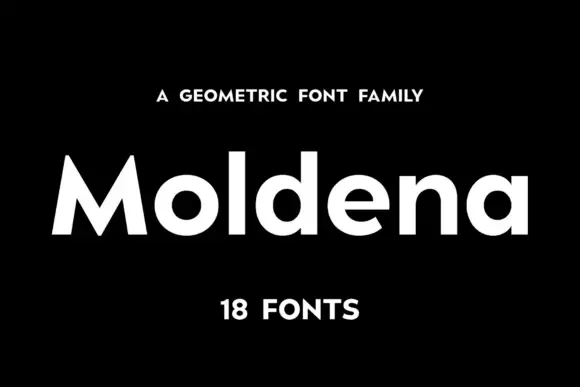
Geometric heavy sans family
Moldena is a heavy geometric sans in white on black: mixed case with circular bowls, a sharply peaked M and flat terminals, set as one word between a small tracked line above and a count of the fonts beneath.
Ideas for this font
Same independent foundry
Allow optional Google Analytics to measure visits and catalogue actions. Your search words and notes are not included. Privacy & storage