Editorial Serif Anchor

Friday Morning Sunshine + The Bilstein Editorial
Anchors Friday Morning Sunshine's fluid strokes with crisp Roman proportions on wedding suites, headers and packaging.
Inspect The Bilstein Editorial specimenDisclosure: MakerFileHub may earn a commission from qualifying purchases via paid links on this page. How our links work.
Light rounded separate lettering with soft terminals and wide counters
Friday Morning Sunshine is light rounded lettering in which every letter stands apart, the terminals are softly rounded and the counters stay wide, so three stacked words read as a calm, open column of text.
Paid link
Get this fontProject & layout blueprintsAt-a-glance maker compatibility
Weld or Unite overlapping script joins into one continuous vector path before sending to the blade.
Visual anatomy & craft review
Nothing joins. Each letter is drawn as a single even line with rounded ends: the capital F keeps a short arm and a stem that stops at the baseline, the r has a shallow shoulder with no arm, the i carries a small round dot, and the d and y rise and fall in straight lines with a gentle bend only at the tip. The x-height letters stay wide, and the spaces between letters are generous enough that the row looks airy even at display size. Weight never changes and nothing tapers, which is what keeps the face legible at small sizes. The three lines are stacked flush left and centred as a block, giving the composition its unhurried rhythm. The pale pastel ground, the yellow banner and the sun ornament are presentation; the lettering is the three words.
Light · Rounded · Open
Two-font hierarchy recipes
Tested contrast partners — pairing Friday Morning Sunshine with grounded secondary typography.
Friday Morning Sunshine + The Bilstein Editorial
Anchors Friday Morning Sunshine's fluid strokes with crisp Roman proportions on wedding suites, headers and packaging.
Inspect The Bilstein Editorial specimen
Friday Morning Sunshine + Modern Heritage
Keeps small-scale dates, URLs, nutrition facts and care instructions crisp and legible below script titles.
Inspect Modern Heritage specimenPractical applications
Concrete hierarchy, scale and production guidance tailored to Friday Morning Sunshine’s stroke geometry.
Rounded separate letters are the shapes children are taught to read first, and because nothing joins, a heading stays legible across a classroom at a size that fits a wall chart.
Hierarchy & layout recipe
Set the heading at 48 pt on an A2 poster, set the instructions in a plain 14 pt sans, and leave 20 mm between the heading and the first line so the rounded terminals do not crowd the text.
Pre-production check
Photocopies and school printers thin a light stroke; print one copy on the classroom machine and take the heading up to 54 pt if the terminals start to break.
A light, open hand softens a pull quote without the whimsy of a script, and the even stroke holds up at 24 pt against a dense column of body text.
Hierarchy & layout recipe
Set the quote at 24 pt on a 90 mm measure, keep the attribution in the same face at 12 pt, and align the quote's left edge with the column so the rounded terminals read as intentional rather than ragged.
Pre-production check
A light rounded face on newsprint can fill in at 24 pt; check one printed copy on the actual stock and hold the size at 22 pt only if the counters stay open.
The light rounded shapes read across a room without the shout of a heavy display face, and the separate letters keep a long name readable when it is printed on fabric.
Hierarchy & layout recipe
Set the name at 80 mm tall on a 1.2 m banner, keep the age in the same face at 50 mm beneath, and leave 40 mm of margin so the last letter clears the sewn hem.
Pre-production check
Printed fabric banners stretch during hemming; check the proof against the finished size and keep the lettering at least 30 mm from any seam.
Technical & licence verification
Confirm included OTF/TTF/WOFF formats, full glyph tables and licence coverage on the live store page before batch production.
Closest visual alternatives
Matched across letterform anatomy, stroke behaviour and craft applications.
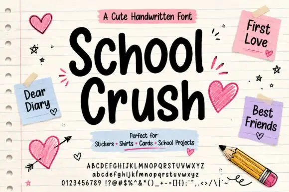
Heavy rounded marker print on a notebook page
School Crush is a heavy rounded marker print in black on a lined notebook page, with drawn hearts, sticky notes and a pencil turning the specimen into a school desk.
Ideas for this font
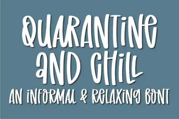
Informal tall hand with soft shadow
Quarantine and Chill is an informal handwritten display in white on slate blue: tall narrow letters, uneven spacing and a soft shadow that lifts the strokes off the ground, with a second line in the same hand.
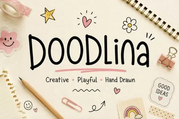
Tall narrow hand-drawn letters with uneven weights and a level baseline
Doodlina is tall narrow hand-drawn lettering in which the letters keep a level baseline but vary in weight, so a word reads as something drawn with a felt tip rather than written with a pen.
Ideas for this font
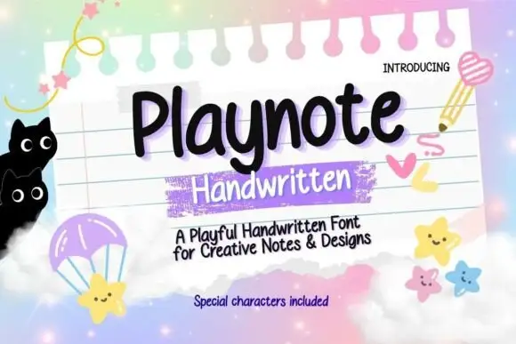
Rounded upright handwriting with a bouncy baseline
Playnote is a rounded upright handwriting face in black on a pink lined notepad: fat rounded letters with a bouncy baseline, shown over a spiral-bound sheet with a purple highlighter block, star stickers and drawn cats.
Ideas for this font
Same independent foundry
Allow optional Google Analytics to measure visits and catalogue actions. Your search words and notes are not included. Privacy & storage