High-Contrast Display Serif

Slugger Union + The Avenue Editorial
Pairs sculptural editorial warmth with Slugger Union's clean modern geometry.
Inspect The Avenue Editorial specimenDisclosure: MakerFileHub may earn a commission from qualifying purchases via paid links on this page. How our links work.
Script and varsity serif pair
Slugger Union is a duo in deep purple on cream: a bold connected baseball script with a long underscore tail, paired with a heavy block serif for the supporting lines, framed by small pennants, a crest and two tracked corner notes.
Paid link
Get this fontProject & layout blueprintsAt-a-glance maker compatibility
Weld or Unite overlapping script joins into one continuous vector path before sending to the blade.
Visual anatomy & craft review
The plate shows the pair doing period work: the block serif carries the main word and the small caps lines, while the script sets one word in a connected hand with a tail that runs beneath it, which is the classic arrangement on a baseball jersey. The serif is a heavy college slab with block serifs, and the script is drawn with a swelling stroke and a thick underscore, so the two voices read as one period system rather than as two fonts. The pennants, the crest and the corner notes belong to the composition, and the palette is two tones on cream, which keeps the plate looking like a printed team mark. Because both faces are heavy, the lockup works on apparel and at sign scale.
Duo, script, varsity, classic
Two-font hierarchy recipes
Tested contrast partners — pairing Slugger Union with grounded secondary typography.
Slugger Union + The Avenue Editorial
Pairs sculptural editorial warmth with Slugger Union's clean modern geometry.
Inspect The Avenue Editorial specimen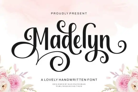
Slugger Union + Madelyn
Introduces organic movement on pull-quotes, signatures and gift tags.
Inspect Madelyn specimenPractical applications
Concrete hierarchy, scale and production guidance tailored to Slugger Union’s stroke geometry.
A script and a college serif are the language of a jersey, and the tail under the script is what makes the lockup read as team lettering.
Hierarchy & layout recipe
Print a 300 mm chest lockup: the team in the serif at 55 mm, the name in the script at 45 mm with a 4 mm underscore, and two inks on a light shirt. Keep 30 mm clear between the tail and the hem stitching.
Pre-production check
Check the screen at actual mesh, where a 4 mm underscore fills; widen it. Wash-test one shirt and confirm the script join stays open after five cycles.
A script and a block serif give a bar a period mark, and the pair covers a fascia, a menu and a coaster without the cost of a third family licence.
Hierarchy & layout recipe
Set the fascia in the serif at 130 mm, the descriptor in small caps at 24 mm, and the menu headings in the script at 30 mm. Keep two colours and reserve clear space equal to the cap height.
Pre-production check
Check the 30 mm script headings on a coated menu, where the join can fill; keep the size above 26 pt. Confirm the fascia reads at ten metres and that the tail clears the panel edge.
A period sports pair sets a theme in one purchase, and the script gives the card a hand-lettered note where the serif would look rigid.
Hierarchy & layout recipe
A6 card: the name in the serif at 26 pt, the greeting in the script at 18 pt, and a 3 mm border. Keep 14 mm margins and print two colours on a cream card.
Pre-production check
Check the 18 pt script at home-print resolution, where a swelling stroke can fill; keep the joins open. Confirm the 26 pt serif name reads at arm's length and that the border clears the tail.
Technical & licence verification
Confirm included OTF/TTF/WOFF formats, full glyph tables and licence coverage on the live store page before batch production.
Closest visual alternatives
Matched across letterform anatomy, stroke behaviour and craft applications.
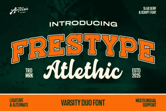
Outlined collegiate slabs paired with a thick connected script
Frestype Atlethic Duo pairs orange slab capitals with a cream connected script, where the slab row arches and carries a fine edge and the script below joins roundly, opens a broad sweeping A and flows loosely through a final c.
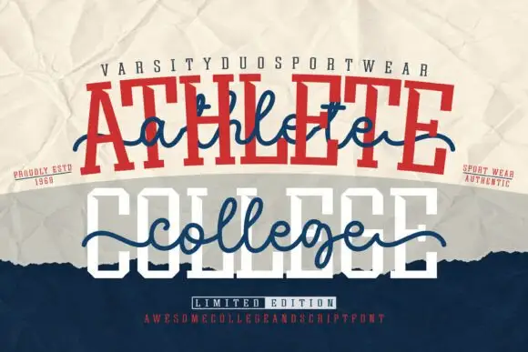
Varsity and script combination layered into one lockup
Athlete College is a combination family in which heavy varsity capitals sit behind a flowing script line that crosses the whole word, so a design reads as a team name with a written banner over it.
Ideas for this font
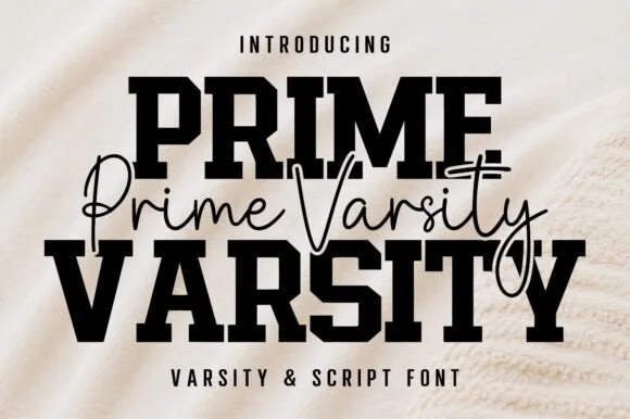
Varsity slab crossed by a thin script
Prime Varsity is a varsity and script pair in black on cream: heavy condensed slab capitals for the two big words and a thin monoline script written across them in a single flowing line, sold together as one duo.
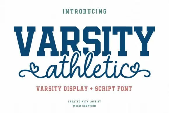
Solid varsity slab caps paired with a looping script with heart ends
Varsity Athletic pairs a solid collegiate slab capital alphabet with a looping script whose ends curl into small hearts, so a two-line design can carry both a team voice and a friendly one.
Ideas for this font
Same independent foundry
Allow optional Google Analytics to measure visits and catalogue actions. Your search words and notes are not included. Privacy & storage



