Neutral Sans Workhorse

Fazero + Corven
Lets Fazero own the focal silhouette while handling secondary copy, sizing and subheads cleanly.
Inspect Corven specimenDisclosure: MakerFileHub may earn a commission from qualifying purchases via paid links on this page. How our links work.
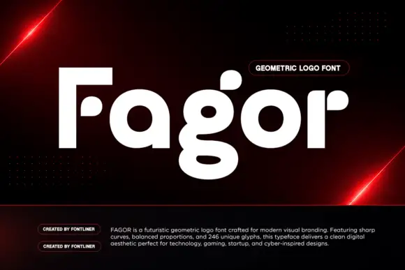
Heavy geometric capitals with detached dots replacing F and E middle arms
Fazero draws very wide black capitals and then cuts them: the F loses a notch from its stem, the E opens at the corner, and the O becomes a heavy ring with a solid dot sitting in the middle.
Paid link
Get this fontProject & layout blueprintsAt-a-glance maker compatibility
Sturdy stroke walls and open counters weed cleanly on adhesive vinyl, HTV apparel film, and cut cardstock.
Visual anatomy & craft review
The name fills the width of a white cover folded into soft paper planes, the letters flat-topped and squared with almost no optical tapering, and each one interrupted in a different place so the line looks engineered rather than typed. The a and e of the lowercase follow the same logic in the wider set, though the sample only shows capitals. A blue pill under the word names the genre and the corner notes list regular and italic cuts plus multilingual support. The concept depends on those cuts, so the face has to be set large enough for a viewer to notice that the interruptions are deliberate, and small enough text turns them into printing errors.
Heavy geometric capitals with detached dots replacing F and E middle arms
Two-font hierarchy recipes
Tested contrast partners — pairing Fazero with grounded secondary typography.
Fazero + Corven
Lets Fazero own the focal silhouette while handling secondary copy, sizing and subheads cleanly.
Inspect Corven specimen
Fazero + Lumera Editorial
Grounds bold display lettering with classic typographic authority on posters, badges and apparel.
Inspect Lumera Editorial specimenPractical applications
Concrete hierarchy, scale and production guidance tailored to Fazero’s stroke geometry.
The cut letterforms read as engineering rather than decoration, which suits a young hardware company better than a plain grotesque would.
Hierarchy & layout recipe
Print a 90 by 50 mm card: set the company name at 15 pt on one row, keep 6 mm of clear ground beneath before the contact line at 5 pt, and keep 5 mm of margin so the sliced stems stay intact.
Pre-production check
The O dot is a separate shape; check the supplied artwork files before using the mark as a stamp.
The wide caps fill a masthead with one word, and the deliberate cuts give a technology issue a graphic idea rather than a colour scheme.
Hierarchy & layout recipe
Print a 200 by 270 mm cover: set the masthead at 84 pt on one row, keep 20 mm of clear ground beneath before the issue line at 10 pt, and keep 16 mm of margin from the trim.
Pre-production check
Thin gaps fill in at small sizes; check the proof and keep the masthead at 60 pt or above.
The engineering character suits a conference about making things, and one wide word carries the whole wall without an illustration behind it.
Hierarchy & layout recipe
Print an A1 poster: set the name at 150 pt on one row, keep 40 mm of clear ground beneath before the dates at 24 pt, and keep 36 mm of border so the open corners have air.
Pre-production check
The cuts read as damage in a low-resolution print; check the output file at the printer's size.
Technical & licence verification
Confirm included OTF/TTF/WOFF formats, full glyph tables and licence coverage on the live store page before batch production.
Closest visual alternatives
Matched across letterform anatomy, stroke behaviour and craft applications.
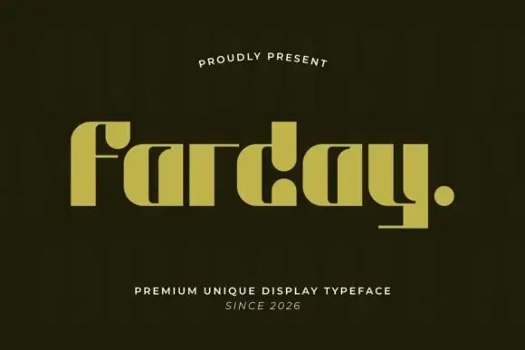
Heavy geometric lowercase with deep cut-in counters and a flat y foot
Farday stretches its letters almost to the point of merging, so the strokes of neighbouring characters run within a hairline of each other and the word reads as one wide slab with slots cut through it.
Ideas for this font
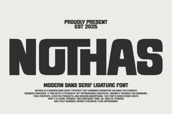
Broad rounded display with shared tops
Nothas is a broad rounded capital display in dark grey on a pale ground: wide letters with tiny counters, a long shared-looking top across the O, T and H, soft rounded shoulders and an even stroke, set as one huge word above two lines of tracked copy and a paragraph of description.
Ideas for this font
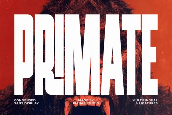
Ultra condensed display sans
Primate is an ultra condensed sans display in white on a red-tinted portrait: very tall narrow caps with flat terminals, a high waist and thin counters, set edge to edge so the letters nearly touch, with three small tracked labels along the foot.
Ideas for this font
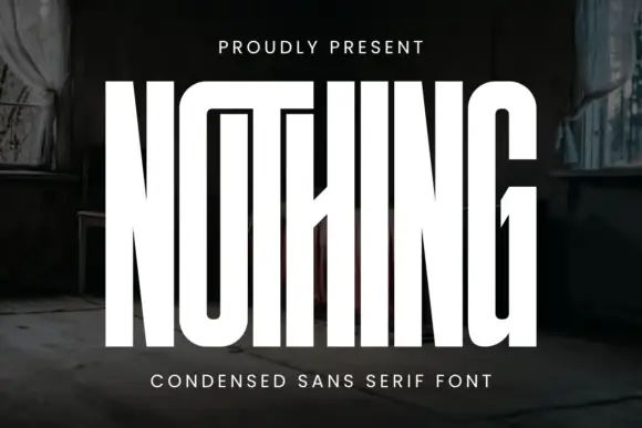
Very tall condensed display
Nothing is an extremely tall condensed display in white on a dark, peeling interior: narrow capitals whose tops join a shared bar, with a central diagonal joint across the middle of the word, flat terminals and hairline counters, and tracked caps above and beneath that name the style.
Ideas for this font
Same independent foundry
Allow optional Google Analytics to measure visits and catalogue actions. Your search words and notes are not included. Privacy & storage