Neutral Sans Workhorse

Farday + Bareum
Lets Farday own the focal silhouette while handling secondary copy, sizing and subheads cleanly.
Inspect Bareum specimenDisclosure: MakerFileHub may earn a commission from qualifying purchases via paid links on this page. How our links work.
Heavy geometric lowercase with deep cut-in counters and a flat y foot
Farday stretches its letters almost to the point of merging, so the strokes of neighbouring characters run within a hairline of each other and the word reads as one wide slab with slots cut through it.
Paid link
Get this fontProject & layout blueprintsAt-a-glance maker compatibility
Sturdy stroke walls and open counters weed cleanly on adhesive vinyl, HTV apparel film, and cut cardstock.
Visual anatomy & craft review
The name sits in olive yellow on a dark ground, the forms heavy and horizontally stressed: the a and the r fuse into one shape, the y drops a long straight tail below the line and the full stop ends the word like a stamp. Counters are reduced to narrow vertical slots, which is what keeps the letters legible at this width. Two tracked captions below describe it as a premium display face, and an arc above names the presentation. The design works only at large size: shrink it and the slots close, the fusion turns the word into a rectangle, and the point of the face disappears.
Heavy geometric lowercase with deep cut-in counters and a flat y foot
Two-font hierarchy recipes
Tested contrast partners — pairing Farday with grounded secondary typography.
Farday + Bareum
Lets Farday own the focal silhouette while handling secondary copy, sizing and subheads cleanly.
Inspect Bareum specimen
Farday + Papillon Serif – Elegant Modern Luxury
Grounds bold display lettering with classic typographic authority on posters, badges and apparel.
Inspect Papillon Serif – Elegant Modern Luxury specimenPractical applications
Concrete hierarchy, scale and production guidance tailored to Farday’s stroke geometry.
The fused forms read as a stamp rather than a word, which suits a house that wants a graphic mark on a tag and a shopping bag.
Hierarchy & layout recipe
Print a 45 by 85 mm tag: set the house name at 14 pt on one row, keep 7 mm of clear ground beneath before the season at 5 pt, and keep 5 mm from the lettering to the punch hole.
Pre-production check
Hairline gaps fill first in print; check the tag proof before the run. Test it on the real material before the run is booked.
One wide word fills a masthead with no ornament, and the cut slots give the cover its graphic idea instead of a photograph.
Hierarchy & layout recipe
Print a 240 by 320 mm cover: set the title at 130 pt on one row, keep 28 mm of clear ground beneath before the year at 10 pt, and keep 22 mm of margin from the trim so the fused block sits inside.
Pre-production check
Extreme widths need exact tracking; check the layout at final size before the proof. Verify the result on the printed piece, then approve.
The dark ground and the fused block give an evening event a poster that reads as one single object from across a wide street.
Hierarchy & layout recipe
Print an A2 poster: set the event name at 140 pt on one row, keep 30 mm of clear ground beneath before the date at 18 pt, and keep 26 mm of border so the tail of the y stays in the sheet.
Pre-production check
Long descenders can cross the trim; check the artwork before the poster is approved. Print a sample and re-check it at final size.
Technical & licence verification
Confirm included OTF/TTF/WOFF formats, full glyph tables and licence coverage on the live store page before batch production.
Closest visual alternatives
Matched across letterform anatomy, stroke behaviour and craft applications.
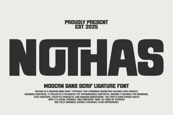
Broad rounded display with shared tops
Nothas is a broad rounded capital display in dark grey on a pale ground: wide letters with tiny counters, a long shared-looking top across the O, T and H, soft rounded shoulders and an even stroke, set as one huge word above two lines of tracked copy and a paragraph of description.
Ideas for this font
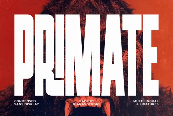
Ultra condensed display sans
Primate is an ultra condensed sans display in white on a red-tinted portrait: very tall narrow caps with flat terminals, a high waist and thin counters, set edge to edge so the letters nearly touch, with three small tracked labels along the foot.
Ideas for this font
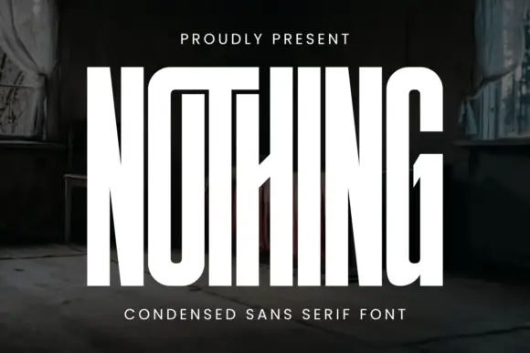
Very tall condensed display
Nothing is an extremely tall condensed display in white on a dark, peeling interior: narrow capitals whose tops join a shared bar, with a central diagonal joint across the middle of the word, flat terminals and hairline counters, and tracked caps above and beneath that name the style.
Ideas for this font
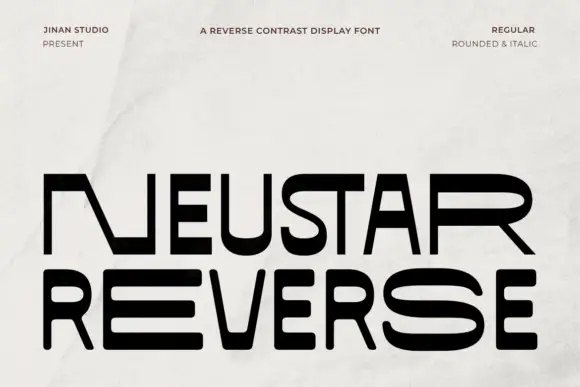
Reverse-contrast geometric display
Neustar Reverse is a wide reverse-contrast display in black on a pale grey ground: heavy horizontal arms and very thin uprights, flat squared terminals, a detached diagonal on the N and an open R bowl, set on two lines with three small tracked notes at the head and a soft paper crease across the sheet.
Same independent foundry
Allow optional Google Analytics to measure visits and catalogue actions. Your search words and notes are not included. Privacy & storage