High-Contrast Display Serif

Hamidlak + The Avenue Editorial
Pairs sculptural editorial warmth with Hamidlak's clean modern geometry.
Inspect The Avenue Editorial specimenDisclosure: MakerFileHub may earn a commission from qualifying purchases via paid links on this page. How our links work.
Brush signature script layered over a heavy vintage serif
Hamidlak layers a loose brush signature over a heavy vintage serif, so the same word appears twice in the sample — once as a signature and once as a stamped plate.
Paid link
Get this fontProject & layout blueprintsAt-a-glance maker compatibility
Cut solid base, outline, and shadow layers in separate vinyl colors and align on registration marks.
Visual anatomy & craft review
The serif half is a fat antique roman with thick bracketed serifs, narrow counters and a heavy vertical stress, and in the sample it is set large and dark behind the script, which is how the pair is meant to be layered. The script half is a loose brush signature with an uneven weight: the H sweeps wide, the m closes quickly, the d and the l rise into light stems and the k splays at the end, all leaning forward with a dry finish on the exits. Used together they reproduce a stamped-and-signed label, where the serif carries the name structurally and the brush adds a personal mark across it. The green ground, the white script, the dark serif and the two small caption lines are presentation; the two faces are the word.
Layered · Vintage · Paired
Two-font hierarchy recipes
Tested contrast partners — pairing Hamidlak with grounded secondary typography.
Hamidlak + The Avenue Editorial
Pairs sculptural editorial warmth with Hamidlak's clean modern geometry.
Inspect The Avenue Editorial specimen
Hamidlak + Abigail
Introduces organic movement on pull-quotes, signatures and gift tags.
Inspect Abigail specimenPractical applications
Concrete hierarchy, scale and production guidance tailored to Hamidlak’s stroke geometry.
The layered pair gives a label both structure and a personal signature, which is how a small producer marks a bottle or a box at 14 pt.
Hierarchy & layout recipe
Set the brand in the serif at 14 pt on a 60 by 90 mm label, layer the script across it at 18 pt, and keep 6 mm of margin so neither layer is cut by the label edge.
Pre-production check
A light brush stroke over a dark serif loses contrast; check the printed label and lighten the serif or darken the script, not both.
The antique serif gives a welcome board its structure while the brush script adds a signed line across it, which suits a period venue.
Hierarchy & layout recipe
Set the greeting in the serif at 14 cm on a 700 by 500 mm board, layer the names in the script at 9 cm across it, and leave 12 cm of margin so both layers stay on the board.
Pre-production check
Two painted layers need the serif to dry first; check the overlap in daylight and keep the script stroke off the thinnest serif parts.
The layered treatment gives a cover its title and a signature in one gesture, and the antique serif holds up over a photograph at 64 pt.
Hierarchy & layout recipe
Set the title in the serif at 64 pt across the upper half of the cover, set the standfirst in the script at 22 pt across it, and leave 20 mm of margin at each side.
Pre-production check
A layered cover line can obscure the serif's letterforms; check the proof at final size and shift the script so it does not sit over the counters.
Technical & licence verification
Confirm included OTF/TTF/WOFF formats, full glyph tables and licence coverage on the live store page before batch production.
Closest visual alternatives
Matched across letterform anatomy, stroke behaviour and craft applications.
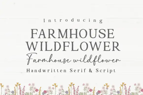
Soft upright serif caps with uneven edges paired with a loose connected script
Farmhouse Wildflower is a two-cut pair in which soft upright serif capitals carry slightly uneven edges and a lighter connected script runs low rounded joins with long strokes leaving the first and last letters.
Ideas for this font
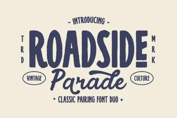
Vintage capitals paired with a script
Roadside is a vintage duo in navy on cream: tall irregular capitals with soft slab ends in a heavy line, paired with a broad slanted connected script beneath, with small vertical notes at both sides, two oval labels and a plain line at the foot naming the pairing.
Ideas for this font
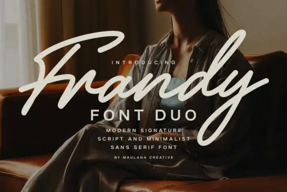
Modern signature script paired with a minimal sans in wide capitals
Frandy pairs a modern signature script with a minimal sans in wide-tracked capitals, so one lockup carries a personal mark and a quiet structural label beneath it.
Ideas for this font
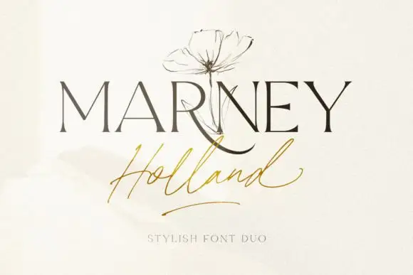
Fine serif and loose signature duo
Marney Holland pairs a tall high-contrast serif capital cut with a loose thin script: the R curls its leg below the serif line, the script runs light through its joins and a long low exit stroke closes the written line.
Ideas for this font
Same independent foundry
Allow optional Google Analytics to measure visits and catalogue actions. Your search words and notes are not included. Privacy & storage