Neutral Sans Workhorse

Esquie + Bielchon
Lets Esquie own the focal silhouette while handling secondary copy, sizing and subheads cleanly.
Inspect Bielchon specimenDisclosure: MakerFileHub may earn a commission from qualifying purchases via paid links on this page. How our links work.
Heavy broad capitals with circular bowls and an enlarged curling Q tail
Esquie places gold capitals over dark foliage, where broad E arms, a substantial U cup and a round Q counter create a compact heavy line, and the Q extends into a large curved tail that drops below the baseline.
Paid link
Get this fontProject & layout blueprintsAt-a-glance maker compatibility
Weld or Unite overlapping script joins into one continuous vector path before sending to the blade.
Visual anatomy & craft review
The forms stay broad and heavy, the bowls round, the arms stretch flat and one tail curls far below. That tail is the character: a short word gains a graphic descender that no other letter supplies, which is why the sample lets it travel under the row. Inspect the actual Q and leave room beneath it, keep 44 pt so the tail keeps its curve and confirm whether the bold styling is included in your file. The tail needs its own room: it travels under the row, so 20 mm of clear ground beneath the Q keeps it off the next line, and the curve flattens at about 30 pt.
Heavy broad capitals with circular bowls and an enlarged curling Q tail
Two-font hierarchy recipes
Tested contrast partners — pairing Esquie with grounded secondary typography.
Esquie + Bielchon
Lets Esquie own the focal silhouette while handling secondary copy, sizing and subheads cleanly.
Inspect Bielchon specimen
Esquie + Rosemode
Grounds bold display lettering with classic typographic authority on posters, badges and apparel.
Inspect Rosemode specimenPractical applications
Concrete hierarchy, scale and production guidance tailored to Esquie’s stroke geometry.
The heavy caps give a bottle weight, and the curling Q carries the detail at 24 pt on a 55 by 70 mm label, where the round bowls stay open on glass.
Hierarchy & layout recipe
Print a 55 by 70 mm label: set the name at 24 pt on one row, keep 14 mm of clear ground beneath for the Q tail, and keep the label dark so the gold letters read.
Pre-production check
The tail cut by a label border looks broken; check the artwork and keep it inside a 5 mm margin.
The compact heavy line sets an appetite-led title, and the broad bowls hold a two-word heading at 56 pt on a page, where the Q tail fills the space below.
Hierarchy & layout recipe
Print a 210 mm page: set the heading at 56 pt on one row, keep 24 mm of clear ground beneath for the tail, and keep the photograph clear of the descender so the curve reads.
Pre-production check
A tail over a busy image disappears; check the page and keep the title on flat colour with 20 mm of clear space.
The gold caps read at a terrace, and the heavy strokes hold a short name at 52 mm on a painted panel, where the curling Q tail gives the row movement.
Hierarchy & layout recipe
Paint a 600 by 300 mm panel: set the name at 52 mm on one row, keep 24 mm of clear ground beneath for the tail, and keep 24 mm of border so the curve is not trimmed.
Pre-production check
A painted tail loses its taper below 30 mm; check the mask artwork and keep the sign at 46 mm.
Technical & licence verification
Confirm included OTF/TTF/WOFF formats, full glyph tables and licence coverage on the live store page before batch production.
Closest visual alternatives
Matched across letterform anatomy, stroke behaviour and craft applications.
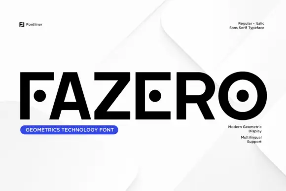
Heavy geometric capitals with detached dots replacing F and E middle arms
Fazero draws very wide black capitals and then cuts them: the F loses a notch from its stem, the E opens at the corner, and the O becomes a heavy ring with a solid dot sitting in the middle.
Ideas for this font
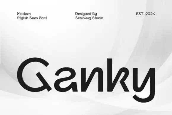
Geometric mixed case with reversed-looking a curves and angular open n and k forms
Ganky draws a modern geometric sans with wide round bowls, cut joins and a few letters that open where the join should close, so a short name looks engineered rather than drawn.
Ideas for this font
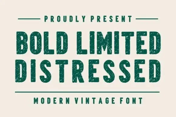
Condensed plain blocks with fine worn texture
Bold Limited Distressed shows tall heavy capitals with softly squared corners and tight inner spaces, where small pale speckles interrupt the green stems without greatly changing the outer silhouettes.
Ideas for this font
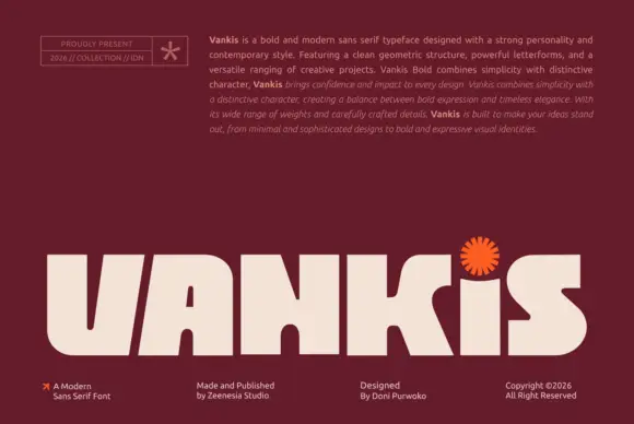
Very heavy broad display with cuts
Vankis is a very heavy broad display in cream on maroon: wide capitals with thick strokes, inward cuts at the joins, squared bowls and a starburst ornament over the final stem, set as one word across the foot of the plate beneath a paragraph of specification text and four footer credits.
Ideas for this font
Same independent foundry
Allow optional Google Analytics to measure visits and catalogue actions. Your search words and notes are not included. Privacy & storage