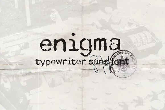
High-Contrast Display Serif

Tall & Tiny Font Duo + Evoire
Pairs sculptural editorial warmth with Tall & Tiny Font Duo's clean modern geometry.
Inspect Evoire specimenDisclosure: MakerFileHub may earn a commission from qualifying purchases via paid links on this page. How our links work.
Heavy narrow capitals and very fine tall letters
Tall & Tiny Font Duo is a hand-drawn pair: a narrow heavy capital face with drawn serifs, and a very fine tall lettering, shown together with line-drawn flowers and insects on a cloudy sky.
Paid link
Get this fontProject & layout blueprintsAt-a-glance maker compatibility
Sturdy stroke walls and open counters weed cleanly on adhesive vinyl, HTV apparel film, and cut cardstock.
Visual anatomy & craft review
TALL is set in a narrow heavy hand with drawn serifs and a few decorative circles in the counters, and TINY beside it in very fine tall strokes, so the same phrase is written in two weights that could hardly be more different. The fine cut is used again beneath for the caption Funny Font Duo + Extras, which shows how it behaves at a smaller size, and the heavy cut carries an ampersand drawn with a loop. Around the words a suite of line drawings — flowers, leaves, a dragonfly, a ladybird, a bee — fills the sky and the hill, and the ground is a soft blue with white clouds. The duo is a playful bundle for children's material and greeting cards: the heavy cut carries a word, the fine cut carries a line, and the extras let a card or a tag be finished in the same drawn language.
A funny duo of thick and thin
Two-font hierarchy recipes
Tested contrast partners — pairing Tall & Tiny Font Duo with grounded secondary typography.
Tall & Tiny Font Duo + Evoire
Pairs sculptural editorial warmth with Tall & Tiny Font Duo's clean modern geometry.
Inspect Evoire specimen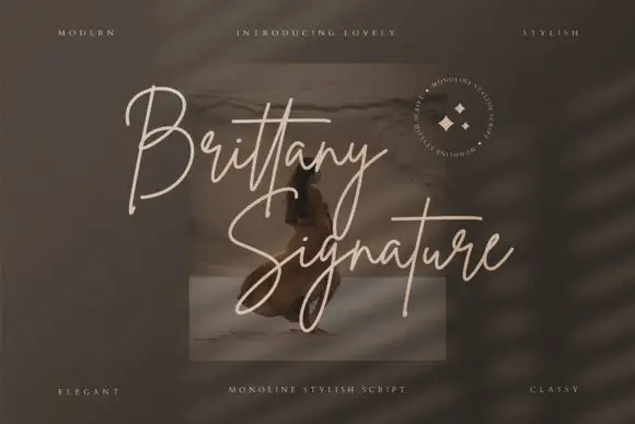
Tall & Tiny Font Duo + Brittany Signature Script
Introduces organic movement on pull-quotes, signatures and gift tags.
Inspect Brittany Signature Script specimenPractical applications
Concrete hierarchy, scale and production guidance tailored to Tall & Tiny Font Duo’s stroke geometry.
Two weights in one hand let a card carry a loud name and a quiet line, and the drawn insects give a plain card a finished look.
Hierarchy & layout recipe
Print a 105 by 148 mm card: set the name at 36 pt in the heavy cut, set the line at 14 pt in the fine cut with 14 mm of clear ground, and hold 12 mm of margin.
Pre-production check
The fine cut at fourteen points can break on a home printer; print one card on the actual machine and check the strokes before the batch.
A hand-drawn pair separates a children's page from the rest of a supplement, and the line drawings fill an opener without photography.
Hierarchy & layout recipe
Print a 230 by 300 mm opener: set the title at 56 pt in the heavy cut, set the standfirst at 10.5 pt with 20 mm of clear ground, and hold 18 mm of margin on both sides.
Pre-production check
Fine strokes can vanish on newsprint; print one opener on the actual paper and check the caption weight before the issue.
A small bag needs a legible word, and the heavy cut reads at a glance while the fine cut adds the child's name underneath it.
Hierarchy & layout recipe
Print a 45 by 30 mm label: set the word at 11 pt in the heavy cut, set the name at 7 pt in the fine cut with 3 mm of clear ground, and hold 3 mm of margin.
Pre-production check
The fine cut below ten points is a risk; print one sheet at the real size and check the name reads before the run.
Technical & licence verification
Confirm included OTF/TTF/WOFF formats, full glyph tables and licence coverage on the live store page before batch production.
Closest visual alternatives
Matched across letterform anatomy, stroke behaviour and craft applications.
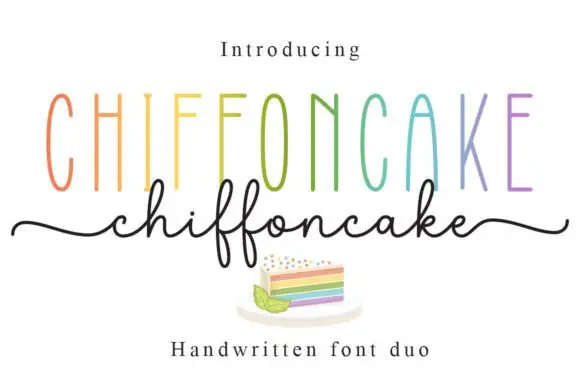
Tall narrow sans and fine looping script duo
Chiffoncake Duo pairs very tall narrow capitals, each in a different pastel tone, with a low connected script whose deep f loops drop below the baseline, and long tails extend from both sides of the lower word above a small cake illustration.
Ideas for this font
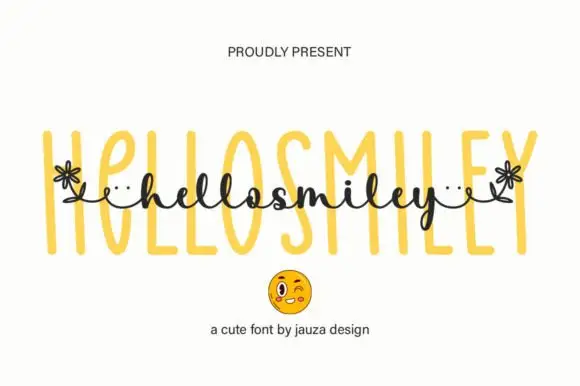
Tall narrow outlined sans paired with a small floral-linked script
Hello Smiley pairs a tall narrow outlined sans with a small script that runs across the middle of the letters, and the script's ends turn into small flowers, so a word reads as a drawn label with a hand-written band across it.
Ideas for this font
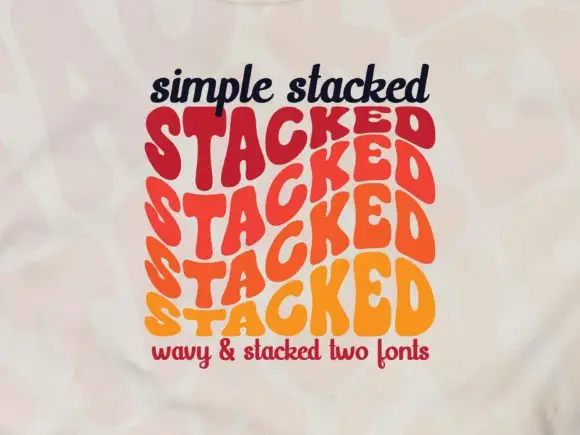
Wavy repeated display letters stacked in three offset rows
Simple Stacked is a wavy display in which rounded capitals repeat down three offset rows, each row bending and stretching the letters differently, so a short word reads as a rainbow of stacked script rather than a plain line.
Ideas for this font
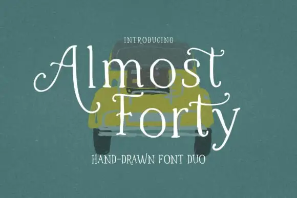
Light hand-drawn serif with curled crossbars paired with a plain companion cut
Almost Forty pairs a light hand-drawn serif whose crossbars curl at the ends with a plainer companion cut, so a title can be drawn and a supporting line can stay quiet in the same family.
Ideas for this font
Same independent foundry
Allow optional Google Analytics to measure visits and catalogue actions. Your search words and notes are not included. Privacy & storage