Modern Grotesque Body

Dusty Western + Headline
Creates crisp high-hierarchy contrast beneath Dusty Western headlines across menus, websites and labels.
Inspect Headline specimenDisclosure: MakerFileHub may earn a commission from qualifying purchases via paid links on this page. How our links work.
Crisp medium-weight spurred Western display serif
Dusty Western is a clean, airy medium-weight Western display serif (zero dusty grunge—100% smooth vectors!) with classic diamond waist spurs.
Paid link
Get this fontProject & layout blueprintsAt-a-glance maker compatibility
Sturdy stroke walls and open counters weed cleanly on adhesive vinyl, HTV apparel film, and cut cardstock.
Visual anatomy & craft review
Dusty Western is a clean medium-weight Western display serif with diamond waist spurs, bracketed serifs and open counters, deliberately smooth rather than distressed, so a word reads as a modern ranch brand rather than a weathered saloon sign. The diamond spur sits at the middle of each stem, which is the detail that makes the face Western, and the smooth vectors mean it prints and cuts predictably. It needs roughly 26 mm for the spur to read as a diamond, and it is best in terracotta on cream or in one ink on kraft.
Crisp-spurred · Airy-frontier · Clean-cut
Two-font hierarchy recipes
Tested contrast partners — pairing Dusty Western with grounded secondary typography.
Dusty Western + Headline
Creates crisp high-hierarchy contrast beneath Dusty Western headlines across menus, websites and labels.
Inspect Headline specimen
Dusty Western + Welcome
Adds a warm human signature touch for 1-to-3-word callouts without competing against structured serif capitals.
Inspect Welcome specimenPractical applications
Concrete hierarchy, scale and production guidance tailored to Dusty Western’s stroke geometry.
A clean spurred Western serif reads as a modern orchard brand, which is what an autumn cider maker is after instead of a distressed rustic look. The diamond spurs stay crisp in a one-colour print, and the open counters keep a long varietal name readable on a 70 mm label.
Hierarchy & layout recipe
Label 70 x 95 mm, name 16 mm, weight 5 pt, 5 mm top arc and 4 mm die margin. Box print 200 x 120 mm, word 50 mm, 20 mm margins. Card 105 x 148 mm, heading 18 mm, details 8/11 pt.
Pre-production check
A curved bottle label rotates the word and a diamond spur on the first letter tips under the arc and gets cut. Keep 5 mm of clear label above the arc, and check one applied label on a filled bottle.
Bracketed Western serifs read as a ranch brand that means business, which is what a livestock or tack business stamps on leather. The smooth vectors cut into a stamp die without a distressed edge to clutter, and the open counters fill cleanly at 10 mm on a tag.
Hierarchy & layout recipe
Leather tag 60 x 40 mm, word 10 mm with 2 mm shoulder clearance. Sign 900 x 600 mm, word 170 mm, 60 mm margins. Label 80 x 60 mm, name 16 mm, 4 mm die margin.
Pre-production check
A hot stamp into 3 mm leather spreads the fill and the diamond spur closes to a fat lozenge. Widen the stamp die by 0.3 mm around the spur, and press one test tag before the order.
A tempered Western serif reads as a summer rodeo that takes itself seriously without looking dusty, which is what a fair committee prints on a programme. The face holds at 160 mm on a gate sign in one colour, and the spurs give the schedule pages a period voice at 9 pt.
Hierarchy & layout recipe
Programme A5, title 40 mm, schedule 8/11 pt on a 13 pt pitch, 12 mm margins. Gate sign 900 x 400 mm, word 160 mm, 60 mm margins. Ticket 90 x 50 mm, word 12 mm, 3 mm margins.
Pre-production check
A programme printed on uncoated stock lets a 9 pt bracket spread and the time column jams against the event name. Keep the schedule in a wider companion face, and check one printed programme before the fair.
Technical & licence verification
Confirm included OTF/TTF/WOFF formats, full glyph tables and licence coverage on the live store page before batch production.
Closest visual alternatives
Matched across letterform anatomy, stroke behaviour and craft applications.
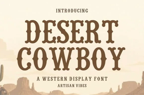
Hand-hewn organic Wood-Type Western slab serif
Desert Cowboy is a warm, hand-hewn Western slab serif softening classic saloon spurs and bracketed feet with organic carved edges.
Ideas for this font
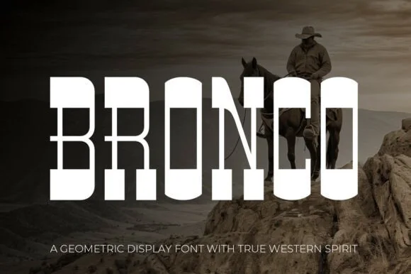
Tall architectural geometric spur-slab Western display
Bronco is a tall, clean-lined geometric Western slab serif pairing crisp rectangular counters with razor-sharp horizontal waist spurs.
Ideas for this font
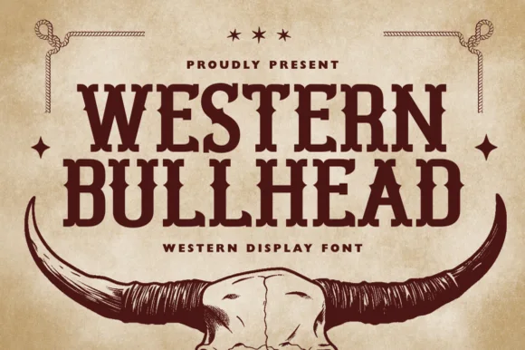
Western display slab with skull mark
Western Bullhead is a western display slab in dark brown on aged tan: heavy bracketed serifs, spurred stems, a notched crossbar and a tight even spacing, presented above a longhorn skull illustration with rope corners, so the pair reads as a ranch brand rather than a modern serif.
Ideas for this font
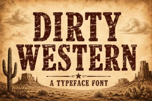
Heavily weathered Wild-West woodtype & saloon slab serif
Dirty Western is a rugged frontier slab serif stamped with coarse woodblock grain, pitted distress, and classic 1880s wanted-poster authority.
Ideas for this font
Same independent foundry
Allow optional Google Analytics to measure visits and catalogue actions. Your search words and notes are not included. Privacy & storage