Modern Grotesque Body

Niken + Clyne Sans
Creates crisp high-hierarchy contrast beneath Niken headlines across menus, websites and labels.
Inspect Clyne Sans specimenDisclosure: MakerFileHub may earn a commission from qualifying purchases via paid links on this page. How our links work.
Rounded serif with rolled initials
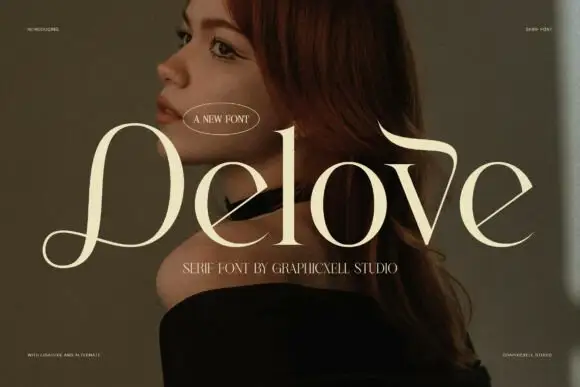
Niken is a rounded serif in cream over a warm portrait: mixed case with an oversized rolled N, soft curved endings, thick stems and open bowls, set as one word with two small lines above and two beneath, the second in a script.
Paid link
Get this fontProject & layout blueprintsAt-a-glance maker compatibility
Sturdy stroke walls and open counters weed cleanly on adhesive vinyl, HTV apparel film, and cut cardstock.
Visual anatomy & craft review
The word sits across the image and the drawing is a serif with rolled details: the N opens into a curl, the endings are soft, and the stems are heavy, so the face reads as a warm display serif rather than as a book face. That construction sets a moderate size floor, because the curls close when the letters shrink, and the placement over a warm-toned portrait shows that the cream holds against a mid-tone ground. The small lines above and the two beneath carry the studio and the style, and the second of those is set in a script, which suggests the pairing the face is meant for. Because the letters are rounded and heavy, the face suits a cover, a label and a menu header, and the rolled initial is the detail a buyer should check at the intended size.
Serif, rounded, warm, editorial
Two-font hierarchy recipes
Tested contrast partners — pairing Niken with grounded secondary typography.
Niken + Clyne Sans
Creates crisp high-hierarchy contrast beneath Niken headlines across menus, websites and labels.
Inspect Clyne Sans specimen
Niken + Lovely
Adds a warm human signature touch for 1-to-3-word callouts without competing against structured serif capitals.
Inspect Lovely specimenPractical applications
Concrete hierarchy, scale and production guidance tailored to Niken’s stroke geometry.
A rounded serif gives a food cover warmth, and the rolled initial makes a short title recognisable on a shelf. Warmth sells food before the photograph does.
Hierarchy & layout recipe
Set the title at 80 mm cap height across 190 mm, the subtitle in a 9.5 pt serif, and the issue at 8 pt. Print one ink on a matte stock and keep 22 mm margins.
Pre-production check
Check the title at 80 mm, where a curl can clot; keep the counters open. Confirm the 8 pt issue survives lamination and that the title clears the trim.
A rounded serif reads as rich rather than clinical, and the heavy stems hold on a small die with a dark ink. A rich mark suits a rich product.
Hierarchy & layout recipe
Print a 70 by 50 mm label: the brand at 13 pt, the bar at 8 pt, and the cocoa at 7 pt. Keep 4 mm inside the die and keep the rolled initial above 0.4 mm.
Pre-production check
Check the 13 pt brand on a small die, where a curl can fill; keep it above 0.4 mm. Confirm the 7 pt cocoa reads on a box edge and that the label holds in a warm room.
A rounded serif gives a menu a warm formal register, and the rolled initial frames the first course. A menu should feel hospitable, not formal.
Hierarchy & layout recipe
A5 menu: the heading at 22 pt, the courses at 10 pt, and the prices at 9 pt. Keep 20 mm margins and print one ink on a cream card. Leave 16 mm at the foot for the date line.
Pre-production check
Check the 22 pt heading, where a curl can crowd the first course line; keep 8 mm leading. Confirm the 9 pt prices keep a 4.5:1 contrast and that the menu lies flat on a plate.
Technical & licence verification
Confirm included OTF/TTF/WOFF formats, full glyph tables and licence coverage on the live store page before batch production.
Closest visual alternatives
Matched across letterform anatomy, stroke behaviour and craft applications.
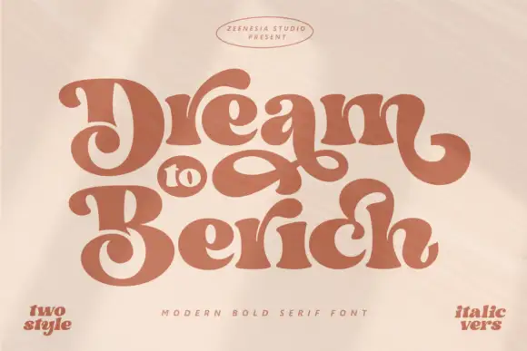
Heavy soft retro lettering with large interwoven loops
Dream to Berich shows orange mixed-case letters with thick rounded strokes and tight curved counters, where the large D and B capitals curl inward and a long loop fills the gap between the two title rows on a pale cover that advertises a two-style and an italic version in the corners.
Ideas for this font
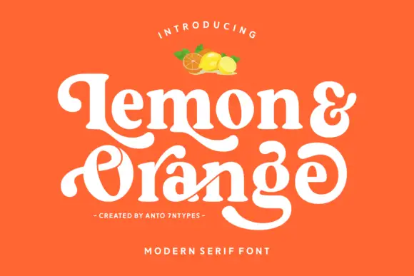
Rounded retro serif with loops
Lemon and Orange is a heavy rounded serif in cream on orange: fat stems with curled terminals, a looping O whose stroke escapes the bowl, a drawn ampersand and a swash that runs under the second word, with a small illustration of fruit above and two tracked lines beneath.
Ideas for this font
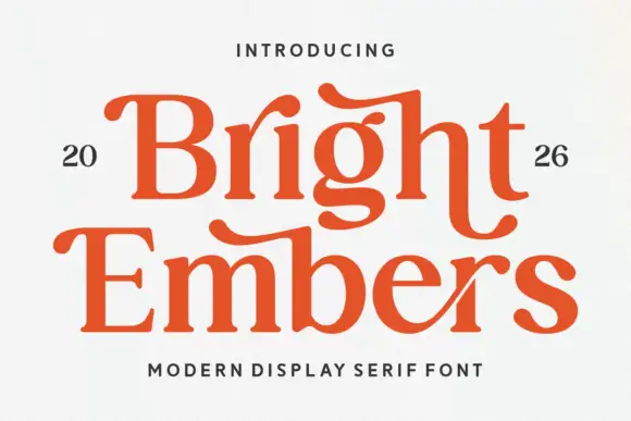
Substantial serif with wavy upper bars and curled lower terminals
Bright Embers is a substantial serif in which the bowls stay broad, the stems hold firm, selected upper bars wave and the t and final s turn into low outward curves, so a two-row heading reads as warm editorial lettering.
Ideas for this font
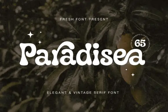
Soft heavy serif with curled entries
Paradisea is a soft heavy serif in cream over dark foliage: fat stems with round terminals, curled entries on the P and the d and a high waist, set as one word with two tracked notes above and beneath and a round badge at the right naming the alternates.
Ideas for this font
Same independent foundry
Allow optional Google Analytics to measure visits and catalogue actions. Your search words and notes are not included. Privacy & storage