Neutral Sans Workhorse

Dotted Back to School + Olline
Lets Dotted Back to School own the focal silhouette while handling secondary copy, sizing and subheads cleanly.
Inspect Olline specimenDisclosure: MakerFileHub may earn a commission from qualifying purchases via paid links on this page. How our links work.
Uneven rounded capitals with pale dot rows and dashed inset borders
Dotted Back to School sets fat rounded capitals in bright colours with a hand-drawn outline and a regular grid of white dots punched through the fill, plus numerals and punctuation in the same construction.
Paid link
Get this fontProject & layout blueprintsAt-a-glance maker compatibility
Sturdy stroke walls and open counters weed cleanly on adhesive vinyl, HTV apparel film, and cut cardstock.
Visual anatomy & craft review
ABCDE fills the card in pink, coral, lime, turquoise and yellow, and every letter is a soft shape with a fine sketched contour and a shadow offset to the right, filled evenly with round white dots. Under the alphabet rows the rest of the set is shown at a much smaller size in a single flat pink, which demonstrates that the pattern survives reduction. A caption at the top names the bundle and a line under it states the bonus formats, with a small stamp at the lower left. The dots are on a grid rather than scattered, which is what gives the face its regularity, and the black contour is what keeps adjacent letters apart when the whole word is a field of dots.
Uneven rounded capitals with pale dot rows and dashed inset borders
Two-font hierarchy recipes
Tested contrast partners — pairing Dotted Back to School with grounded secondary typography.
Dotted Back to School + Olline
Lets Dotted Back to School own the focal silhouette while handling secondary copy, sizing and subheads cleanly.
Inspect Olline specimen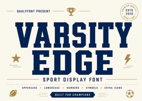
Dotted Back to School + Varsity Edge
Grounds bold display lettering with classic typographic authority on posters, badges and apparel.
Inspect Varsity Edge specimenPractical applications
Concrete hierarchy, scale and production guidance tailored to Dotted Back to School’s stroke geometry.
The face is cheerful for a first-week worksheet, and the simple contour copies cleanly enough for a class set on the room machine.
Hierarchy & layout recipe
Print an A4 worksheet: set the header at 34 pt on one row, keep 14 mm of clear ground beneath before the first task at 11 pt, and hold 16 mm of margin at both sides.
Pre-production check
Photocopiers drop the small dots; copy one sheet on the school machine and check the letters stay distinct.
The dotted fill suits a party for a child old enough to read the card, and the bright palette reads at a glance on a fridge door.
Hierarchy & layout recipe
Print a 105 by 148 mm invitation: set the name at 36 pt across two rows, keep 15 mm of clear ground beneath before the details at 8.5 pt, and hold 12 mm from the shadow to the card edge.
Pre-production check
Dots merge at small sizes; print one invitation at the finished size and check the counters first.
The lettering says school before the box is opened, and the dotted fill gives a plain kraft carton a printed look without a full wrap.
Hierarchy & layout recipe
Print a 70 by 50 mm box label: set the service name at 16 pt on one row, keep 6 mm of clear ground beneath before the month at 5 pt, and hold 5 mm from the outline to the label edge.
Pre-production check
Kraft stock mutes the bright fills; print one label on the real material and check the dots before the order.
Technical & licence verification
Confirm included OTF/TTF/WOFF formats, full glyph tables and licence coverage on the live store page before batch production.
Closest visual alternatives
Matched across letterform anatomy, stroke behaviour and craft applications.
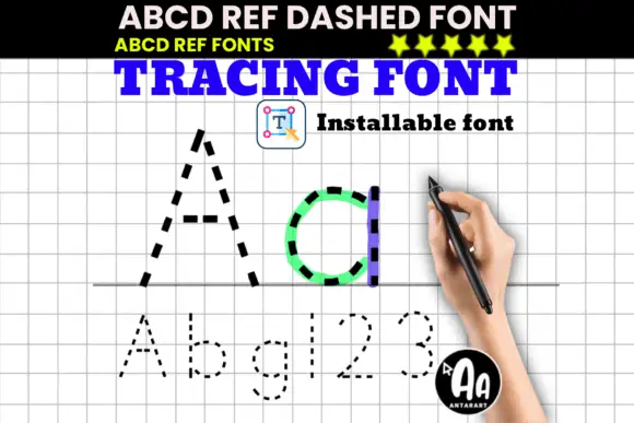
Dashed upright letter paths shown in large A and d with smaller letters and numerals
ABCD Ref Dashed and Dotted are tracing faces: the same letterforms drawn as a dashed outline for tracing and as a dotted form for dot-to-dot practice, meant to sit on ruled paper for handwriting drills.
Ideas for this font
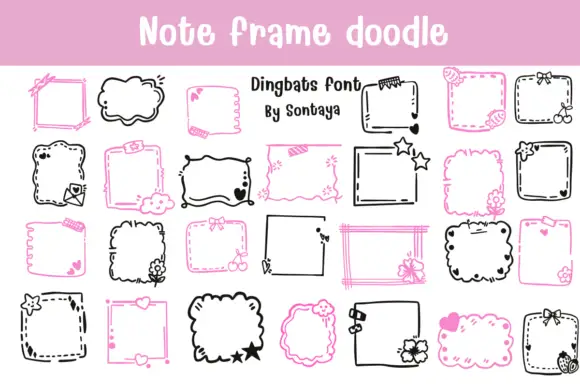
Note-frame dingbat set
Note Frame Doodle is a dingbat sheet on a pink band and white ground: many hand-drawn note frames in black and pink, some straight and ruled, some cloud-like with scalloped edges, decorated with small flowers, bows, stars and hearts, with a lined title at the top and a credit in the middle.
Ideas for this font
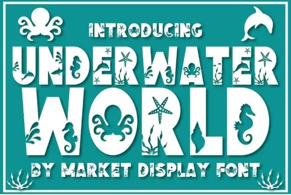
Marine-cutout display
Underwater World is a heavy display in white on a teal field: fat capitals whose strokes are cut by marine shapes, with an octopus in one counter, a seahorse inside a stem, starfish and seaweed growing from the letters, plus an outlined intro line and a smaller outlined line along the foot.
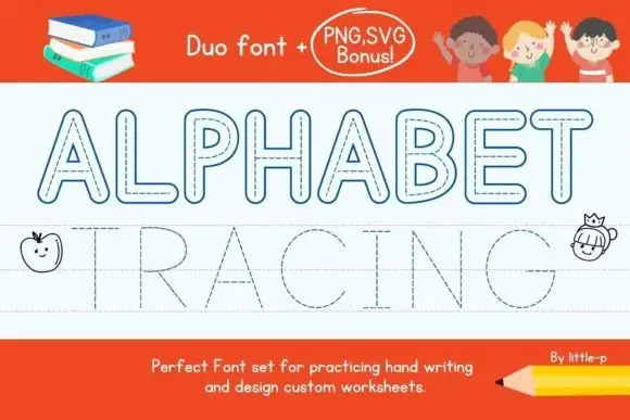
Outlined capitals with dashed centre paths shown beside a fine dotted tracing row
Alphabet Tracing shows two distinct uppercase rows on a ruled sheet, where outlined rounded letters with dashed centre paths sit above much finer dotted letters aligned to guide lines, the A and R keep visible counters and the long straight strokes make the two path treatments easy to compare.
Ideas for this font
Same independent foundry
Allow optional Google Analytics to measure visits and catalogue actions. Your search words and notes are not included. Privacy & storage