Neutral Sans Workhorse

Dinosaur + Hermano
Lets Dinosaur own the focal silhouette while handling secondary copy, sizing and subheads cleanly.
Inspect Hermano specimenDisclosure: MakerFileHub may earn a commission from qualifying purchases via paid links on this page. How our links work.
Heavy white capitals interrupted by large dinosaur-shaped silhouettes
Dinosaur Pui Art sets heavy white block capitals and cuts a different dinosaur silhouette into each letter, so the O holds a full body and the R carries a smaller figure in its counter.
Paid link
Get this fontProject & layout blueprintsAt-a-glance maker compatibility
Sturdy stroke walls and open counters weed cleanly on adhesive vinyl, HTV apparel film, and cut cardstock.
Visual anatomy & craft review
The word fills two rows on a blue ground with faded dinosaurs drifting behind, the letters wide and square with flat tops and straight sides. Each silhouette is placed to fit the counter it occupies, and the shapes are cut out rather than drawn on, which keeps the letterform intact. Two tracked captions frame the sample. Because the figures belong to particular glyphs, a different word shows a different set of animals, so the design has to be checked letter by letter before it is used as a mark. The heavy blocks give the face enough weight to survive a vinyl cut.
Heavy white capitals interrupted by large dinosaur-shaped silhouettes
Two-font hierarchy recipes
Tested contrast partners — pairing Dinosaur with grounded secondary typography.
Dinosaur + Hermano
Lets Dinosaur own the focal silhouette while handling secondary copy, sizing and subheads cleanly.
Inspect Hermano specimen
Dinosaur + Worldstar
Grounds bold display lettering with classic typographic authority on posters, badges and apparel.
Inspect Worldstar specimenPractical applications
Concrete hierarchy, scale and production guidance tailored to Dinosaur’s stroke geometry.
The cut silhouettes carry the theme without extra decorations, and the heavy blocks read across a garden at a child's eye level.
Hierarchy & layout recipe
Print a 500 by 700 mm board: set the greeting at 80 pt across two rows, keep 26 mm of clear ground beneath before the age at 20 pt, and keep 28 mm of border so no figure is cut at the edge.
Pre-production check
Only some letters hold a figure; check your own word at final size before the board is made.
The silhouettes open a topic before a pupil reads the title, and the block letters stay clear on a photocopied worksheet.
Hierarchy & layout recipe
Print an A4 worksheet: set the header at 40 pt on one row, keep 14 mm of clear ground beneath before the first question at 11 pt, and keep 16 mm of margin on both sides of the sheet.
Pre-production check
Fine figures blur on a cheap copier; check a copy before running a class set. Request a proof on the actual stock before signing off.
The cut figures signal a children's trail, and the heavy white letters stay readable on a low panel in bright daylight and from a distance.
Hierarchy & layout recipe
Print a 420 by 297 mm panel: set the trail title at 66 pt on one row, keep 22 mm of clear ground beneath before the first step at 14 pt, and keep 20 mm of border around the panel frame.
Pre-production check
Gloss panels reflect daylight; check where it hangs before choosing the finish. Order one sample before committing to the run.
Technical & licence verification
Confirm included OTF/TTF/WOFF formats, full glyph tables and licence coverage on the live store page before batch production.
Closest visual alternatives
Matched across letterform anatomy, stroke behaviour and craft applications.
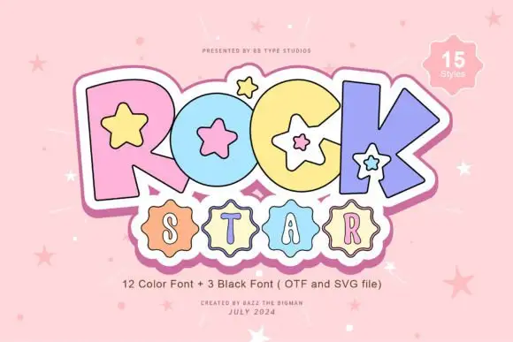
Pastel starred block display
Rock Star is a pastel block display on a pink ground: fat outlined capitals in four pastel colours with white star counters and a white keyline, a scalloped badge under them holding a second word, and a corner badge that names the count of styles.
Ideas for this font
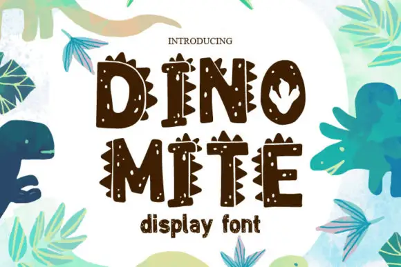
Narrow irregular capitals with sharp side spikes, scattered pale spots and a footprint-like O
Dinomite is a hand-drawn display face whose caps carry dinosaur features: rows of triangular plates along the tops, small dot clusters inside the strokes and a footprint cut into one counter.
Ideas for this font
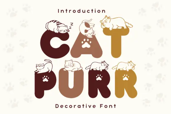
Rounded heavy capitals topped by resting cat drawings with paw-shaped counters
Cat Purr is a colour font that draws fat rounded letters in warm browns and golds, sets a white paw print in most counters, and rests a drawn cat on top of nearly every letter.
Ideas for this font
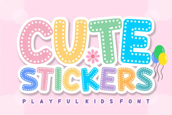
Dashed-inset sticker capitals
Cute Stickers shows thick rounded capitals with short white dash marks following the inner contours. The C curves broadly, the T carries a soft wide top, the strokes stay even and heavy, and the smaller line beneath repeats the same dashed decoration.
Ideas for this font
Same independent foundry
Allow optional Google Analytics to measure visits and catalogue actions. Your search words and notes are not included. Privacy & storage