Neutral Sans Workhorse

Dinomite + Memoir Slang
Lets Dinomite own the focal silhouette while handling secondary copy, sizing and subheads cleanly.
Inspect Memoir Slang specimenDisclosure: MakerFileHub may earn a commission from qualifying purchases via paid links on this page. How our links work.
Narrow irregular capitals with sharp side spikes, scattered pale spots and a footprint-like O
Dinomite is a hand-drawn display face whose caps carry dinosaur features: rows of triangular plates along the tops, small dot clusters inside the strokes and a footprint cut into one counter.
Paid link
Get this fontProject & layout blueprintsAt-a-glance maker compatibility
Sturdy stroke walls and open counters weed cleanly on adhesive vinyl, HTV apparel film, and cut cardstock.
Visual anatomy & craft review
DINO over MITE fills the middle of the card in a warm brown on a pale ground, drawn with thick uneven strokes and slightly tilted letters, so the word looks written with a brush rather than built. Rows of rounded plates run along the tops of the letters, a scatter of small dots and dashes sits inside most strokes, and the O holds a three-toed footprint instead of a counter. Around the words a watercolour jungle is painted in soft greens and teals with ferns, leaves and the silhouettes of two dinosaurs at the edges. A caption at the top introduces the face and one below names it. The style is playful and hand-made rather than polished, and it holds at moderate sizes because the plates and dots are drawn large enough to survive a print.
Narrow irregular capitals with sharp side spikes, scattered pale spots and a footprint-like O
Two-font hierarchy recipes
Tested contrast partners — pairing Dinomite with grounded secondary typography.
Dinomite + Memoir Slang
Lets Dinomite own the focal silhouette while handling secondary copy, sizing and subheads cleanly.
Inspect Memoir Slang specimen
Dinomite + Alerigue
Grounds bold display lettering with classic typographic authority on posters, badges and apparel.
Inspect Alerigue specimenPractical applications
Concrete hierarchy, scale and production guidance tailored to Dinomite’s stroke geometry.
The plates and the footprint carry the theme in one word, and the hand-drawn strokes keep the card from looking like a licensed design.
Hierarchy & layout recipe
Print a 105 by 148 mm invitation: set the name at 40 pt across two rows, keep 15 mm of clear ground beneath before the details at 8.5 pt, and hold 12 mm of margin so no plate is cut.
Pre-production check
The dot clusters close up below 20 pt; print one card at the finished size and check the pattern before the batch.
The face gives a worksheet a subject children already like, and the thick strokes stay legible at the back of a classroom.
Hierarchy & layout recipe
Print an A4 worksheet: set the header at 38 pt on one row, keep 15 mm of clear ground beneath before the first task at 11 pt, and hold 16 mm of margin at both sides of the sheet.
Pre-production check
The painted background is part of the sample, not the font; print one sheet without it to check the letters stand alone.
The letterforms suit a family trail, and the warm brown on a pale board reads clearly in daylight where a light face would wash out.
Hierarchy & layout recipe
Print a 600 by 400 mm board: set the trail name at 90 pt across two rows, keep 24 mm of clear ground beneath before the first stop at 14 pt, and hold 26 mm of border so the plates stay whole.
Pre-production check
Warm browns go flat on foam board; print one board and check the contrast of the inner dots before the set.
Technical & licence verification
Confirm included OTF/TTF/WOFF formats, full glyph tables and licence coverage on the live store page before batch production.
Closest visual alternatives
Matched across letterform anatomy, stroke behaviour and craft applications.
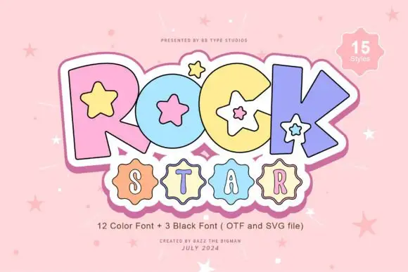
Pastel starred block display
Rock Star is a pastel block display on a pink ground: fat outlined capitals in four pastel colours with white star counters and a white keyline, a scalloped badge under them holding a second word, and a corner badge that names the count of styles.
Ideas for this font
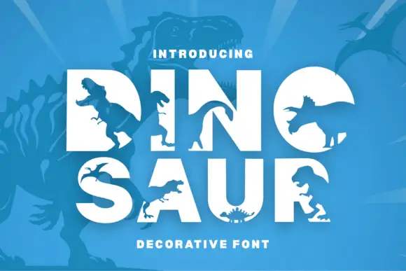
Heavy white capitals interrupted by large dinosaur-shaped silhouettes
Dinosaur Pui Art sets heavy white block capitals and cuts a different dinosaur silhouette into each letter, so the O holds a full body and the R carries a smaller figure in its counter.
Ideas for this font
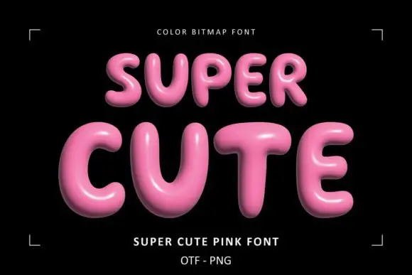
Glossy pink rounded display
Super Cute Font is a colour display on a black ground: glossy pink rounded capitals with soft highlights, dark shaded undersides and a slight taper, set in two lines inside small corner brackets, with a small note above and two plain lines beneath naming the style and the formats.
Ideas for this font
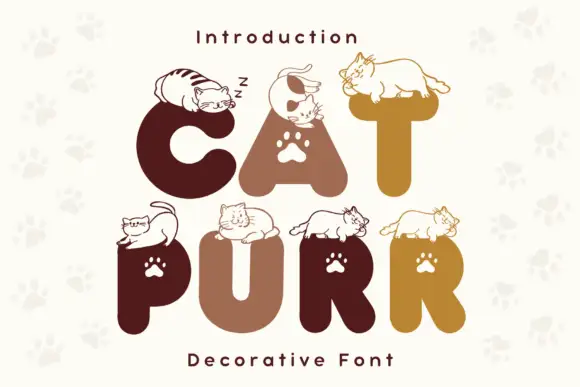
Rounded heavy capitals topped by resting cat drawings with paw-shaped counters
Cat Purr is a colour font that draws fat rounded letters in warm browns and golds, sets a white paw print in most counters, and rests a drawn cat on top of nearly every letter.
Ideas for this font
Allow optional Google Analytics to measure visits and catalogue actions. Your search words and notes are not included. Privacy & storage