High-Contrast Display Serif

Davish Family + Aureline
Pairs sculptural editorial warmth with Davish Family's clean modern geometry.
Inspect Aureline specimenDisclosure: MakerFileHub may earn a commission from qualifying purchases via paid links on this page. How our links work.
Heavy condensed capitals with a small triangular A counter and broad rounded D bowl
Davish is a grotesque family of twelve fonts in which the bold cut does the talking: squared bowls, flat terminals, closed apertures and a heavy weight that fills a wide measure.
Paid link
Get this fontProject & layout blueprintsAt-a-glance maker compatibility
Sturdy stroke walls and open counters weed cleanly on adhesive vinyl, HTV apparel film, and cut cardstock.
Visual anatomy & craft review
DAVISH sits across the middle of the frame in a deep plum on a city skyline at dusk, and the letters are all the same width apart from the S and the I, which is the sign of a family designed on a shared skeleton rather than drawn letter by letter. The bowls are squared off at the corners, the stroke ends are flat, and the counters are tall rectangles, so the word looks built from blocks. Under the word a lighter cut names the product in one line, and a badge at the top right marks the set at twelve fonts. The italic of the lighter cut is used in the presented line at the top, which shows the range in one page: the family runs from a thin condensed through the bold display weight to a slanted text face. Because the bold is only slightly wider than the regular, a headline and a caption can share a column without realigning. This is the practical sort of family a small brand can build an identity from: one voice, many weights, no display ornament to date it.
Heavy condensed capitals with a small triangular A counter and broad rounded D bowl
Two-font hierarchy recipes
Tested contrast partners — pairing Davish Family with grounded secondary typography.
Davish Family + Aureline
Pairs sculptural editorial warmth with Davish Family's clean modern geometry.
Inspect Aureline specimen
Davish Family + Stylish
Introduces organic movement on pull-quotes, signatures and gift tags.
Inspect Stylish specimenPractical applications
Concrete hierarchy, scale and production guidance tailored to Davish Family’s stroke geometry.
One family covers the wordmark, the headings and the body without hiring a second typeface, and the squared grotesque reads as current without being fashionable.
Hierarchy & layout recipe
Print an A4 identity sheet: set the logotype at 64 pt across the top, keep 20 mm of clear ground beneath before the colour chips at 9 pt, and hold 16 mm of margin on all four sides of the sheet.
Pre-production check
Bold weights gain weight on uncoated stock; print one sheet and compare the logotype with the on-screen weight before the set is fixed.
The squared bowls give a masthead a hard urban edge, and the shared width across the family lets the section heads align with the logo for free.
Hierarchy & layout recipe
Print a 230 by 300 mm cover: set the masthead at 88 pt across the full measure, keep 28 mm of clear ground beneath before the cover line at 14 pt, and hold 20 mm from the last letter to the right trim.
Pre-production check
Every letter of a masthead prints as a separate inked area; check the trap on a proof before the cover run.
The plain weight keeps an adult education handbook from looking like a child's workbook, and the bold cut still reads on a shelf at a distance.
Hierarchy & layout recipe
Print an A5 handbook cover: set the course title at 36 pt across two rows, keep 16 mm of clear ground beneath before the term at 10 pt, and hold 14 mm from the title block to the spine edge.
Pre-production check
Tight leading closes the counters in the bold; print one cover at the final size and check the rows do not touch before the copy order.
Technical & licence verification
Confirm included OTF/TTF/WOFF formats, full glyph tables and licence coverage on the live store page before batch production.
Closest visual alternatives
Matched across letterform anatomy, stroke behaviour and craft applications.
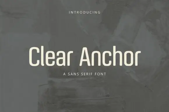
Condensed mixed case with narrow bowls and softly rounded corners
Clear Anchor sets a humanist sans in cream over a grey painted field, its shoulders rounded, its strokes even and its capitals just narrow enough to sit calmly in a line.
Ideas for this font
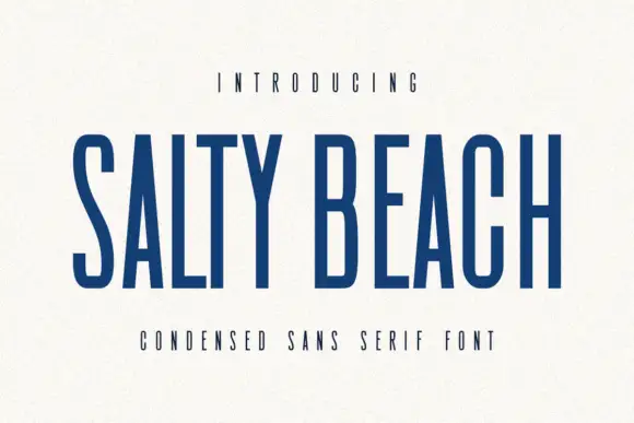
Tall narrow sans
Salty Beach is a tall narrow sans in navy on an off-white sheet: capitals with flat endings, compressed rounded bowls, a low middle bar and an even stroke, with tracked caps above and beneath that name the style.
Ideas for this font
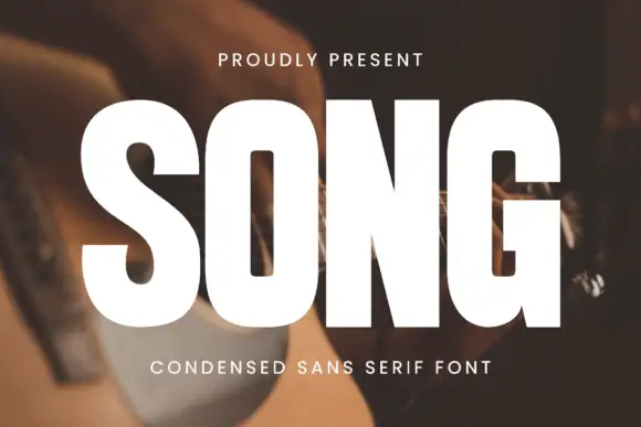
Heavy condensed sans
Song is a heavy condensed sans in white over a photograph of a guitar being played: tall capitals with rounded rectangular counters, a square G opening and an even heavy stroke, set as one large word with a small tracked line above and a plain line beneath.
Ideas for this font
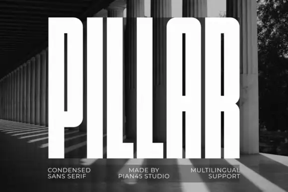
Extremely tall heavy capitals
Pillar is an extremely tall heavy sans in white over a black-and-white photograph of a colonnade: capitals with narrow vertical slots, flat tops, a rounded arch-top A and an even thick stroke, set as one word filling the frame with three small tracked notes along the foot.
Ideas for this font
Same independent foundry
Allow optional Google Analytics to measure visits and catalogue actions. Your search words and notes are not included. Privacy & storage