High-Contrast Display Serif

Clear Anchor + Resquel
Pairs sculptural editorial warmth with Clear Anchor's clean modern geometry.
Inspect Resquel specimenDisclosure: MakerFileHub may earn a commission from qualifying purchases via paid links on this page. How our links work.
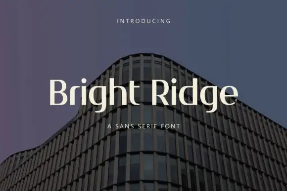
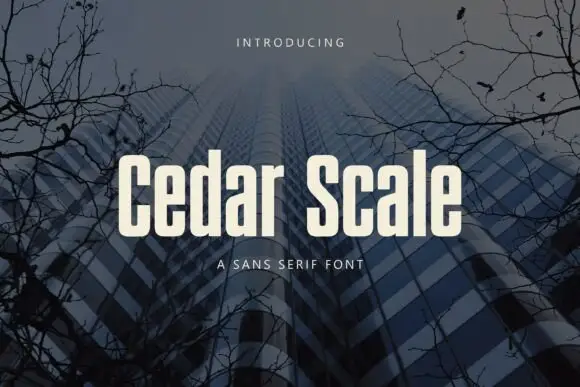
Condensed mixed case with narrow bowls and softly rounded corners
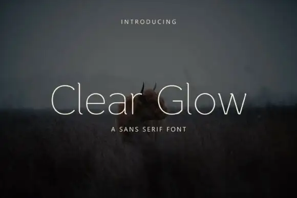
Clear Anchor sets a humanist sans in cream over a grey painted field, its shoulders rounded, its strokes even and its capitals just narrow enough to sit calmly in a line.
Paid link
Get this fontProject & layout blueprintsAt-a-glance maker compatibility
Sturdy stroke walls and open counters weed cleanly on adhesive vinyl, HTV apparel film, and cut cardstock.
Visual anatomy & craft review
The two words run in mixed case, the C and the l drawing soft curves, the e and the a keeping wide open apertures and the r with a short arm that ends cleanly. There is no contrast to speak of, and nothing is squared off, so the face reads as neutral with a slightly warmer tone than a grotesque. Two tracked captions frame the sample. This is a text-capable sans: it holds a heading, it sets a menu and it stays readable at ten points, which is the point of a face like this and the reason it will not be remembered for its personality.
Condensed mixed case with narrow bowls and softly rounded corners
Two-font hierarchy recipes
Tested contrast partners — pairing Clear Anchor with grounded secondary typography.
Clear Anchor + Resquel
Pairs sculptural editorial warmth with Clear Anchor's clean modern geometry.
Inspect Resquel specimen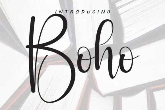
Clear Anchor + Boho
Introduces organic movement on pull-quotes, signatures and gift tags.
Inspect Boho specimenPractical applications
Concrete hierarchy, scale and production guidance tailored to Clear Anchor’s stroke geometry.
The calm letterforms read as competence rather than fashion, and the open apertures stay legible on a sign at the end of a corridor.
Hierarchy & layout recipe
Print a 600 by 300 mm sign: set the clinic name at 60 mm on one row, keep 22 mm of clear ground beneath before the hours at 14 mm, and keep 28 mm of border so the letters sit inside the panel.
Pre-production check
Thin arms thin further in vinyl; check a cut test before the sign is produced. Request a proof on the actual stock before signing off.
The humanist shapes hold up in continuous text, and the open counters keep a long column readable at the small sizes a local paper uses.
Hierarchy & layout recipe
Print an A4 page: set the body at 10 pt with 14 pt leading, keep 14 mm of clear ground at the outer margin before the folio at 8 pt, and keep 16 mm of margin from the trim on all sides.
Pre-production check
Newsprint thickens strokes; check a proof on the actual paper before the first issue. Order one sample before committing to the run.
A neutral sans keeps a long document consistent, and the warm shapes stay friendly on a handout that students actually have to read.
Hierarchy & layout recipe
Print an A4 handout: set the section head at 18 pt on one row, keep 8 mm of clear ground beneath before the body at 10 pt, and keep 16 mm of margin from the text block on both sides.
Pre-production check
Photocopiers blur small type; check a copy before printing the pack. Test it on the real material before the run is booked.
Technical & licence verification
Confirm included OTF/TTF/WOFF formats, full glyph tables and licence coverage on the live store page before batch production.
Closest visual alternatives
Matched across letterform anatomy, stroke behaviour and craft applications.
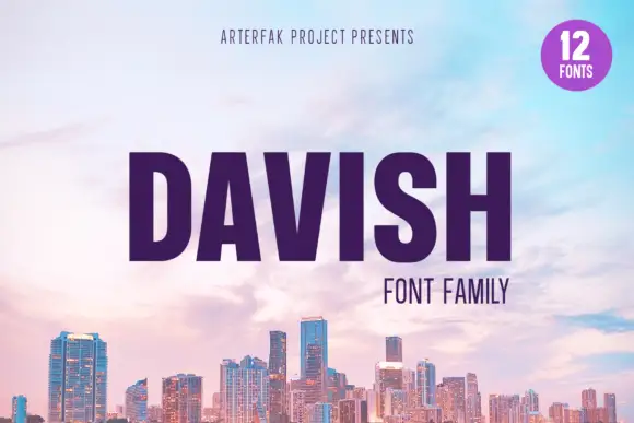
Heavy condensed capitals with a small triangular A counter and broad rounded D bowl
Davish is a grotesque family of twelve fonts in which the bold cut does the talking: squared bowls, flat terminals, closed apertures and a heavy weight that fills a wide measure.
Ideas for this font
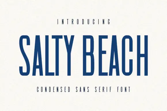
Tall narrow sans
Salty Beach is a tall narrow sans in navy on an off-white sheet: capitals with flat endings, compressed rounded bowls, a low middle bar and an even stroke, with tracked caps above and beneath that name the style.
Ideas for this font
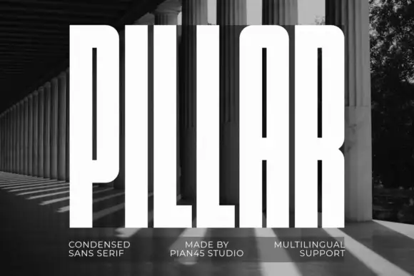
Extremely tall heavy capitals
Pillar is an extremely tall heavy sans in white over a black-and-white photograph of a colonnade: capitals with narrow vertical slots, flat tops, a rounded arch-top A and an even thick stroke, set as one word filling the frame with three small tracked notes along the foot.
Ideas for this font
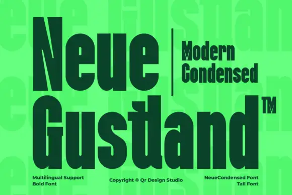
Very heavy condensed display sans
Neue Gustland is a very heavy condensed mixed case shown in dark green on a bright acid ground: tall narrow letters with tight bowls, a sharply cut N diagonal and thick even strokes, set in two large lines with a small tracked block beside the first line and three notes along the foot.
Ideas for this font
Same independent foundry
Allow optional Google Analytics to measure visits and catalogue actions. Your search words and notes are not included. Privacy & storage