High-Contrast Display Serif

Cyprus Sunrise Duo + Stanza
Pairs sculptural editorial warmth with Cyprus Sunrise Duo's clean modern geometry.
Inspect Stanza specimenDisclosure: MakerFileHub may earn a commission from qualifying purchases via paid links on this page. How our links work.
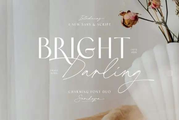
Rounded uppercase paired with a connected sloping script and a sweeping R leg
Cyprus Sunrise Duo places white rounded capitals above a flowing script word on a beach photograph, where the upper R sends a long curved leg beneath the following letters and the script S opens a large lower loop before the remaining letters connect on a rising rhythm.
Paid link
Get this fontProject & layout blueprintsAt-a-glance maker compatibility
Fine grain and micro-texture excel in 300 DPI print, sublimation, and screen print rather than small vinyl weeding.
Visual anatomy & craft review
The caps stay round and even, the R leg sweeps under its neighbours, the script joins rise slightly and the S loop drops low. The two voices are clearly different cuts rather than one weight change, which is why the cover shows a sans line over a script line and nothing else. The photograph, date and small captions belong to the holiday theme rather than to the files, so keep the script away from factual text and give long finishing strokes room before promising a pairing.
Duo · Rounded caps · Sloping script
Two-font hierarchy recipes
Tested contrast partners — pairing Cyprus Sunrise Duo with grounded secondary typography.
Cyprus Sunrise Duo + Stanza
Pairs sculptural editorial warmth with Cyprus Sunrise Duo's clean modern geometry.
Inspect Stanza specimen
Cyprus Sunrise Duo + Simple Alphabet
Introduces organic movement on pull-quotes, signatures and gift tags.
Inspect Simple Alphabet specimenPractical applications
Concrete hierarchy, scale and production guidance tailored to Cyprus Sunrise Duo’s stroke geometry.
The rounded caps and flowing script suit a seaside card, and both voices fit at 26 pt and 20 pt on an A6 sheet with room for the R leg.
Hierarchy & layout recipe
Print an A6 card: set the names at 26 pt in the caps, set the phrase at 20 pt in the script beneath with 14 mm of clear ground, and keep 16 mm of margin so the R leg stays inside the trim.
Pre-production check
A script printed at 16 pt loses its connectors; check the card and hold the script at 18 pt or above.
The pair gives a cafe label a clear hierarchy, and the rounded caps hold the name at 20 pt on a 55 mm panel in one ink, while the script carries a short phrase underneath.
Hierarchy & layout recipe
Print a 55 by 40 mm label: set the cafe name at 20 pt in the caps, set the phrase at 15 pt in the script below, and keep 6 mm of clear ground between the two rows.
Pre-production check
A sloping script on a narrow label runs into the border; check the artwork and keep 4 mm of clear panel at each end.
The script carries the emotional line while the caps stay neutral, and the two voices hold at 28 pt and 22 pt on a folded card.
Hierarchy & layout recipe
Print a 105 by 148 mm card: set the question at 28 pt in the caps, set the answer line at 22 pt in the script beneath with 16 mm of clear ground, and leave the foot empty.
Pre-production check
Two script lines stacked at this size compete; check the card and keep only one line in the script.
Technical & licence verification
Confirm included OTF/TTF/WOFF formats, full glyph tables and licence coverage on the live store page before batch production.
Closest visual alternatives
Matched across letterform anatomy, stroke behaviour and craft applications.
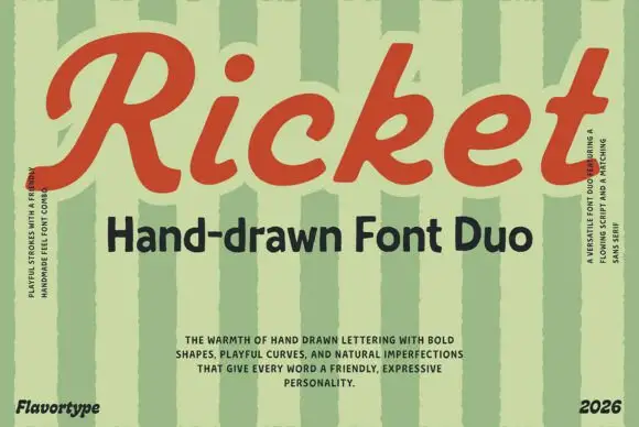
Broad slanted script and irregular sans
Ricket is a retro duo: a broad slanted script in brick red with bubbly bowls and a ball terminal, matched to a bold irregular sans that carries the subtitle.
Ideas for this font

Casual script with a sans companion
Malley Jacklist is a duo: a heavy casual script in cream with wide loops and a light sans companion, presented as a hand-lettered pair on a deep green photograph of leaves.
Ideas for this font
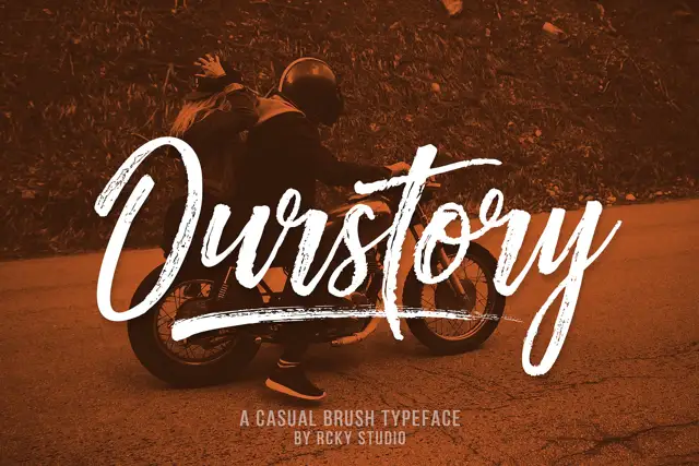
Rough brush script with a fine companion
Ourstory is a duo on a warm-toned photograph: a rough brush script in white with dry, split strokes and a long underline swash, plus a fine companion hand for smaller lines.
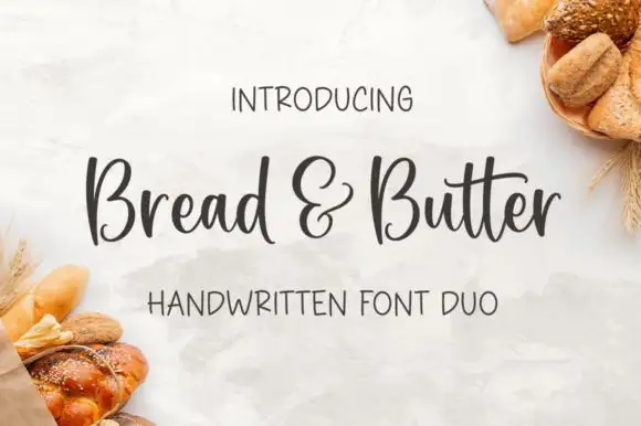
Rounded handwritten script paired with a narrow print in mixed case
Bread and Butter Duo pairs a rounded handwritten script with a narrow mixed-case print, so a label can carry a warm name and a quiet supporting line in the same ink without a second style.
Ideas for this font
Same independent foundry
Allow optional Google Analytics to measure visits and catalogue actions. Your search words and notes are not included. Privacy & storage