High-Contrast Display Serif

Ricket + Augler
Pairs sculptural editorial warmth with Ricket's clean modern geometry.
Inspect Augler specimenDisclosure: MakerFileHub may earn a commission from qualifying purchases via paid links on this page. How our links work.
Broad slanted script and irregular sans
Ricket is a retro duo: a broad slanted script in brick red with bubbly bowls and a ball terminal, matched to a bold irregular sans that carries the subtitle.
Paid link
Get this fontProject & layout blueprintsAt-a-glance maker compatibility
Weld or Unite overlapping script joins into one continuous vector path before sending to the blade.
Visual anatomy & craft review
Ricket fills the upper half of the card in brick red, set in a wide slanted script whose bowls are almost circular, whose t and k carry tall narrow ascenders, and whose entry strokes finish in round balls. Beneath it Hand-drawn Font Duo is set in the matching sans: bold, slightly irregular, with uneven stroke ends and a warm hand-drawn feel that keeps it from looking like a system grotesque. The ground is a sage-green vertical stripe, and the card is finished with small vertical captions on both edges, a centred paragraph in caps and a studio credit at the foot. The construction is a matched pair for packaging and small brands: the script takes the name, the sans takes everything that must be read, and the two only work together when the sans is set at roughly half the script's size.
A retro script paired with a friendly sans
Two-font hierarchy recipes
Tested contrast partners — pairing Ricket with grounded secondary typography.
Ricket + Augler
Pairs sculptural editorial warmth with Ricket's clean modern geometry.
Inspect Augler specimen
Ricket + Thick Black
Introduces organic movement on pull-quotes, signatures and gift tags.
Inspect Thick Black specimenPractical applications
Concrete hierarchy, scale and production guidance tailored to Ricket’s stroke geometry.
The pair gives a wedding sign a hand-made tone and a readable line beneath, so guests get both a mood and the information.
Hierarchy & layout recipe
Print a 500 by 300 mm board: set the couple's names at 90 pt on one row, set the detail line at 26 pt in the sans beneath with 24 mm of clear ground between, and hold 22 mm of border.
Pre-production check
Sage green on a printed board shifts toward grey outdoors; print one board and check the red holds its warmth before the set.
A retro duo gives a small publication a cover system in two voices, and the sans carries the issue details without a second family.
Hierarchy & layout recipe
Print a 210 by 297 mm cover: set the title at 80 pt across one row, set the issue line at 20 pt in the sans beneath with 18 mm of clear ground, and hold 16 mm of margin on all sides.
Pre-production check
The script's slant fights a vertical grid; print one cover at the final size and check the title sits level before the run.
The pair supplies a name and an ingredients line in one purchase, and the hand-drawn sans keeps a small label from looking corporate.
Hierarchy & layout recipe
Print a 60 by 45 mm label: set the bakery name at 16 pt in the script, set the product at 7 pt in the sans beneath with 5 mm of clear ground, and hold 4 mm from the outer stroke to the die line.
Pre-production check
At label size the ball terminals close up; print one label at the real size and check the t and k before the order.
Technical & licence verification
Confirm included OTF/TTF/WOFF formats, full glyph tables and licence coverage on the live store page before batch production.
Closest visual alternatives
Matched across letterform anatomy, stroke behaviour and craft applications.
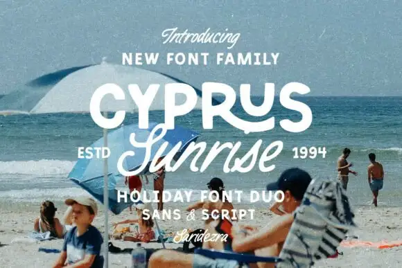
Rounded uppercase paired with a connected sloping script and a sweeping R leg
Cyprus Sunrise Duo places white rounded capitals above a flowing script word on a beach photograph, where the upper R sends a long curved leg beneath the following letters and the script S opens a large lower loop before the remaining letters connect on a rising rhythm.
Ideas for this font

Casual script with a sans companion
Malley Jacklist is a duo: a heavy casual script in cream with wide loops and a light sans companion, presented as a hand-lettered pair on a deep green photograph of leaves.
Ideas for this font
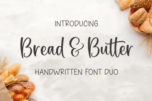
Rounded handwritten script paired with a narrow print in mixed case
Bread and Butter Duo pairs a rounded handwritten script with a narrow mixed-case print, so a label can carry a warm name and a quiet supporting line in the same ink without a second style.
Ideas for this font
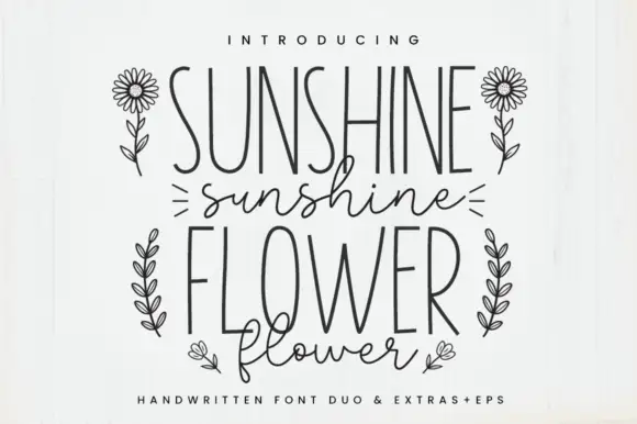
Tall narrow print and fine script
Sunshine Flower is a hand-drawn duo: a tall thin monoline capital face and a loose thin script, supplied with line-art flowers and shown in black on white.
Ideas for this font
Same independent foundry
Allow optional Google Analytics to measure visits and catalogue actions. Your search words and notes are not included. Privacy & storage